1. Beyond the Sea

    November 16, 2016 by Samuel Panda

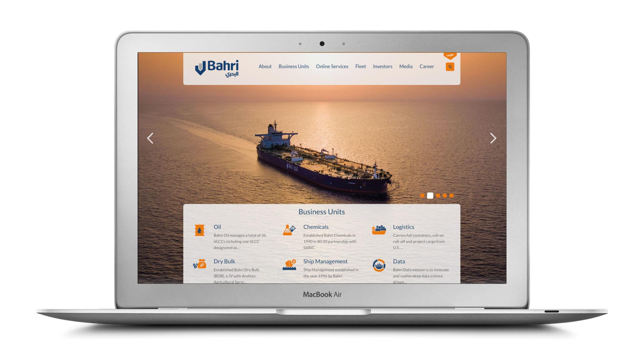
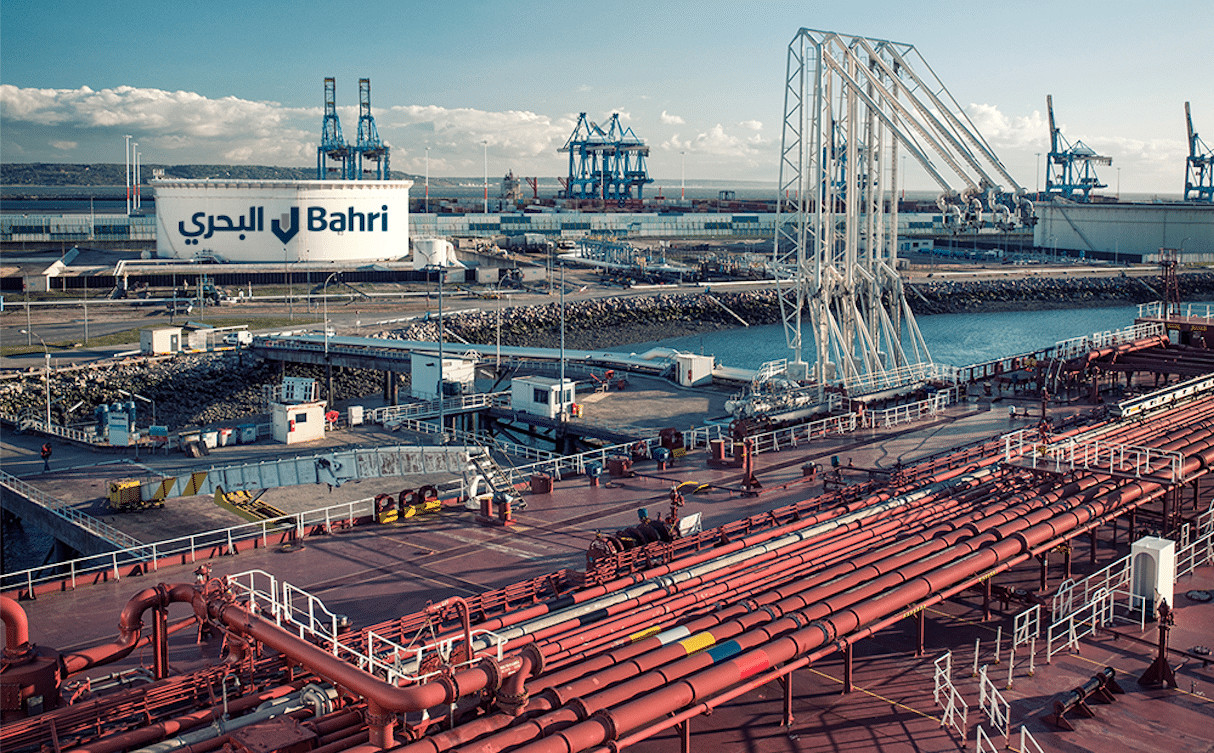
    Bahri case study AERON web 7

    Context

    Formed by a Royal Decree in 1978 as the National Shipping Company of Saudi Arabia, Bahri, has grown from a small shipping firm operating multipurpose vessels to become one of the biggest shipping conglomerates in the world.

    Bahri continues to strive for continuous improvement and expansion of its services in the global logistics industry.

    Ambition

    As the company expanded and added new services to its offer, it became necessary to review the brand architecture, to ensure there was a system in place to accommodate all Bahri international and regional businesses, new brands, acquisitions and endorsements of existing and potentially new products and services.

    Action

    We were tasked with creating a compelling, enhanced Bahri Visual Identity System to fit their business and brand strategies and give fresh life to the identity developed previously for the company’s renaming from the National Shipping Company of Saudi Arabia.

    Result

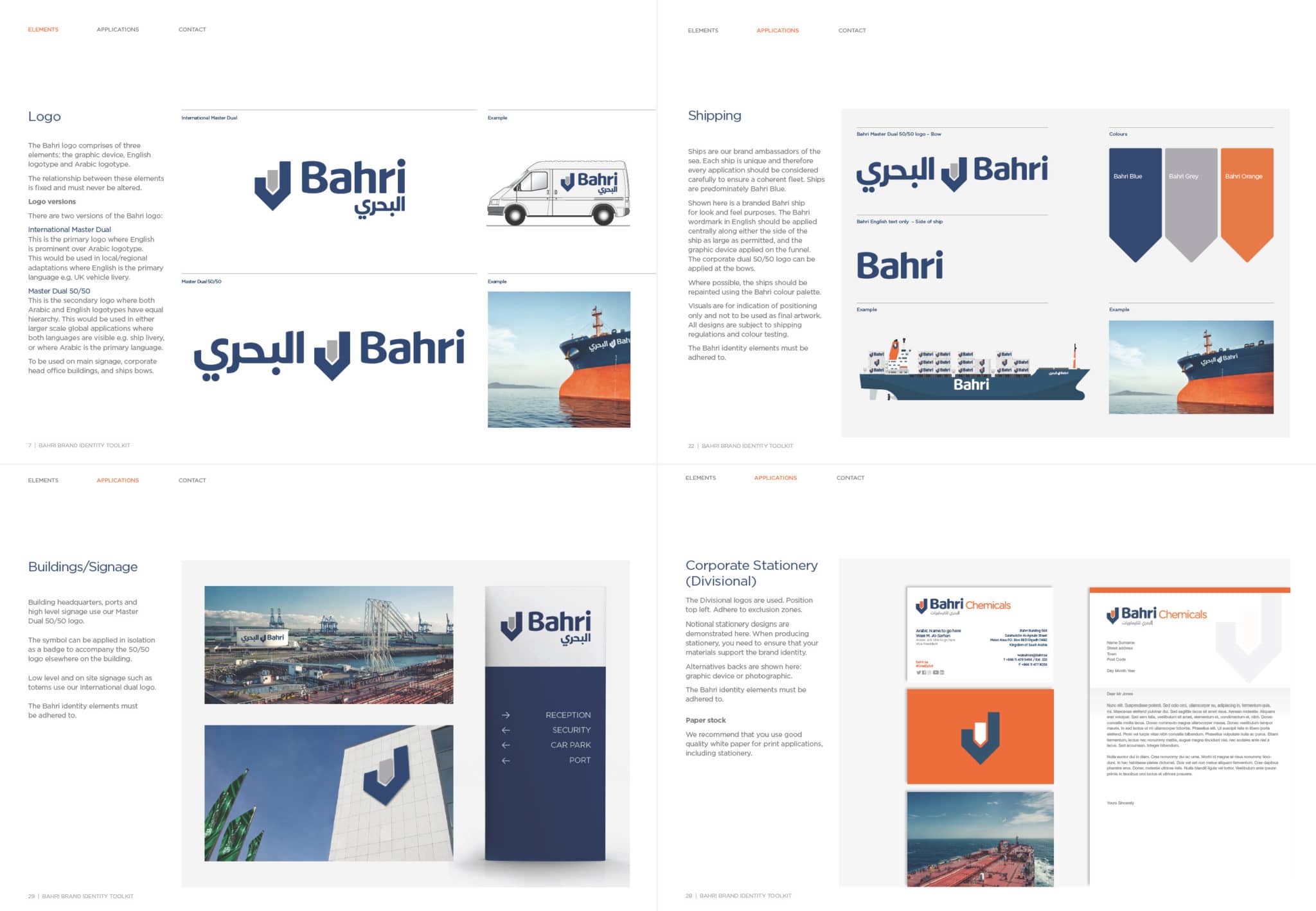
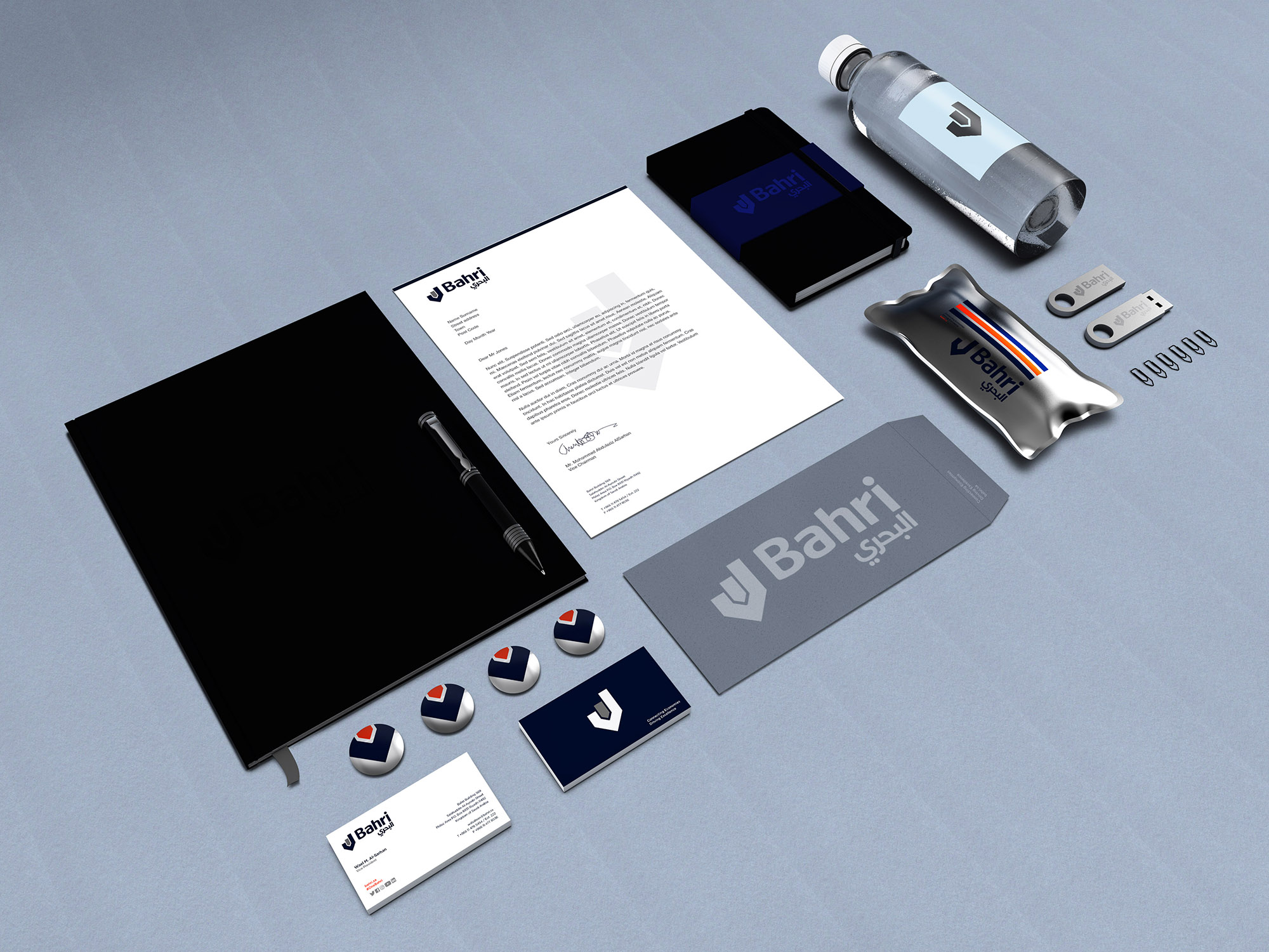
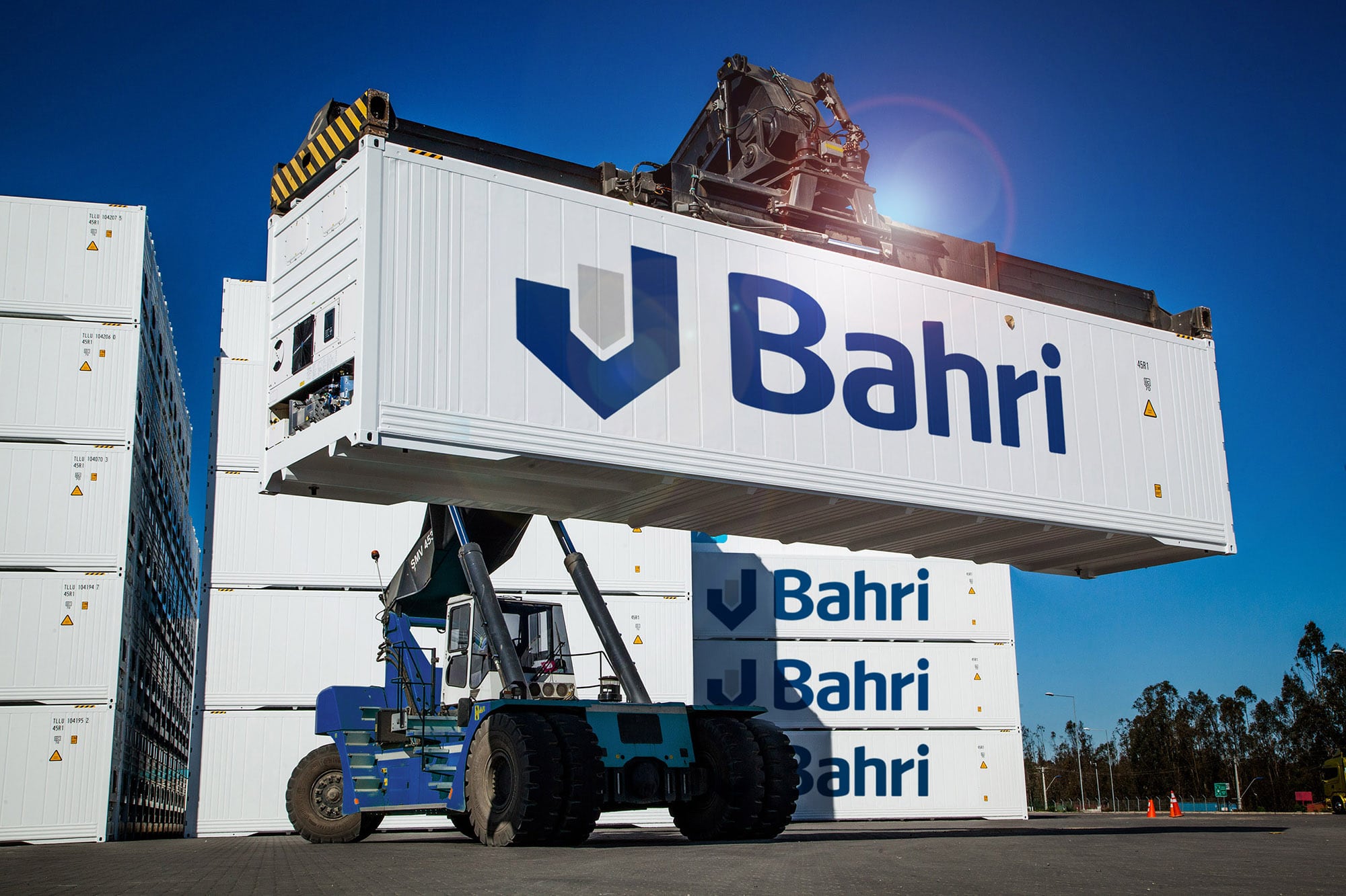
    We developed a new bi-lingual word mark, an enhanced graphic device and a brand architecture system that could be used in a variety of applications across all Bahri services.

    A comprehensive bi-lingual logo suite was provided along with detailed usage guidelines for the roll-out of the brand.

    After the successful roll-out of the refreshed identity, we have continued to support Bahri through international trademark advice and registration and with strategic consulting on the branding and identity of joint ventures and partnered endeavours.

    Bahri case study AERON web 13
     

    Bahri case study AERON web 6
    Bahri case study AERON web 5


  2. The Future is Retro

    October 27, 2016 by Samuel Panda

    Sometimes backwards is the way forwards.

    When times get hard, there is often comfort to be found looking back to former glories. Certainly that seems to be story behind three of this year’s big rebrands.

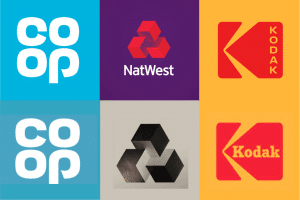
    The Co-opNatwest and Kodak have launched refreshed identities that look to consolidate past heavyweight status after recent challenging periods that were in danger of turning them into deadweights.

    Top Row: 2016 Bottom Row: 1968, 1968, 1971

    Top Row: 2016
    Bottom Row: 1968, 1968, 1971

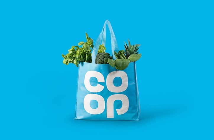
    Co-op in particular are deliberately attempting to “evoke[s] nostalgic memories of local shops and dividend stamps”. Harking back to simpler times, they are asking you to forget recent banking scandals that have tarnished the forgettable mixed-weight, navy blue marque and remember the glory days of the high street – when Co-op and it’s icy-clue clover dominated and it was Brentry, not Brexit, that was looming.

    AERON_Retro_Case_Study_Co-Op bag

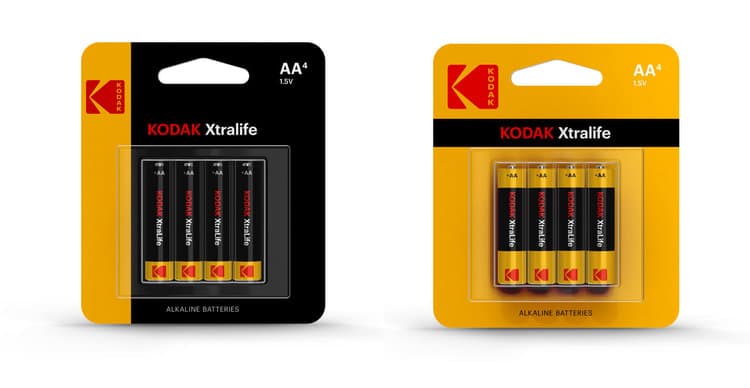
    Likewise Kodak’s golden years, when it dominated the camera market, seem like ancient history. Having been all but forgotten in the era of smart phones and Instagram, reclaiming 1971’s red and yellow K looks like a smart way of reasserting a strong heritage – especially when tied with a launch of retro-inspired products that straddle the digital/analogue line.

    AERON_Retro_Case_Study_Kodak_Batteries

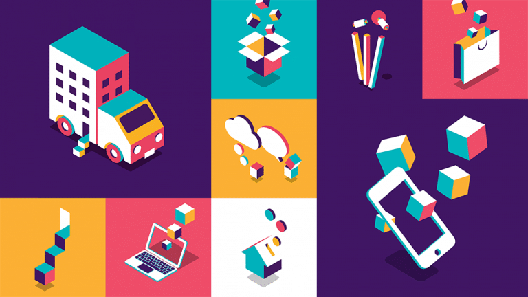
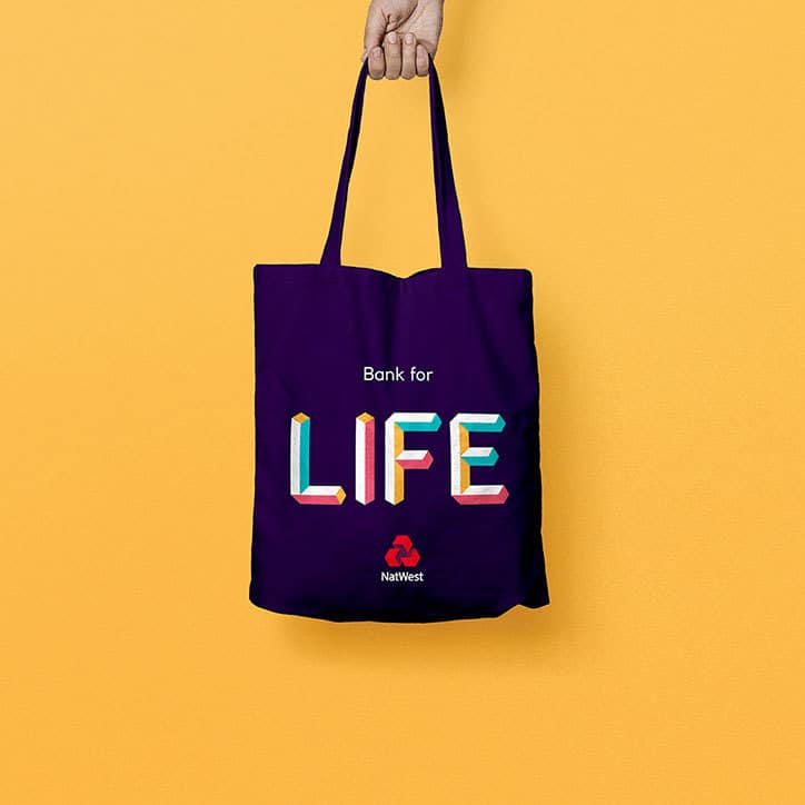
    Natwest’s call-back to 1968 is subtler in some respects – the Natwest logo has never been far removed from its original conception of three interlinking blocks representing three merging banks. An odd move, perhaps, as the three separate banks is no longer particularly relevant to its current story. Nevertheless, it does enable a far more interesting development in its broader storytelling and brand language with colourful, playful blocky illustrations trying to break the mould of the more staid traditional banking imagery.

    AERON_Retro_Case_Study_Natwest_Illustrations

    This does, of course, rely on people having positive memories and associations with the time and its identity. And while there have been dissenting voices, it seems to be doing some good for Co-op. Earlier this week, they were rewarded for Outstanding Achievement at the Retailer Industry Awards, after a major shakeup crowned by rising sales and the successful relaunch.

    Further more, simple, flat logos like Co-op’s and Kodak’s work well in the digital age, the limitations of print in the sixties and seventies giving way to the need for scalable, vector-based artwork that can sit comfortable across digital and physical platforms.

    This could suggest, therefore, that nostalgia is trending once more – not that it ever really goes away.

    Then again, judging from these examples it might just be more cases of “when things get hard, just stop, reset and relaunch from the last ‘save point’.”

    AERON_Retro_Case_Study_Natwest_Illustrations-Personal-Bank-For-Life


  3. Coca-Cola’s ‘One Brand’ Campaign starts tasting better after a flat start

    September 21, 2016 by Samuel Panda

    Coca-Cola is already the world’s number 1 beverage brand but in a market under pressure to be forever healthier and contain less sugar, how can the infamously sugary soft drink stay fresh and stop sales going flat?

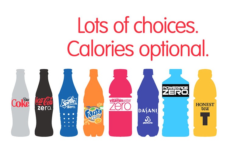
    Previously, Coca-Cola had approached the health trend by branching out into new products. Diet Coke had traditionally been marketed to women, so Coke Zero was introduced to give men a low-calorie alternative too. Then Coke Life appeared, using natural sweeteners as a direct response to calls to reduce artificial sweeteners.
    Throughout these developments, the original variant was kept separate to keep the brand from being diluted by the low/no-calorie options. However, with the market turning against sugar so sharply, it appears that the opposite is true. It is the original Coke that might benefit from the association with its ‘healthier’ offspring.
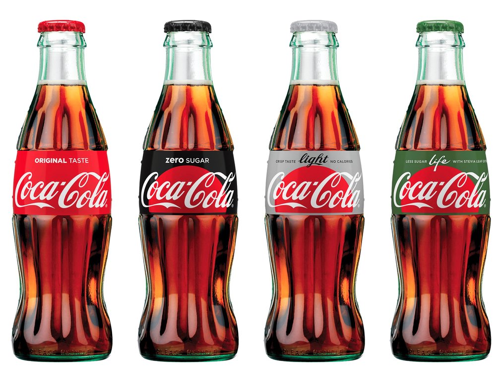
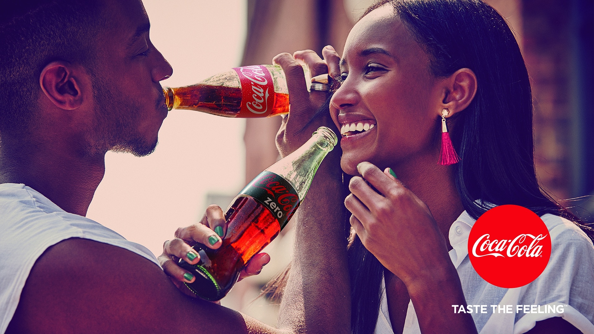
    Aeron Thinking - Coca-cola One Brand bottles

    In January this year, Coca-Cola launched their “One Brand” strategy, bringing all four variants together under the same red dot label and the unified tagline “Taste The Feeling.” As Coca-Cola President and COO James Quincey explains:

    The One Brand strategy takes us from [an] ineffective way of talking about four different brands and if you grew up drinking Coke Classic and you wanted to switch to Coke Zero you almost have to change brand and change your lifestyle. Now the idea of the one brand is you can enjoy Coca-Cola the whole of your life and you can have it in different product variants as you want to mix and match whether it is caffeine or sugar or whatever.

    This also means, that rather than pushing four different brands, Coca-Cola have been able to focus their marketing efforts behind a single, clear message that is endorsed by the world’s most iconic logo.

    And according to Quincey after just over six months it is already “starting to look very encouraging”, bringing in more sales and giving a further boost to the overall brand.

    In a market that’s in danger of losing it’s fizz, Coca-Cola’s strategy of bringing its brands together appears to be paying off.

    Aeron Thinking - Coca-cola Taste the Feeling 11


  4. Britvic adds another Zero to soft drinks

    August 10, 2016 by Samuel Panda

    One of the biggest trends to hit soft drinks in the last few years, is nothing. Or at least the number that represents it.

    Ever since the launch of Coca-Cola’s ‘manlier’ alternative to Diet Coke, zero has been a big number for beverages.

    Zero‘ variants stretch across all Coca-Cola and Lucozade brands and the new ZERoh! water range are all keen to tap into health-conscious consumers.

    Aeron_Case_study-Britvic_Zero-Coca-Cola_Zero_Range

    Britvic have now added a new twist to the Zero mix, stretching the claim to alcohol as well as the other demons of sugar, salt and/or calories.

    Sponsorship of Alcohol Concern’s Zero Alcohol Awards earlier this year, showed Britvic’s intent to give Zero fresh meaning.

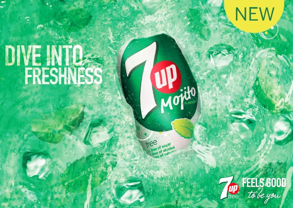
    With 7up Free Mojito and J2O already behind the bar as adult-friendly soft drinks, now their new NPD innovation arm, WiseHead Productions, has brought the launch of a ‘zero-proof’ drink, Thomas & Evans No.1.

    Aeron_Case_study-Britvic_Zero-Thomas_Evans-1

    Zero-proof drinks are an emerging category of drinks that are made with the same processes as alcoholic beverages, but without the alcohol. With more studies reporting the health dangers of alcohol, this could be a big new trend as Britvic reaching out to the conscientious adult ‘non’-drinker in a market drowned in syrupy sweet alternatives to alcohol.

    Aeron_Case_study-Britvic_Zero-Lucozade Aeron_Case_study-Britvic_Zero--7Up_Mojito


  5. Virgin Red: Bringing the family together to reward loyalty

    August 4, 2016 by Samuel Panda

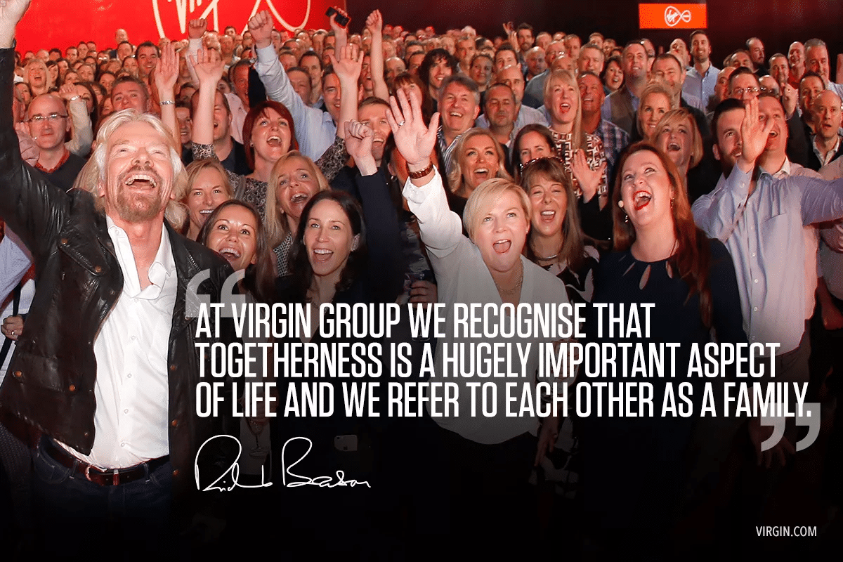
    Virgin is a brand with big ambitions and a big family.

    Offering everything from books to gyms to space travel, Virgin is a house of brands like no other.

    And now, they are going further to tie the family together – launching a new loyalty scheme, Virgin Red, to reward customers for their interactions across all virgin companies.

    Whether shopping in a Virgin Megastore, flying with Virgin Atlantic or talking on Virgin Mobile, users will now be eligible for rewards from the whole Virgin family, within a single app.

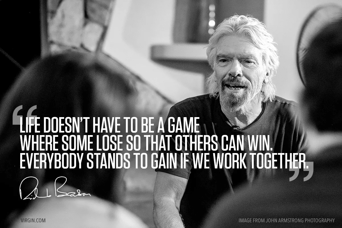
    Aeron_Case_Study-Virgin_Togetherness_quote-1200x800

    Virgin has tried bringing its brands together before, launching Virgin Radio on board a Virgin Train sponsored by Virgin Mobile earlier this year, but never anything on this scale.

    Virgin Red’s head of marketing Helen Tupper explains such synergy “rarely happens because each of the businesses has their own agendas and targets. If we can create something that all the Virgin companies can authentically get involved in then it is powerful for the brand. That is a powerful way of activating the Virgin brand.

    She said “The loyalty programme is designed to encourage multiple relationships. We have known for a long time that this is the right thing to do from a customer and business perspective. But we wanted something efficient, engaging and that felt Virgin-like.”

    Virgin have found a way to bring a scattered family of brands together, meaning they can offer their customers more and keep the relationship between brands and customers going much, much further.

    Aeron_Case_Study-Virgin_Work_together_quote-1200x80Aeron_Case_study-virgin_red_press_4_lockup

  6. Every Millisecond Counts

    June 16, 2016 by Samuel Panda

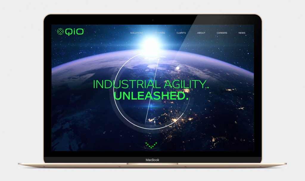
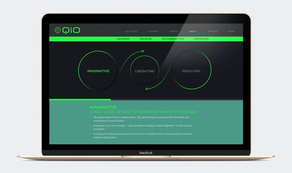
    Aeron Case Study - QiO Website Homepage

    Context

    QiO Technologies is a fast-growing software engineering and data science business focussed on industrial optimisation. Since launching in February 2015, QiO has grown rapidly with it’s NAUTILIAN platform more than proving itself as a highly valuable asset for customers.

    The QiO team combine agile software development and data science expertise with extensive ‘Industry 4.0’ knowledge. Collectively and as individuals, the team has been at the forefront of developments in industrial optimisation in recent years at leading major multinational players.

    Ambition

    As a pioneer of Industry 4.0 and leading the drive to realise the potential for the Internet of Things, QiO needed a cutting edge, dynamic identity and set of values that firmly positioned them at the head of the new generation of innovative software solutions providers.

    Action

    After assessing the competitive landscape with a comparator audit, and doing some internal market research we were able to pick out the existing identity’s core strengths and craft a much clearer identity that was unambiguous about the brand’s name and what it stood for. From a launchpad of “liberating engineering talent” we developed the value proposition of “Imaginative; Liberating; Involving” to reaffirm QiO’s commitment to working together to empower everyone in the QiO family to keep reinventing and pushing the boundaries of possibility.

    Result

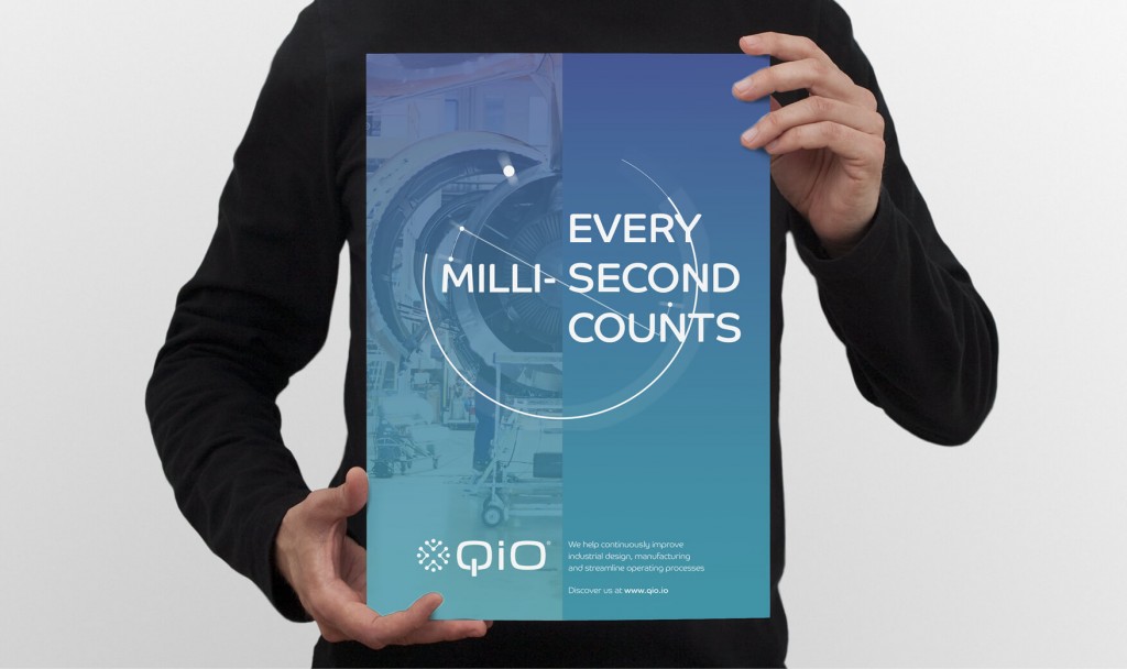
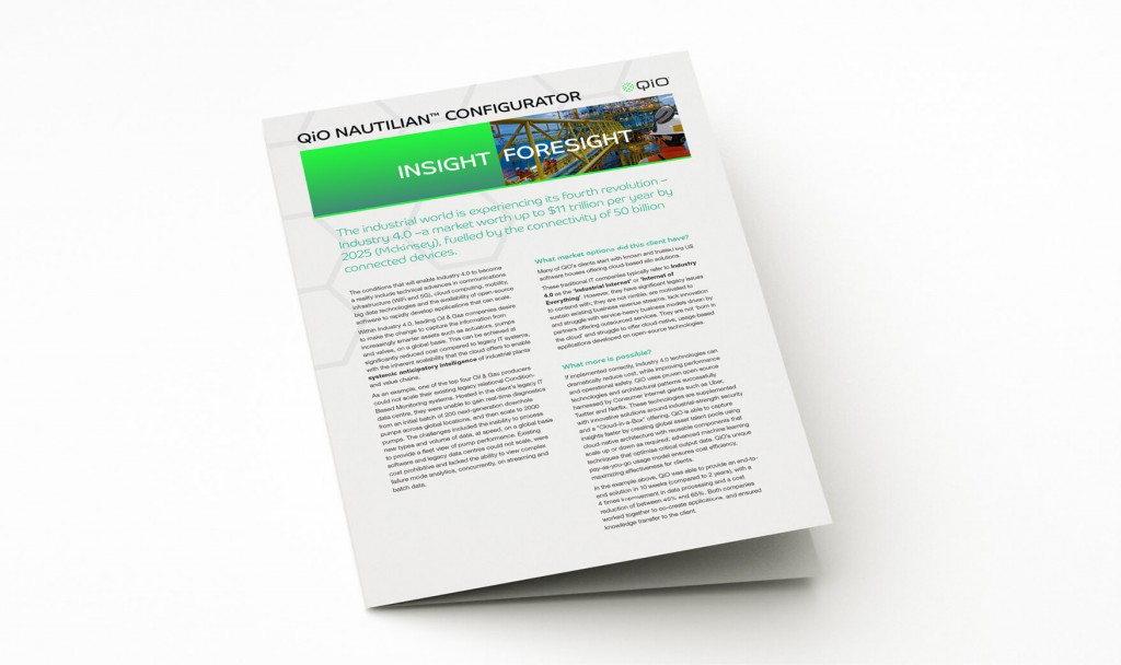
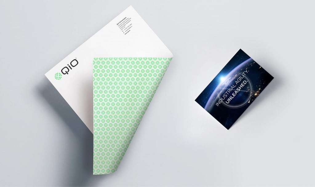
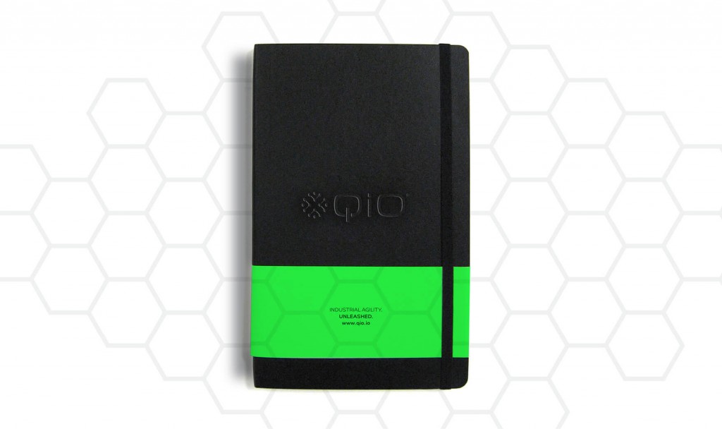
    We delivered a range of services, including a comparator audit, proposition, tone of voice and refreshed visual identity across all key touch points. The new identity featured a reshaped logo and distinctive patterns and icons tailored specifically for QiO. This was most celebrated in the launch of a new, dynamic website and url – https://qio.io/ – and is also proudly shaping QiO’s technical white papers and presentations.


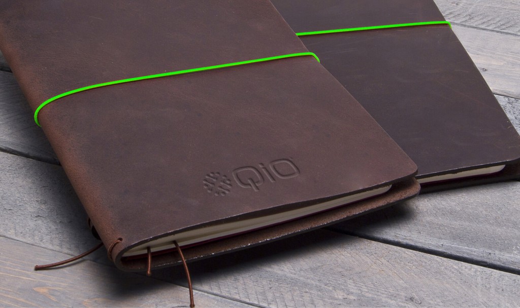
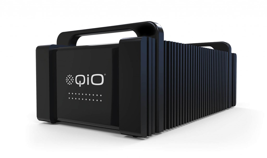
    Aeron Case Study - QiO brand iconsQiO_Website_Casestudies-113QiO_Website_Casestudies-118Aeron Case Study - QiO White PaperAeron Case Study - QiO Branded StationeryAeron Case Study - QiO branded moleskineAeron Case Study - QiO branded notebookAeron Case Study - QiO logo stamp Aeron Case Study - QiO branded server


    About Aeron

    We are Aeron, a London brand design consultancy that specialises in business transformation, brand strategy and design. Our purpose is set on helping ambitious businesses thrive in today’s market place.

    Based on fundamental insights, our London brand design consultancy is expert in helping organisations define their brand purpose; a clear, relevant, ownable and defendable territory – which delivers genuine value to customers.

    With a reputation for linking brand strategy and innovative design with clear financial outcomes, our London branding agency combines intelligent data, imaginative insight with inspiring creativity and transformative digital technology to deliver enduring growth.


  7. There in black & white

    June 9, 2016 by Samuel Panda

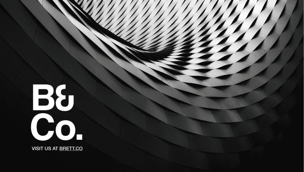
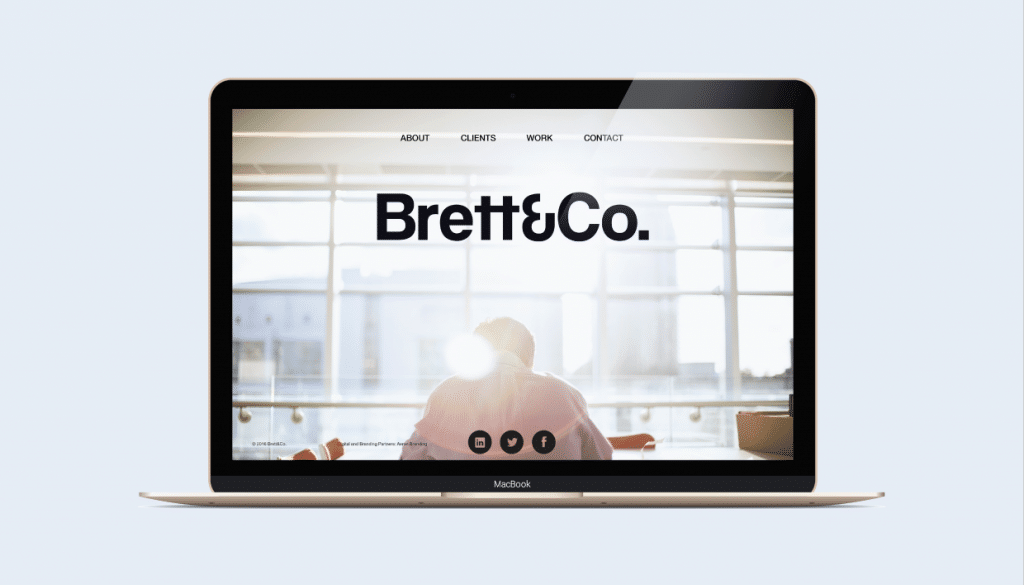
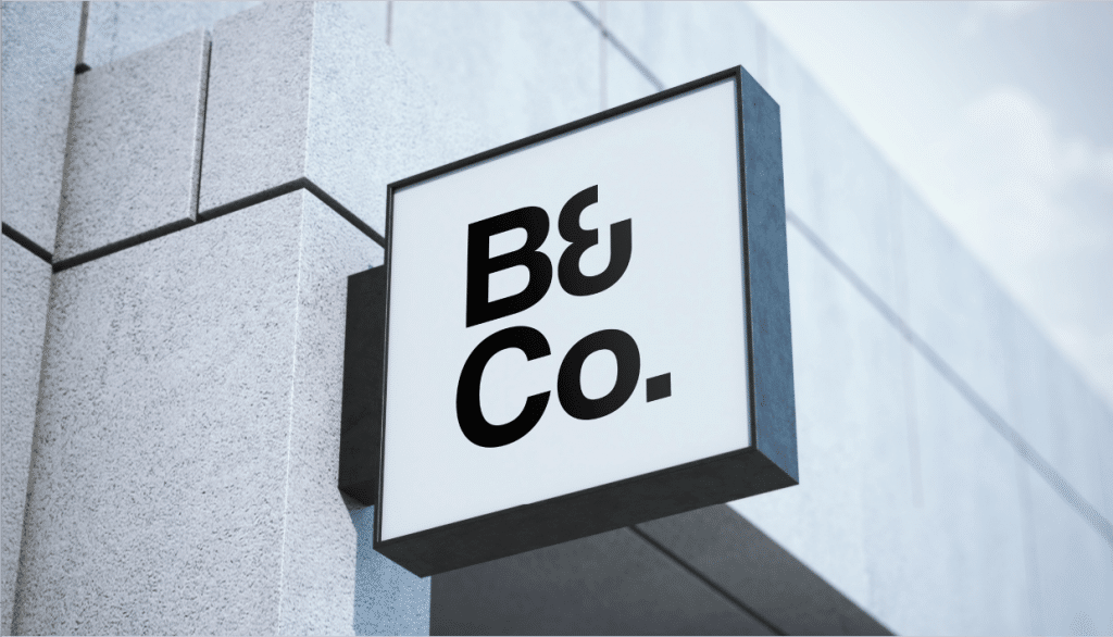
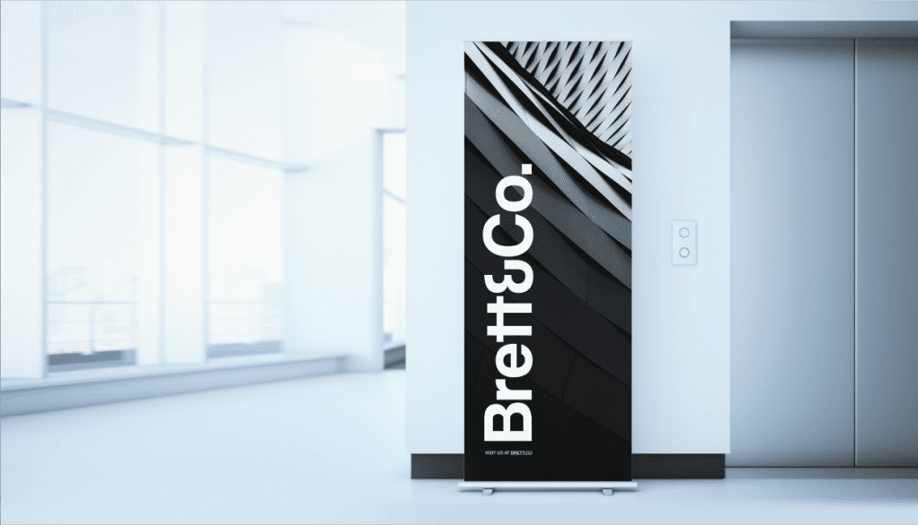
    Aeron Case Study - BrettCo 4

    Context

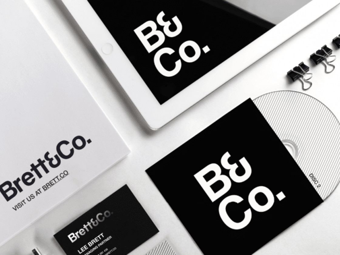
    Brett & Co was formed to help owners, agencies and brands define better. A creative consultancy, ensuring clients have the right people in the room for ideas, advice and achieving good things.

    Ambition

    A fresh start for Brett & Co required a fresh image and identity.

    Action

    We developed a striking identity that can be rolled across a variety of touch points, as the brand develops.

    Aeron Case Study - BrettCo 7Aeron Case Study - BrettCo 3 Aeron Case Study - BrettCo 5 Aeron Case Study - BrettCo 6

    About Aeron

    We are Aeron, a London brand design consultancy that specialises in business transformation, brand strategy and design. Our purpose is set on helping ambitious businesses thrive in today’s market place.

    Based on fundamental insights, our London brand design consultancy is expert in helping organisations define their brand purpose; a clear, relevant, ownable and defendable territory – which delivers genuine value to customers.

    With a reputation for linking brand strategy and innovative design with clear financial outcomes, our London branding agency combines intelligent data, imaginative insight with inspiring creativity and transformative digital technology to deliver enduring growth.


  8. Starting Fires

    June 1, 2016 by Samuel Panda

    Giving a voice to people in the dark on social 


    Context
    As a competitive sports woman Cathy Wood was a member of the GB diving team and also a medal winner in the Iron Man Triathlon, a sport which she competed in at European and World levels. Both a former GB athlete and Daily Mail Journalist, Cathy came to us looking for a fresh perspective and a re-brand for her social media consultancy.

    Ambition
    With Cathy’s strong passions for sport, communication and empowering young people to have a voice, we wanted to create an engaging, youthful brand that would appeal to young people and athletes alike but which still reflected her significant sporting and journalistic credentials.

    Action
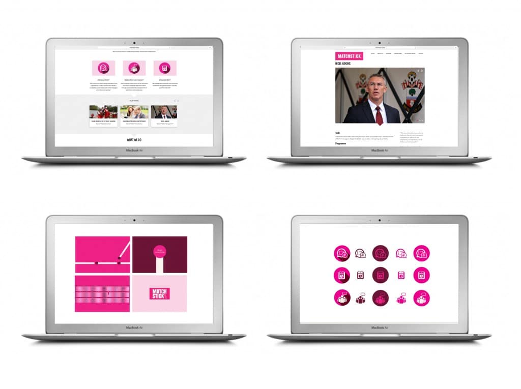
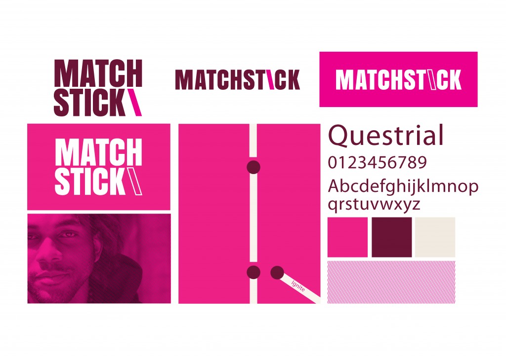
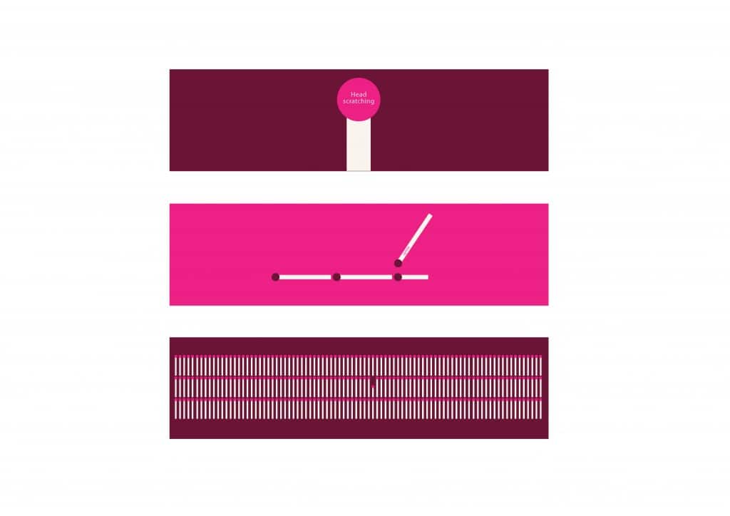
    Through strategic positioning and working closely with Cathy herself, we developed an exciting new corporate identity with a bespoke graphic system for use across both print and digital ecosystems.

    Result
    Having created the ‘Matchstick’ brand for Cathy we have now implemented the new corporate identity on a fully responsive website which can be seen here: www.matchstick.media

    Matchstick Laptops

    CathyWood_identity_pres_210115_JP-2_Page_04

    CathyWood_identity_pres_210115_JP-2_Page_10


    About Aeron

    We are Aeron, a London brand design consultancy that specialises in business transformation, brand strategy and design. Our purpose is set on helping ambitious businesses thrive in today’s market place.

    Based on fundamental insights, our London brand design consultancy is expert in helping organisations define their brand purpose; a clear, relevant, ownable and defendable territory – which delivers genuine value to customers.

    With a reputation for linking brand strategy and innovative design with clear financial outcomes, our London branding agency combines intelligent data, imaginative insight with inspiring creativity and transformative digital technology to deliver enduring growth.


  9. Silence is Golden

    May 10, 2016 by Samuel Panda

    BEN ROBINSON

    When there are so many more channels of communication it can be easy to be overawed by the variety of platforms and their incumbent cacophonies. Sometimes it makes you want to say nothing at all.

    Which appears to be the latest trend for high profile musicians releasing new music.

    In the last few weeks we have seen big releases from Beyonce and Radiohead, appearing with minimal fanfare but creating huge hype.

    Beyonce launched her new 'visual' album as a TV special, taking fans by surprise

    Beyonce launched her new ‘visual’ album as a TV special, taking fans by surprise

    Radiohead actually set the ball rolling by saying less than nothing – they did their best to wipe their official presence off the internet, deleting social media feeds and removing websites. The remaining void immediately got people excited. People were talking because the band suddenly weren’t.

    Radio silence preceded Radiohead's first album in 5 yers

    Radio silence preceded Radiohead‘s first album in 5 years


    For a band such as Radiohead, any new release is sure to garner instant publicity and reach across the twittersphere thanks to their consistent high quality and popular appeal, but also their approach to experimenting with music and how they make it available (such as their innovative ‘pay what you want’ approach to releasing 2007’s In Rainbows).

    In this case, they decided the best way to hype a new release wasn’t a sustained teaser campaign – adding to the noise – but instead clearing a space so that people would not just hear what they had to say, but stop what they were doing and listen to it.

    The first tweet back - Radiohead returned to the internet with clips of their new video, shortly before the full album was launched

    The first tweet back – Radiohead returned to the internet with clips of their new video, shortly before the full album was launched

    This is the great challenge all bands and brands face in a noisy marketplace. It’s all very well making yourself heard above other raising voices, the real question is: how do you make people listen?


  10. Agthia PJSC : Group nine-month net profit increases 19 percent

    October 30, 2015 by Samuel Panda

    CBD Product Porfolio AERON Oct 22, 2015 cw_rgb_both sides

    ABU DHABI, 29th October 2015 (WAM) — Agthia Group PJSC, one of the UAE’s leading food and beverage companies, has reported a net profit of AED 179 million for the first nine months of 2015, an increase of 19 percent compared to the same period in 2014.

    The group said this performance was driven by a growth in sales of 12 percent to AED 1.4 billion, as well as improved gross margins.

    Dhafer Ayed Al Ahbabi, Chairman of Agthia Group commented: “Our performance over the last nine months shows that we are making strong progress on our strategy to become the market leader in our chosen categories and to deliver sustainable and profitable growth for our shareholders.”

    Iqbal Hamzah, Chief Executive Officer of Agthia, added: “We have seen our core businesses continue to grow year-on-year, with water and beverages and flour categories in particular driving the results.”

    “Our business and financial position is strong and we have the right strategy in place to remain on our growth trajectory creating value to our shareholders,” Hamzah added.

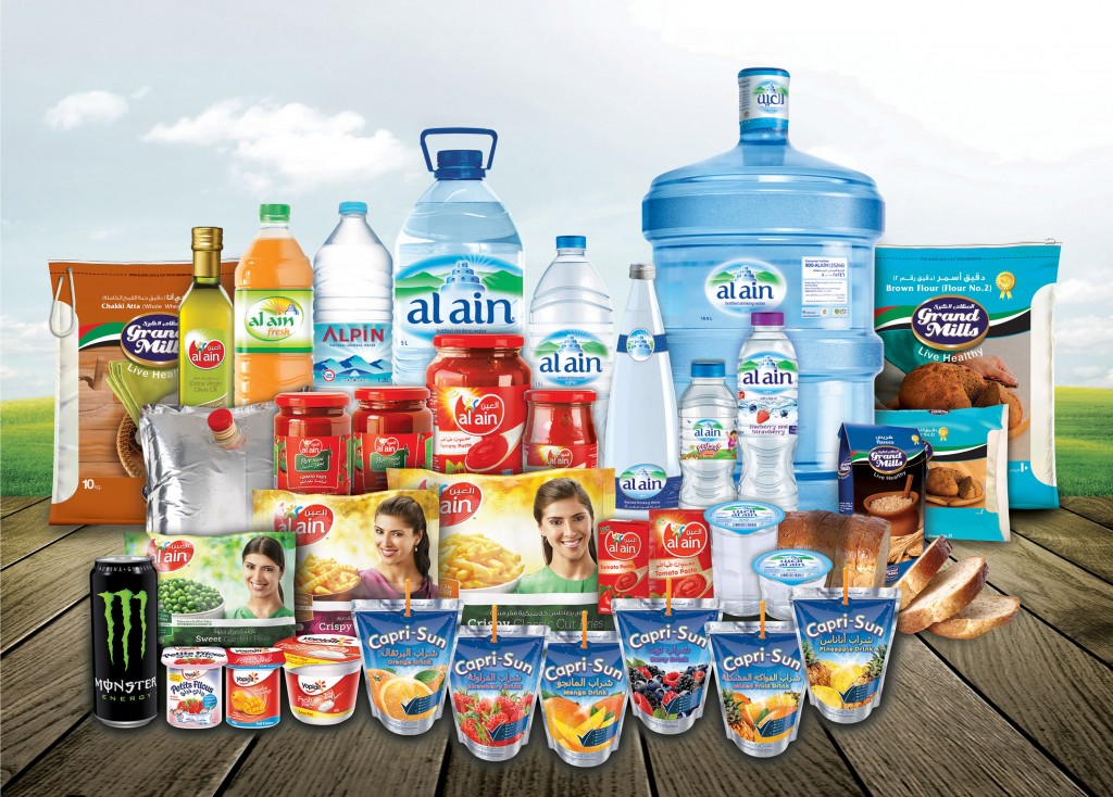
    Agthia’s water and beverages segment, dominated by Al Ain bottled water, saw net revenues increase 24 per cent to AED457m during the first nine months of the year. The net profit for the segment rose 30 per cent to AED80m.

    (c) 2015 Emirates News Agency (WAM) Provided by SyndiGate Media Inc. (Syndigate.info)., source Middle East & North African Newspapers


© Aeron Branding, 2025. All rights reserved.