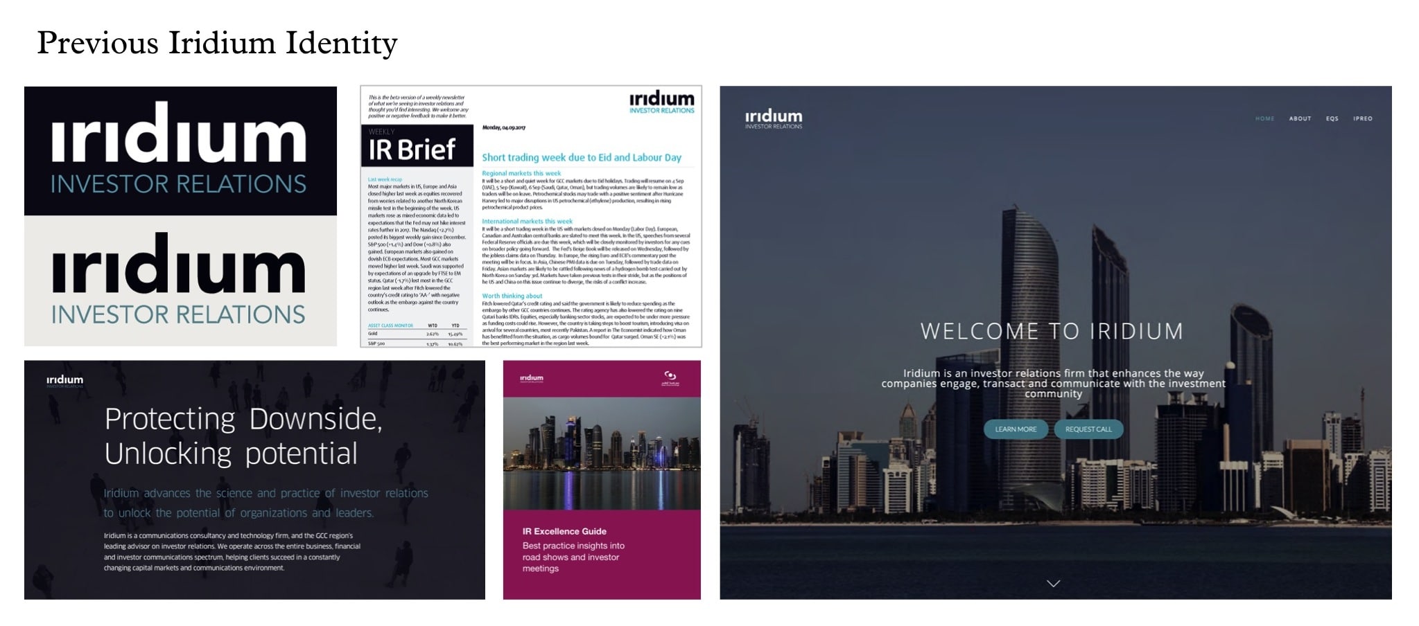
1. A Complete Welcome – Al Waseel

    March 20, 2018 by Samuel Panda

    Screen Shot 2015-11-06 at 11.14.51

    Time For A Change 


    Context

    Nestled amongst Riyadh’s rugged desert landscape Al Waseel is a wellness spa & resort set in a secluded conservation reserve intended for those seeking a rejuvenating retreat to serenity.

    Ambition

    Our ambition for Al Waseel was for it to be valued by Riyadh’s leaders in life as the most progressive, authentic and serene wellness spa & resort of choice.

    Action

    Borne out of the spirit of Al Waseel, the land, it’s people and it’s eternal connections we sought about creating a brand & identity for the resort that would encapsulate it’s timeless values just like the unique fossils that can be found in it’s environs.

    Results

    Having created an entirely new brand and identity we crafted a beautifully elegant bespoke symbol, wordmark and visual system that represent the Al Waseel’s ongoing commitment to luxury, refinement and sophistication.


    Screen Shot 2015-11-06 at 11.13.49

    Screen Shot 2015-11-06 at 11.11.27

    Screen Shot 2015-11-06 at 11.17.13


    Screen Shot 2015-11-06 at 11.16.51


    Screen Shot 2015-11-06 at 11.22.11

    Screen Shot 2015-11-06 at 11.15.20

    Screen Shot 2015-11-06 at 11.22.29

    Screen Shot 2015-11-06 at 16.12.33

    Screen Shot 2015-11-06 at 16.12.20

    Screen Shot 2015-11-06 at 16.07.18

    Screen Shot 2015-11-06 at 16.12.44

    About Aeron

    We are Aeron, a London brand design consultancy that specialises in business transformation, brand strategy and design. Our purpose is set on helping ambitious businesses thrive in today’s market place.

    Based on fundamental insights, our London brand design consultancy is expert in helping organisations define their brand purpose; a clear, relevant, ownable and defendable territory – which delivers genuine value to customers.

    With a reputation for linking brand strategy and innovative design with clear financial outcomes, our London branding agency combines intelligent data, imaginative insight with inspiring creativity and transformative digital technology to deliver enduring growth.


  2. Insights Influence Impact

    October 19, 2017 by Samuel Panda

    Context

    Iridium was founded in 2015 as the Middle East’s first pure investor relations consultancy and technology firm. In a short time, Iridium established itself as the region’s leading investor relations advisor.

    Iridium’s business model is underpinned by the growing interest of international investors in MENA equities, greater regulation of investor relations by GCC governments and continuous advances in global best practices.

    Ambition

    Working across strategy, finance, investor relations and communications, Iridium brings rigour, coherence and consistency to the heart of senior management, and enables them to project confidence and clarity to the global investment community.

    Our task was to create a compelling corporate visual identity system, which would encapsulate Iridium’s ambition, proposition and guiding principles.

    Action

    We worked closely with Iridium to get a thorough understanding of its position in the market, its appeal to clients and the key differentiators the brand should stand for.

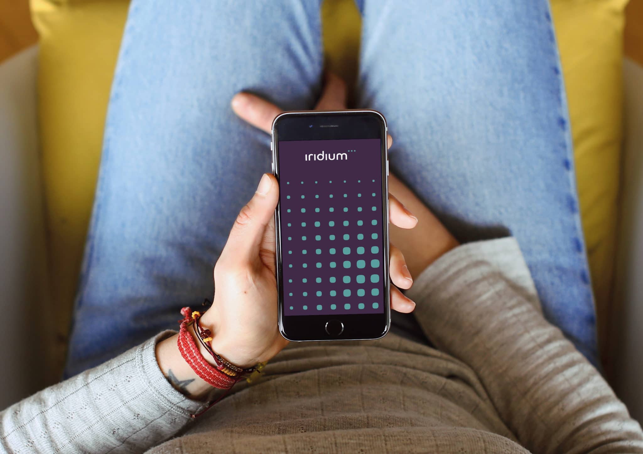
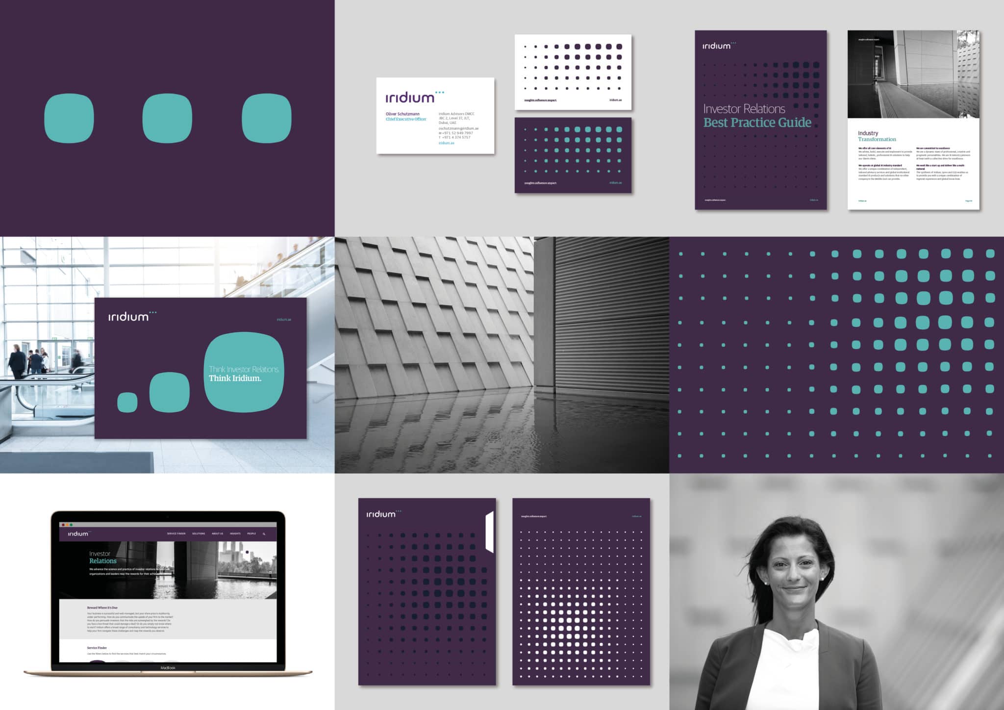
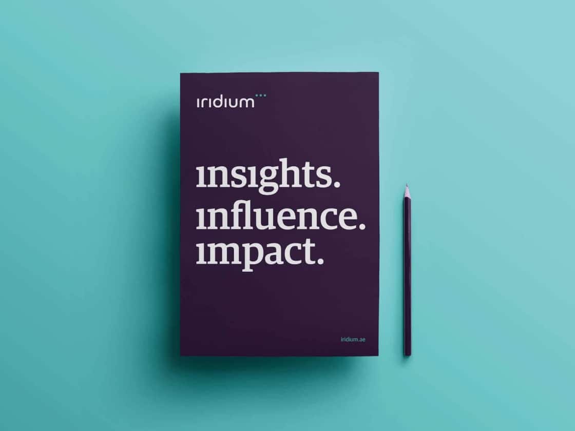
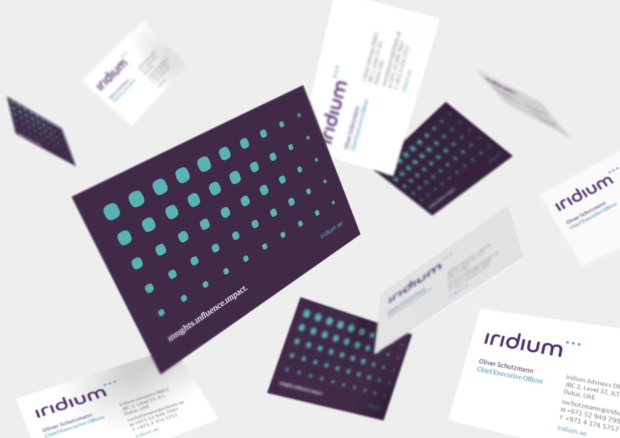
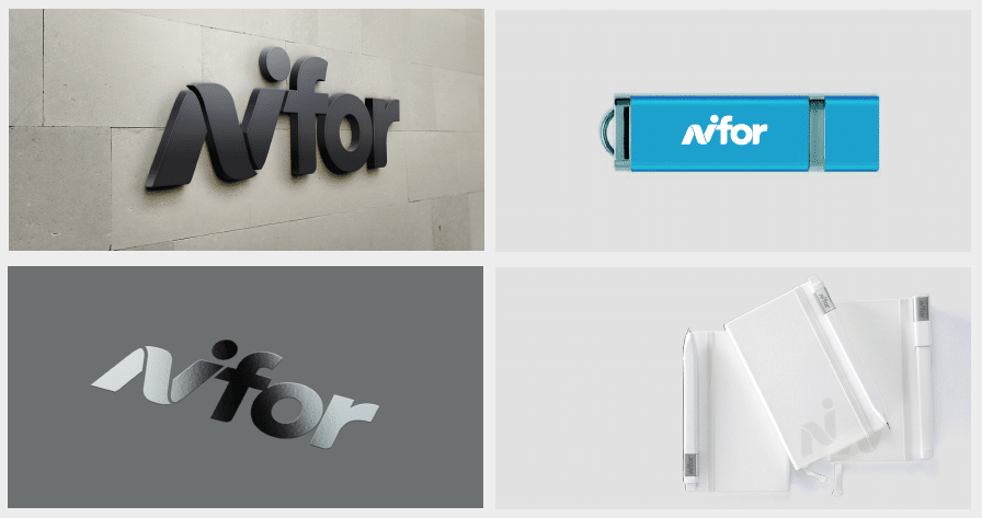
    We created a distinctive wordmark and symbol for Iridium that reflects the belief that high quality investor relations are the hallmark of successful capital markets.

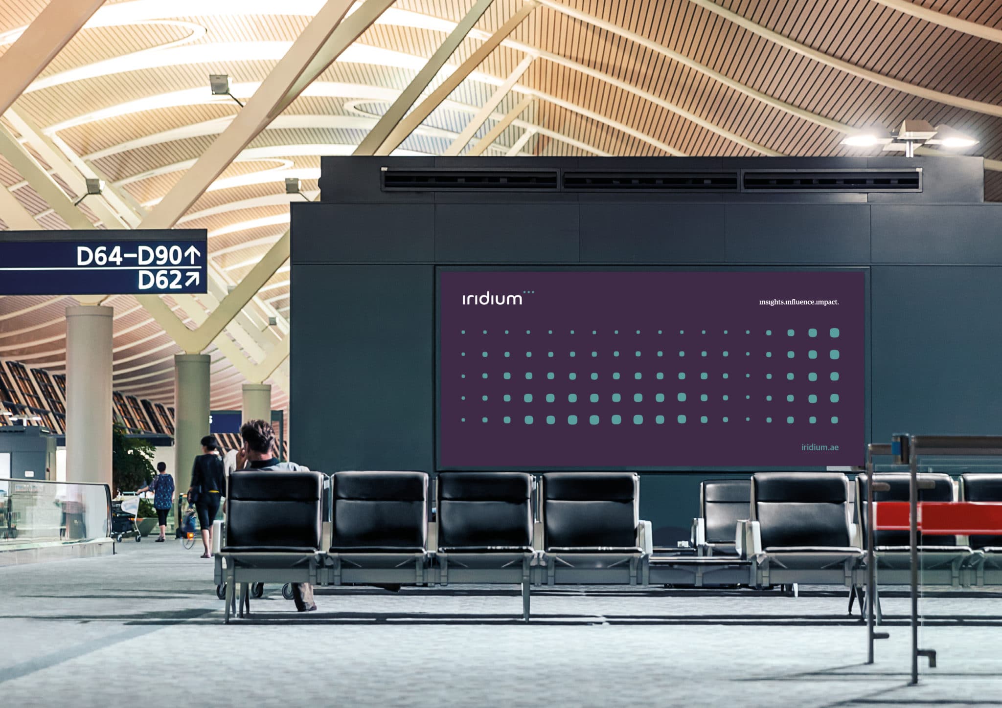
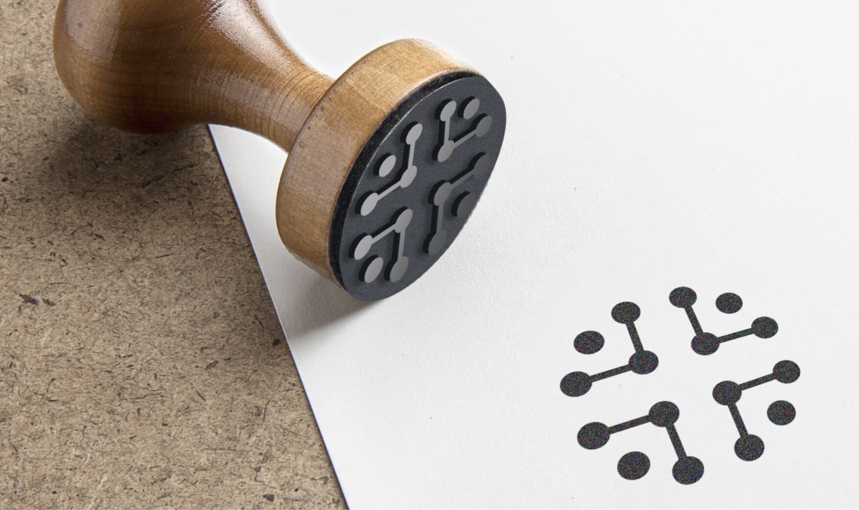
    The wordmark and symbol are strongly interlinked, to represent the synergy Iridium builds with its clients, and are formed by the dots from each letter ‘i’ escaping the confines of the type to create an ellipsis symbol that hints at Iridium’s ability to identify and close gaps, and unlock new opportunities. The three dots also encapsulate Iridium’s three key principles: insights.influence.impact.

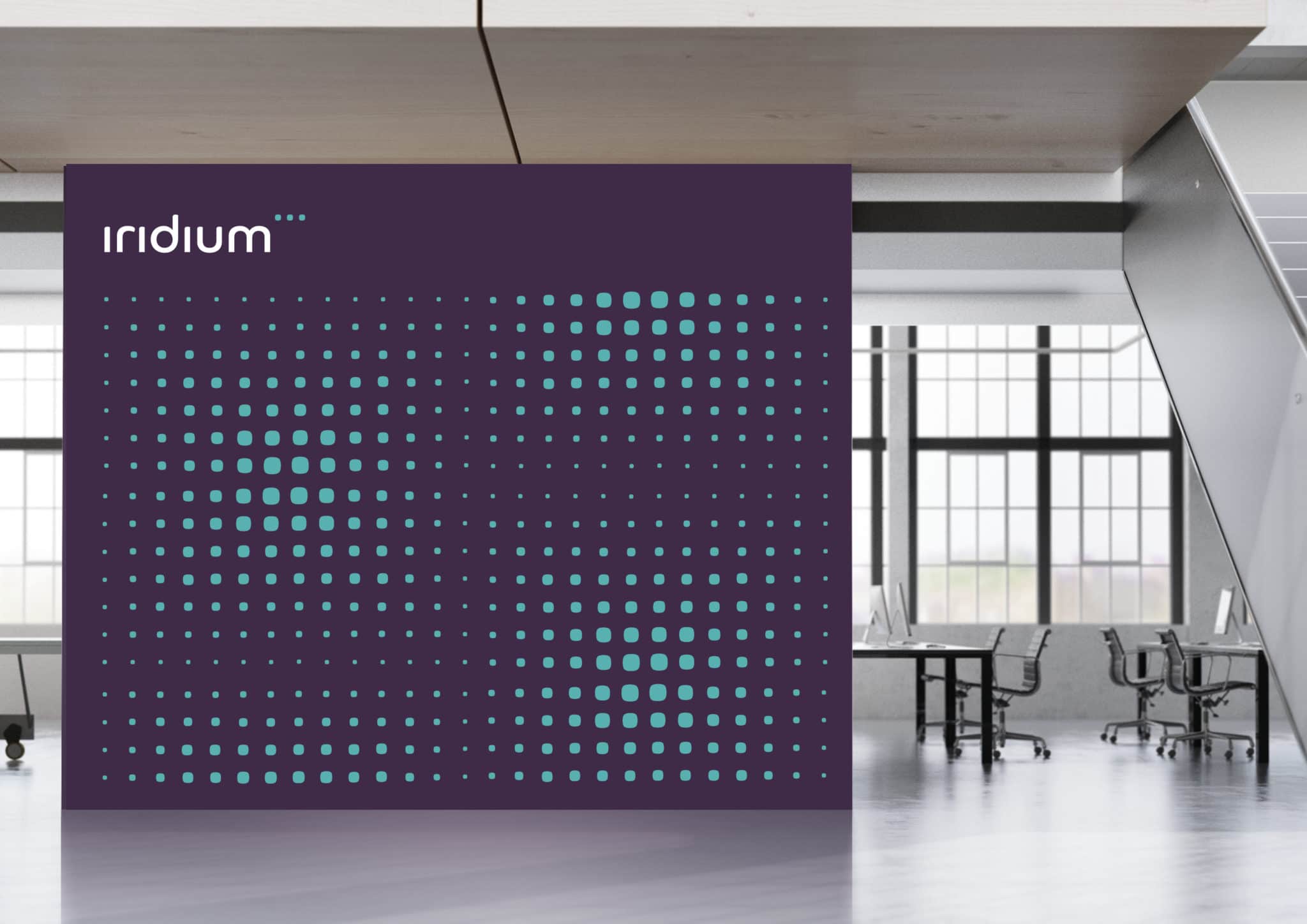
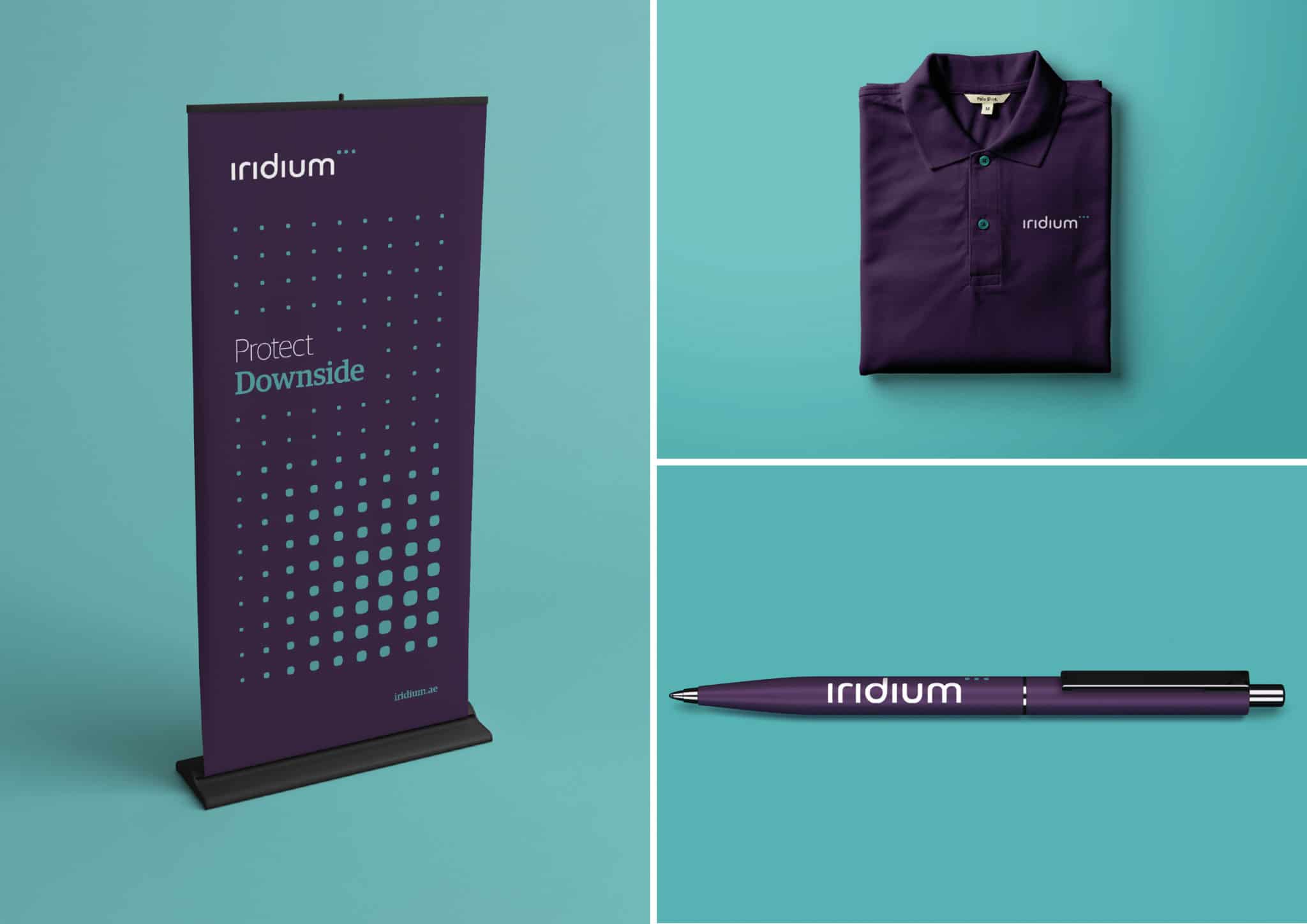
    The symbol then opened up a comprehensive visual identity system that enabled distinctive and dynamic brand communication. This system was rooted in a grid matrix, built from the dots of the ellipsis, and highlighting the attention to detail and fine technical analysis that Iridium prides itself on.

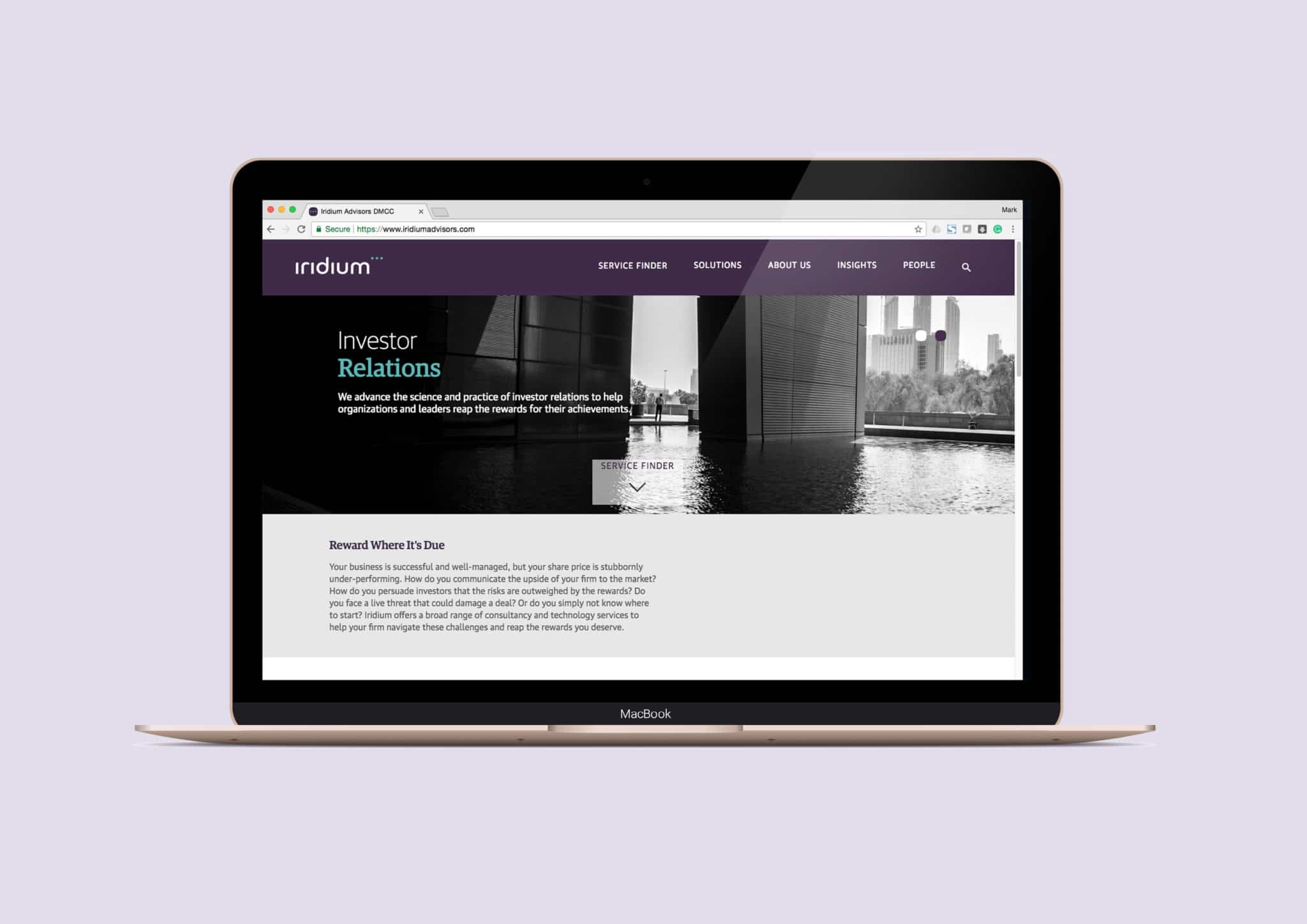
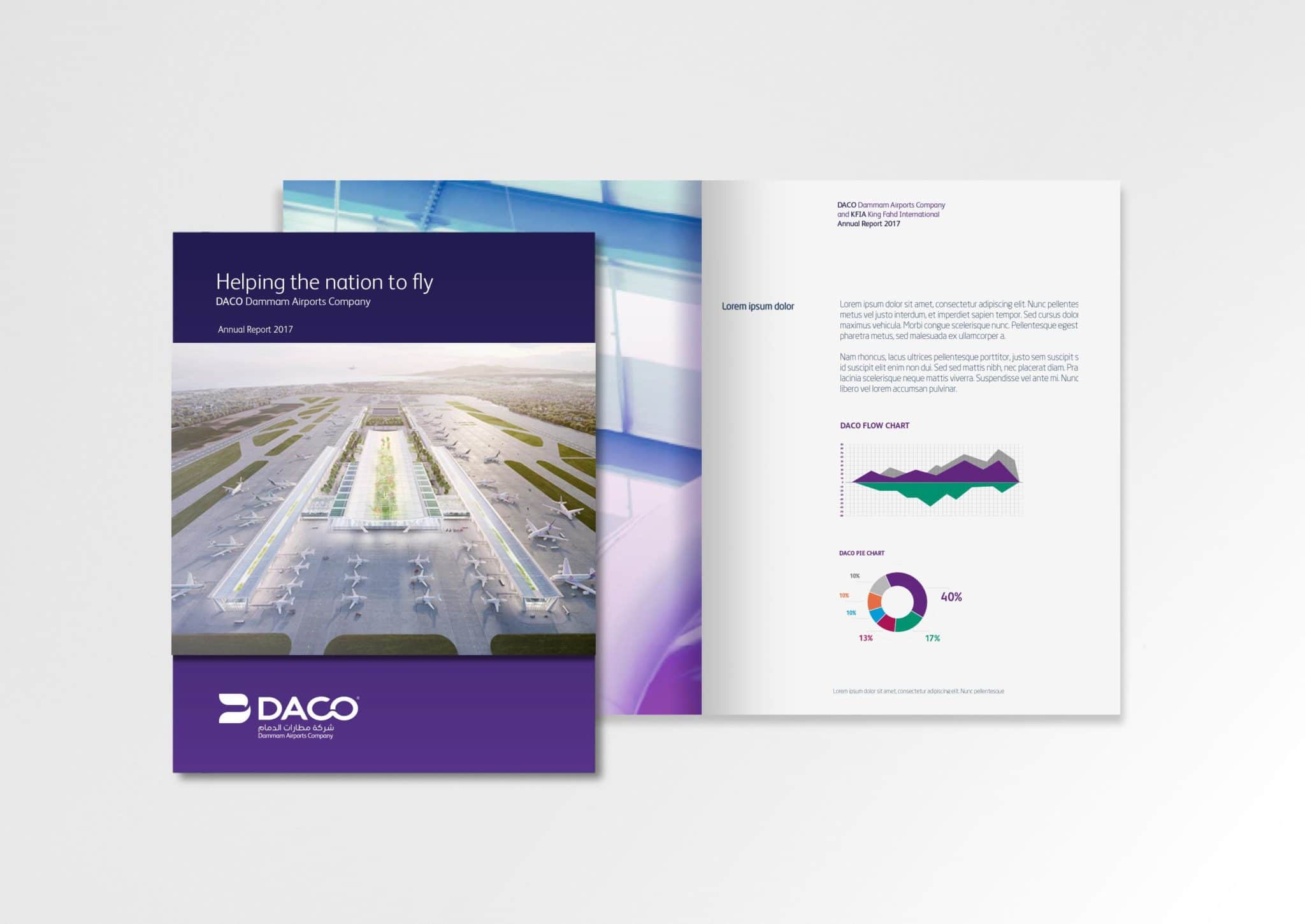
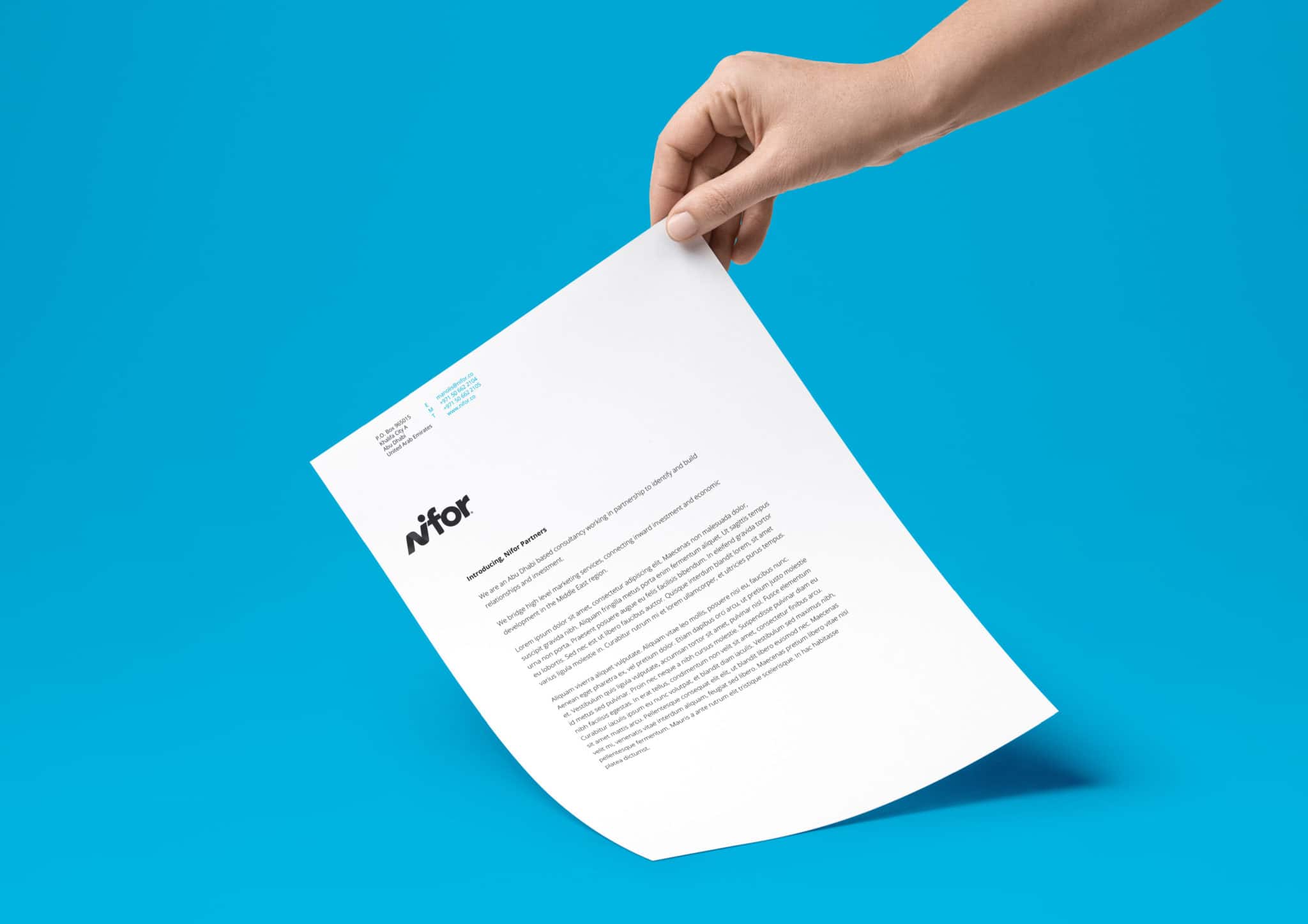
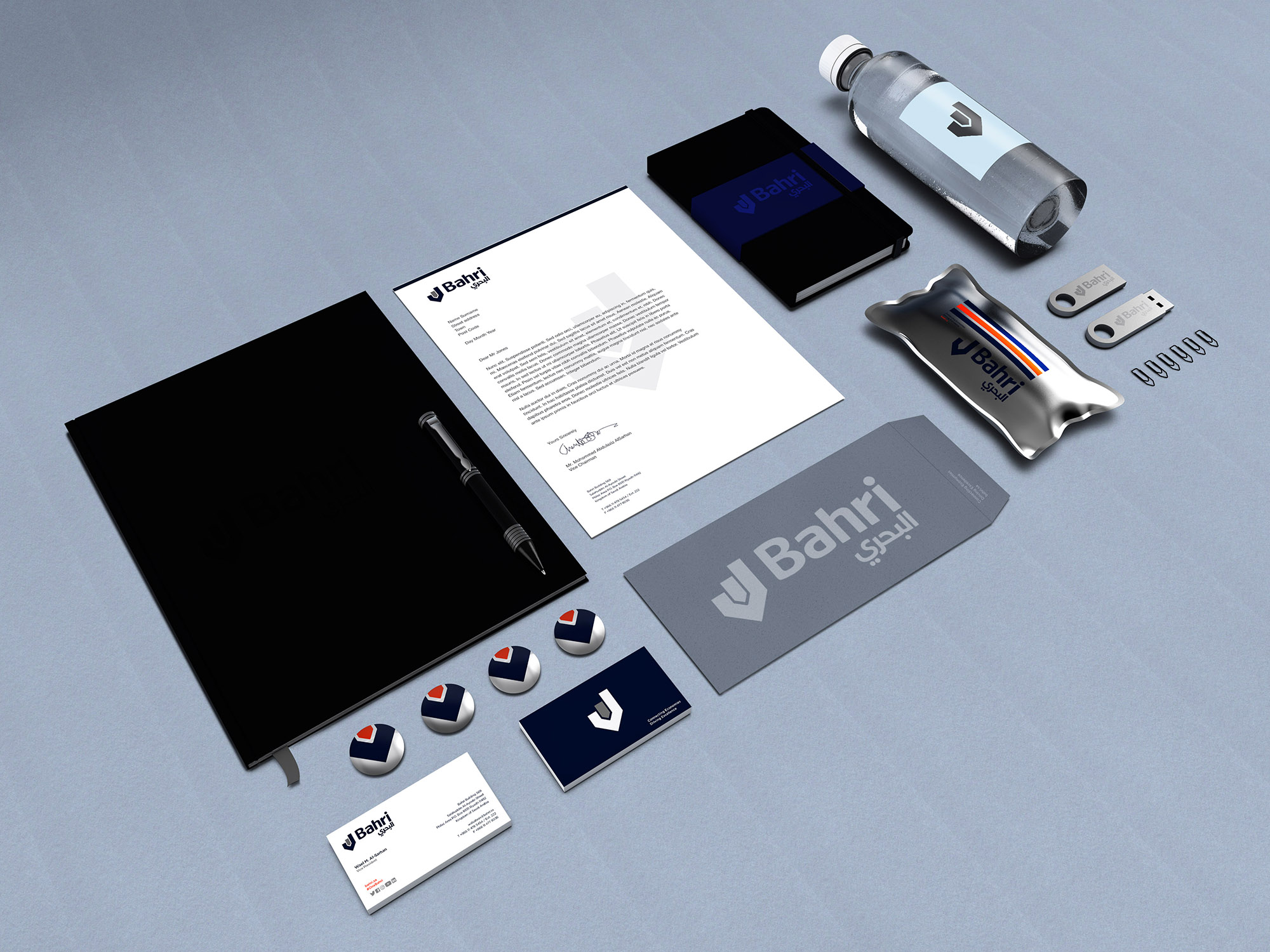
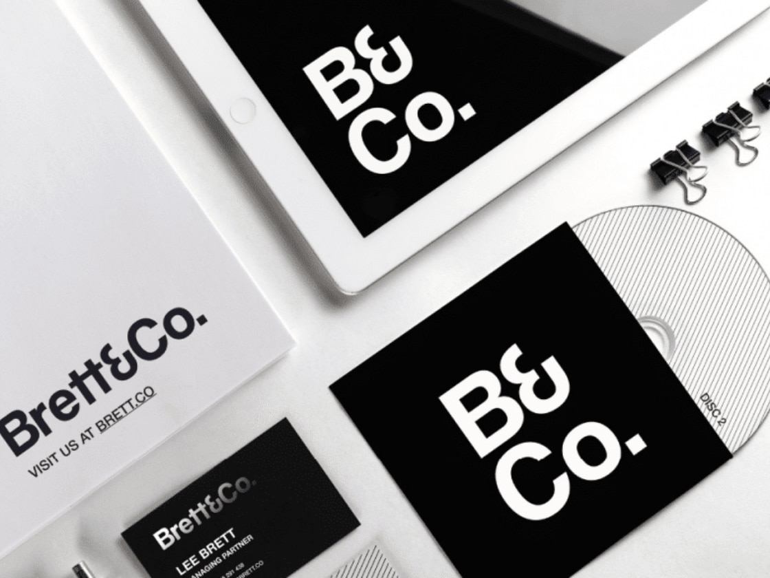
    Overall, the visual identity system includes a broad range of brand assets from new typography, a full logo suite, corporate stationery, infographics, icons and photography to marketing communications – including investment reports and digital newsletters. In addition we provided design direction for digital applications such as a new website, presentations and signage, wayfinding and brand environments.

    Response

    The new identity was unveiled to the capital markets investment community on Tuesday September 19, 2017 in Dubai at the Middle East Investor Relations Association (MEIRA) annual conference. Iridium’s bold new identity took a prominent position at the conference, thanks to Iridium’s sponsorship of the event.

    We have continued to support Iridium in the development of the identity since the initial launch, exploring additional elements and refining the design system to ensure its flexible use across different applications.

    More information about Iridium is available from their website: iridium.ae


    About Aeron

    We are Aeron, a London brand design consultancy that specialises in business transformation, brand strategy and design. Our purpose is set on helping ambitious businesses thrive in today’s market place.

    Based on fundamental insights, our London brand design consultancy is expert in helping organisations define their brand purpose; a clear, relevant, ownable and defendable territory – which delivers genuine value to customers.

    With a reputation for linking brand strategy and innovative design with clear financial outcomes, our London branding agency combines intelligent data, imaginative insight with inspiring creativity and transformative digital technology to deliver enduring growth.


  3. Opening Up Your World

    July 5, 2017 by Samuel Panda

    Raising Standards in Aviation

    Context

    As the Kingdom of Saudi Arabia focuses on Saudi Vision 2030 as a means to drive economic development and social advancement, GACA and Saudi Arabian Airports have an instrumental role in achieving the plan’s goals by enhancing the connectivity of the Nation.

    As a result of the directive of Vision 2030, GACA is in the process of refreshing and clarifying its business strategy including the privatisation of its network of airports.

    Ambition

    In line with this, and based on its current corporate brand values, the initial task at hand was to assess, plan and deliver a clear, relevant and differentiated brand and campaign strategy to promote Dammam International Airport.

    The airport has the ambition to be a progressive driver of economic development and symbol of national pride and the rebrand will help enable this by creating clarity, consistency and leadership.

    Action

    We developed an entirely new brand visual and verbal identity system based on the airport’s existing brand values of professional, dependable and forward-looking. Addressing touchpoints across the airport infrastructure we created an identity that aims to feel approachable, dynamic and timeless and allows for the airport identity, KFIA, to sit comfortably within the parent company brand, DACO.

    Results

    The brand film we prepared to herald the launch of the DACO brand was premiered in the Summer of 2017. As the new look is rolled-out we continue to support DACO and KFIA to ensure the identity takes-off and reach new heights.


    About Aeron

    We are Aeron, a London brand design consultancy that specialises in business transformation, brand strategy and design. Our purpose is set on helping ambitious businesses thrive in today’s market place.

    Based on fundamental insights, our London brand design consultancy is expert in helping organisations define their brand purpose; a clear, relevant, ownable and defendable territory – which delivers genuine value to customers.

    With a reputation for linking brand strategy and innovative design with clear financial outcomes, our London branding agency combines intelligent data, imaginative insight with inspiring creativity and transformative digital technology to deliver enduring growth.


  4. An Eye for Branding

    February 15, 2017 by Samuel Panda


    Context

    Nifor are a strategic international marketing consultancy focused on helping ambitious companies realise their growth objectives in Europe and the Middle East.

    Ambition

    Established at the end of 2016, Nifor needed a strong brand identity to support their launch as a consulting partner that bridges high-level marketing services with regional insight to connect investment with commercially rewarding opportunities.

    Action

    Working closely with the Nifor team, we ran a competitive audit to establish their intended positioning in the market. Having assessed the strategic positioning opportunities, we made sure Nifor had a clear offer and proposition, so that we could develop a compelling visual and verbal identity.

    Response

    We developed a striking brand identity, to reinforce Nifor’s eye for marketing detail and providing them with an iconic device and communications system that can be applied across marketing communications and brand assets.


  5. Learning, Naturally

    January 15, 2017 by Samuel Panda

    Context
    Based on a carefully considered combination of modern, innovative approaches to learning, Wigwam offer daily opportunities for children to enjoy child initiated and teacher led activities. All set within beautiful and tranquil open fields, woodland, vegetable plots and activity playground.

    Ambition
    To create a fun, engaging brand identity that encapsulates the independent, free-learning and creative approach to outdoor education for young children.

    Action
    We conducted a competitive audit of leading independent Forest Schools and similar educational organisations and charities. Having identified the strategic positioning we worked with the school’s core values to explore a range of potential identities.

    Response
    We then developed the chosen design into an identity toolkit – including a logo suite, colour palette and fonts – to be applied to the school’s website, communication materials and staff uniforms.


  6. Beyond the Sea

    November 16, 2016 by Samuel Panda

    Bahri case study AERON web 7

    Context

    Formed by a Royal Decree in 1978 as the National Shipping Company of Saudi Arabia, Bahri, has grown from a small shipping firm operating multipurpose vessels to become one of the biggest shipping conglomerates in the world.

    Bahri continues to strive for continuous improvement and expansion of its services in the global logistics industry.

    Ambition

    As the company expanded and added new services to its offer, it became necessary to review the brand architecture, to ensure there was a system in place to accommodate all Bahri international and regional businesses, new brands, acquisitions and endorsements of existing and potentially new products and services.

    Action

    We were tasked with creating a compelling, enhanced Bahri Visual Identity System to fit their business and brand strategies and give fresh life to the identity developed previously for the company’s renaming from the National Shipping Company of Saudi Arabia.

    Result

    We developed a new bi-lingual word mark, an enhanced graphic device and a brand architecture system that could be used in a variety of applications across all Bahri services.

    A comprehensive bi-lingual logo suite was provided along with detailed usage guidelines for the roll-out of the brand.

    After the successful roll-out of the refreshed identity, we have continued to support Bahri through international trademark advice and registration and with strategic consulting on the branding and identity of joint ventures and partnered endeavours.

    Bahri case study AERON web 13
     

    Bahri case study AERON web 6
    Bahri case study AERON web 5


  7. Every Millisecond Counts

    June 16, 2016 by Samuel Panda

    Aeron Case Study - QiO Website Homepage

    Context

    QiO Technologies is a fast-growing software engineering and data science business focussed on industrial optimisation. Since launching in February 2015, QiO has grown rapidly with it’s NAUTILIAN platform more than proving itself as a highly valuable asset for customers.

    The QiO team combine agile software development and data science expertise with extensive ‘Industry 4.0’ knowledge. Collectively and as individuals, the team has been at the forefront of developments in industrial optimisation in recent years at leading major multinational players.

    Ambition

    As a pioneer of Industry 4.0 and leading the drive to realise the potential for the Internet of Things, QiO needed a cutting edge, dynamic identity and set of values that firmly positioned them at the head of the new generation of innovative software solutions providers.

    Action

    After assessing the competitive landscape with a comparator audit, and doing some internal market research we were able to pick out the existing identity’s core strengths and craft a much clearer identity that was unambiguous about the brand’s name and what it stood for. From a launchpad of “liberating engineering talent” we developed the value proposition of “Imaginative; Liberating; Involving” to reaffirm QiO’s commitment to working together to empower everyone in the QiO family to keep reinventing and pushing the boundaries of possibility.

    Result

    We delivered a range of services, including a comparator audit, proposition, tone of voice and refreshed visual identity across all key touch points. The new identity featured a reshaped logo and distinctive patterns and icons tailored specifically for QiO. This was most celebrated in the launch of a new, dynamic website and url – https://qio.io/ – and is also proudly shaping QiO’s technical white papers and presentations.


    Aeron Case Study - QiO brand iconsQiO_Website_Casestudies-113QiO_Website_Casestudies-118Aeron Case Study - QiO White PaperAeron Case Study - QiO Branded StationeryAeron Case Study - QiO branded moleskineAeron Case Study - QiO branded notebookAeron Case Study - QiO logo stamp Aeron Case Study - QiO branded server


    About Aeron

    We are Aeron, a London brand design consultancy that specialises in business transformation, brand strategy and design. Our purpose is set on helping ambitious businesses thrive in today’s market place.

    Based on fundamental insights, our London brand design consultancy is expert in helping organisations define their brand purpose; a clear, relevant, ownable and defendable territory – which delivers genuine value to customers.

    With a reputation for linking brand strategy and innovative design with clear financial outcomes, our London branding agency combines intelligent data, imaginative insight with inspiring creativity and transformative digital technology to deliver enduring growth.


  8. There in black & white

    June 9, 2016 by Samuel Panda

    Aeron Case Study - BrettCo 4

    Context

    Brett & Co was formed to help owners, agencies and brands define better. A creative consultancy, ensuring clients have the right people in the room for ideas, advice and achieving good things.

    Ambition

    A fresh start for Brett & Co required a fresh image and identity.

    Action

    We developed a striking identity that can be rolled across a variety of touch points, as the brand develops.

    Aeron Case Study - BrettCo 7Aeron Case Study - BrettCo 3 Aeron Case Study - BrettCo 5 Aeron Case Study - BrettCo 6

    About Aeron

    We are Aeron, a London brand design consultancy that specialises in business transformation, brand strategy and design. Our purpose is set on helping ambitious businesses thrive in today’s market place.

    Based on fundamental insights, our London brand design consultancy is expert in helping organisations define their brand purpose; a clear, relevant, ownable and defendable territory – which delivers genuine value to customers.

    With a reputation for linking brand strategy and innovative design with clear financial outcomes, our London branding agency combines intelligent data, imaginative insight with inspiring creativity and transformative digital technology to deliver enduring growth.


  9. Starting Fires

    June 1, 2016 by Samuel Panda

    Giving a voice to people in the dark on social 


    Context
    As a competitive sports woman Cathy Wood was a member of the GB diving team and also a medal winner in the Iron Man Triathlon, a sport which she competed in at European and World levels. Both a former GB athlete and Daily Mail Journalist, Cathy came to us looking for a fresh perspective and a re-brand for her social media consultancy.

    Ambition
    With Cathy’s strong passions for sport, communication and empowering young people to have a voice, we wanted to create an engaging, youthful brand that would appeal to young people and athletes alike but which still reflected her significant sporting and journalistic credentials.

    Action
    Through strategic positioning and working closely with Cathy herself, we developed an exciting new corporate identity with a bespoke graphic system for use across both print and digital ecosystems.

    Result
    Having created the ‘Matchstick’ brand for Cathy we have now implemented the new corporate identity on a fully responsive website which can be seen here: www.matchstick.media

    Matchstick Laptops

    CathyWood_identity_pres_210115_JP-2_Page_04

    CathyWood_identity_pres_210115_JP-2_Page_10


    About Aeron

    We are Aeron, a London brand design consultancy that specialises in business transformation, brand strategy and design. Our purpose is set on helping ambitious businesses thrive in today’s market place.

    Based on fundamental insights, our London brand design consultancy is expert in helping organisations define their brand purpose; a clear, relevant, ownable and defendable territory – which delivers genuine value to customers.

    With a reputation for linking brand strategy and innovative design with clear financial outcomes, our London branding agency combines intelligent data, imaginative insight with inspiring creativity and transformative digital technology to deliver enduring growth.


  10. For the more in you

    April 8, 2014 by admin

    Context

    Cycling isn’t just about getting from A-B, neither is it about being better than the rest and winning the next race. It’s about personal achievement, enjoyment and experience of riding just for ridings sake. It’s the constant challenge to yourself to be better, push yourself harder and cycle to places you’ve never been before.

    Ambition

    Eastway wants to be the brand that inspires and motivates our riders to get more out of themselves and their cycling. A bike that lets you ride harder and further, going places you never could before and pushing yourself to be better.

    Action

    We conducted a rigorous comparator audit and developed key insights for the brand which led to brand’s positioning, proposition of “for the more in you” and then brought this to life through a direct and motivational tone of voice, and a differentiated visuals identity system and full communications suite from advertising, POS and digital applications.

    Results

    Having created a new strategic platform and a visual identity, we are now in the implementation stage. https://eastwaybikes.com/ 


    Eastway - moodboard photoshot EASTWAY_Guidelines_0410135  EASTWAY_Guidelines_0410136 EASTWAY_Guidelines_0410137 EASTWAY_Guidelines_0410138 EASTWAY_Guidelines_0410139 eastway_740_cs_4 EASTWAY_Guidelines_04101310 EASTWAY_Guidelines_04101311 EASTWAY_Guidelines_04101319

    About Aeron

    We are Aeron, a London brand design consultancy that specialises in business transformation, brand strategy and design. Our purpose is set on helping ambitious businesses thrive in today’s market place.

    Based on fundamental insights, our London brand design consultancy is expert in helping organisations define their brand purpose; a clear, relevant, ownable and defendable territory – which delivers genuine value to customers.

    With a reputation for linking brand strategy and innovative design with clear financial outcomes, our London branding agency combines intelligent data, imaginative insight with inspiring creativity and transformative digital technology to deliver enduring growth.


© Aeron Branding, 2026. All rights reserved.