
BEN ROBINSON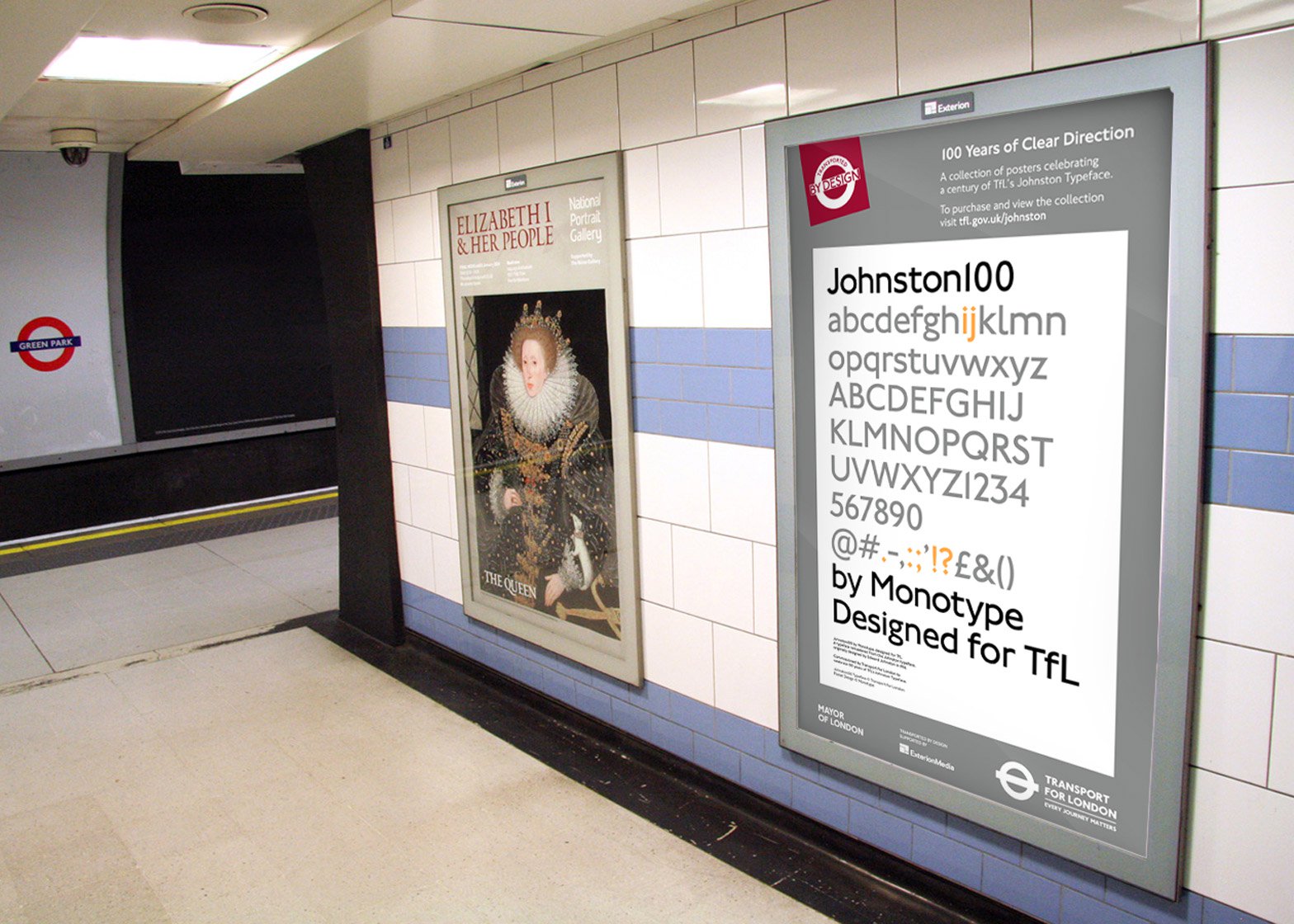
When we think of details that define a city, architecture is often first in line to illustrate location: The Eiffel Tower, Empire State Building, Burj Khalifa, and the Palace of Westminster all immediately conjure up images of their respective home cities, countries and cultures.
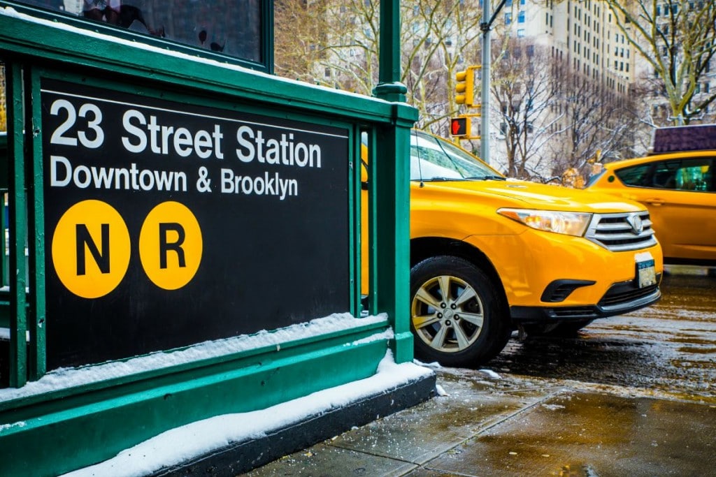
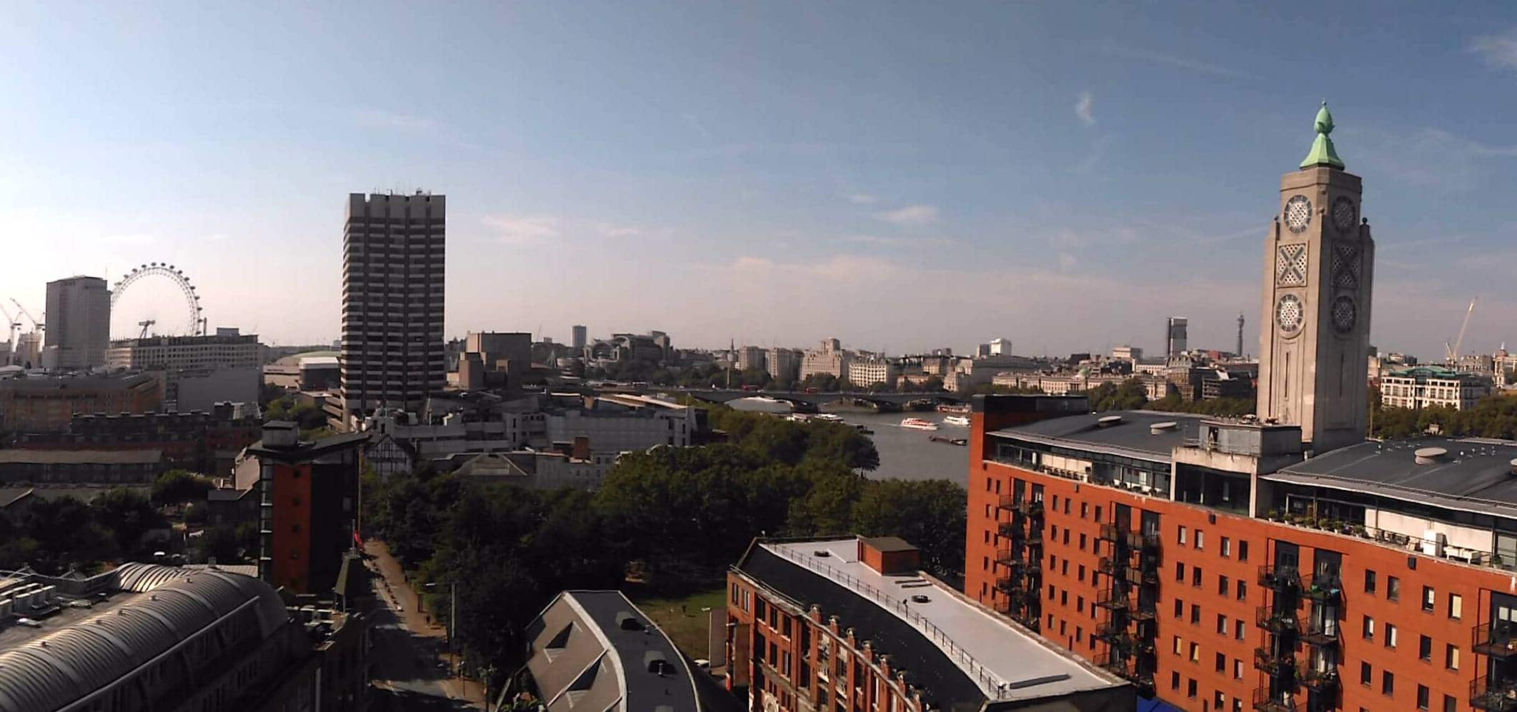
Down from the towers and back at street level and public transport plays it’s part too – the big yellow taxis of NYC versus London’s hefty black cabs and statuesque red double-deckers portray two strikingly different and iconic street scenes.
However, it’s when you go even further down that you can find something that can be taken completely out of context, and used subtly to create something that is still wonderfully evocative.
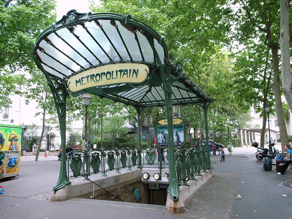
Hector Guimard’s fantastically audacious Art Noveau Metro entrances are unmistakably Parisian, the New York subway features signs that are smart and practical (though fairly boring, like much of America’s urban planning) set in the internationally ubiquitous Helvetica, but enter the London Underground and you are met with a mark almost 100 years old and barely changed, that defines a city like no other piece of graphic design.
Edward Johnston’s take on the Transport for London (TfL) roundel remains one of the most identifiable logos in the world. And at the heart of it, is a new font – that is as iconic as the device it sits in.
It is difficult to fathom now quite how revolutionary Johnston’s clean serif font must have been in the early 20th Century, but BBC4 documentary Two Types gives a good indication. In the programme typeface expert Mark Ovenden takes a look at the origins of the new style and the impact it has had in international design.
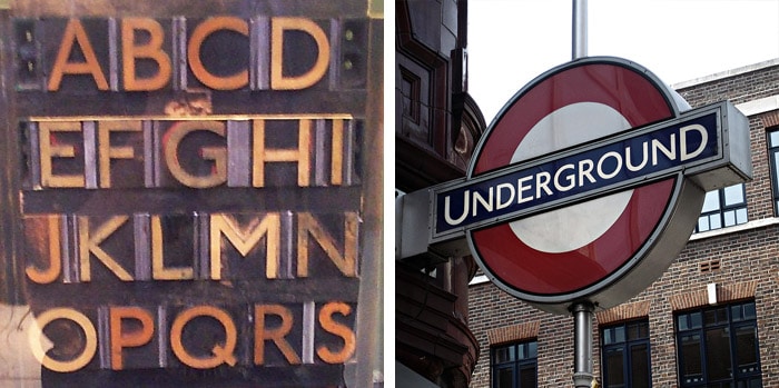
Johnston was commissioned to create a font by Frank Pick, who was in charge trying to forge a unified identity for TfL in an age when fly-posting and random font selection made text communication a nightmare to navigate. Pick pushed for design-led solutions, and his time on the Underground is famous for the ground-breaking graphic design and advertising.
Indeed, the legibility of Johnston’s smart serifs made it a must for transport planning and easy reading of signs. The calligrapher’s apprentice, Eric Gill, then went on to develop his own version – whose stylish beauty is matched only by its ubiquity. The fonts Johnston and Gill revolutionised type design in the 20th Century and their fresh and crisp letterforms mean that Gill is still a first weapon of choice for many designers.
What was interesting to learn about Johnston was that while Gill was released far and wide, TfL held on tightly to Johnston. No printer was allowed to use the fonts for any other client, and the letterforms were never available for licensing.

Pick’s strong grasp of the importance of unified and controlled branding was summed up in Johnston’s design for the Roundel and the accompanying brand guidelines. Indeed, this provided the blueprint not just for using the TFL brand – but for defining consistent brand application for any new identity.
It also meant that the font’s association with the city has endured like no other – even as other fonts, including Gareth Hague’s edgy 2012 Headline for the London Olympics, have come and gone.

Now, it seems other cities are at last getting in on the act. The executive council of Dubai has partnered with Microsoft and Monotype to develop the city’s own typeface. Clean, modern and easily legible, it owes much to Johnston and Gill, although with less of the distinctive character in it’s English letters. Crucially, however, it is also available in Arabic – bringing a very calligraphic language firmly into the 21st century. Whether it will have the durability, or definition, that Johnston has enjoyed, only time will tell.


 Context
