BEN ROBINSON
The launch of any new brand identity always carries a mixture of excitement and trepidation for both those announcing it, and those who will use and wear it day-to-day – in some cases literally.
Reinvigorating established brands will always be met with resistance. New identities for AirBnB and DropBox were both met with criticism, which is always heard louder than praise on the internet. Launch hiccups were handled well, stakeholders brought on board and the designs are now firmly established.

However, football clubs are brands of a different ilk. They engender fierce loyalty, and fans almost always prefer to look backwards than forwards when it comes to asserting their identity.
Branding football clubs, therefore, is a task increasingly fraught with danger – especially in the age of social media. Pre-internet grumbles from the terraces might have made it as far as a fanzine but otherwise fans just had to take what they were given when their treasured team unleashed a fashionable – if rarely stylish – new badge on the latest match-shirt.
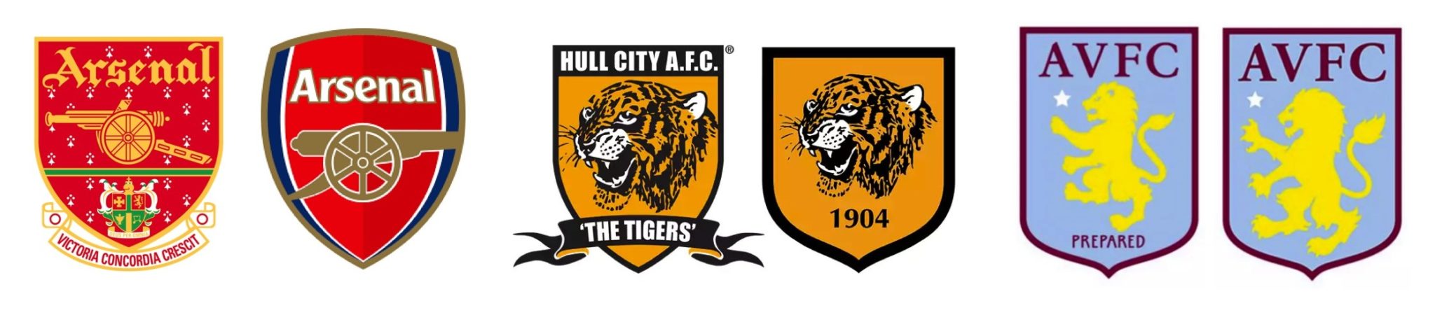
Now, every slightest tweak is subject to the mightiest scrutiny. Arsenal’s 2002 simplified crest looked neat, but switched the direction the Gooners gun was pointing – sacrilege! In 2014 Hull dropped the name of the club from their badge to fan’s ire. Two years later, Aston Villa “spent £80,000 to remove the word ‘prepared’ from their crest” – ‘that could have been a new player!’. They should have asked the fans first. The fans care most about the club. The fans know best.
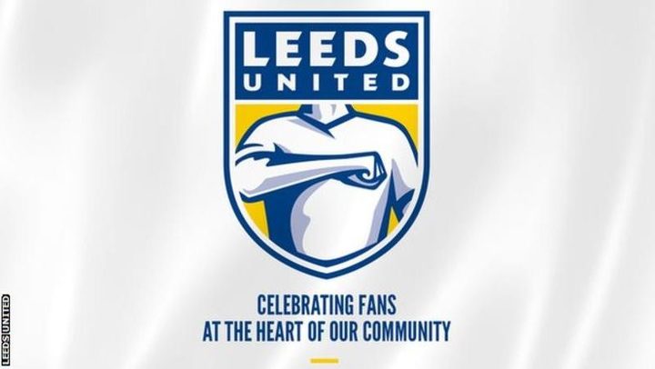
Which brings us to Leeds United. Keen to avoid such pitfalls, the new design to celebrate the club’s centenary was launched after six months of research and consultation with 10,000 stakeholders. Great fanfare and excitement was met with immediate and apparently universal distain from social media – especially the fans.
6 months of research
10,000 people consulted
Ready for the next 100 yearsWatch video ➡️ https://t.co/rIIdL2Yz9F pic.twitter.com/pMrd3zTjCl
— Leeds United (@LUFC) January 24, 2018
For brands with such powerful stakeholder groups, the ability to meet everyone’s needs is like disentangling a Gordian knot. Careful engagement is crucial and goes beyond market research and consultation. It requires careful management after the launch as well.
However, sometimes it is necessary to show leadership and just cut the chord so you can move on. Juventus, took a radical approach to rebrand. Their success on and off the pitch meant they could reveal a far more revolutionary symbol as demonstration for their intention to build a brand – and legacy – that is more than just selling a few extra scarves and shirts. The new design therefore, although challenged by fans, seems to be living up to its iconic ambitions.
Now it seems Hull City have learned from their mistakes and our keeping the fanbase in the loop on the new design.
Leeds are stuck in the bind though. After all, if you are designing a logo for the fans, by the fans – you better make sure the fans actually like it!
Life is a matter of Black and White. #2beJUVENTUS pic.twitter.com/qQgiPf0nKV
— JuventusFC (@juventusfcen) January 16, 2017
April 27, 2024
November 20, 2023
October 20, 2023
September 13, 2023
October 29, 2022
September 23, 2022
July 15, 2022
June 14, 2022
April 13, 2022
March 10, 2022
February 16, 2022
February 7, 2022
