Category: HomePageSlidesTags: Brand Analysis, Brand Communication, Brand Design, Brand Digital Design, Brand Environment, Brand Implementation, Brand Journey, Brand Strategy, Brand Verbal Identity, London, Riyadh | Comments Off on Aeron 2017 Slider 2 flynas
Category: HomePageSlidesComments Off on Aeron 2017 Slider 3 DACO
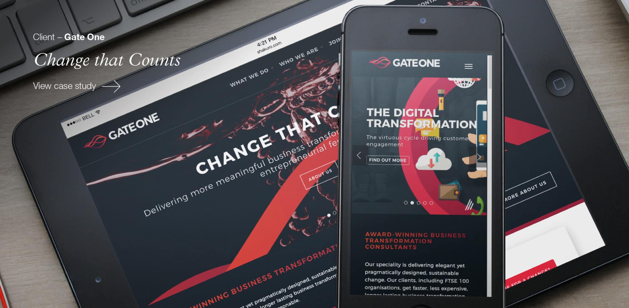
Category: OurWorkSliderTags: Brand Analysis, Brand Communication, Brand Design, Brand Digital Design, Brand Environment, Brand Implementation, Brand Journey, Brand refresh, Brand Strategy, Brand Verbal Identity, London | Comments Off on Aeron 2017 Slider CS1 – Gate One
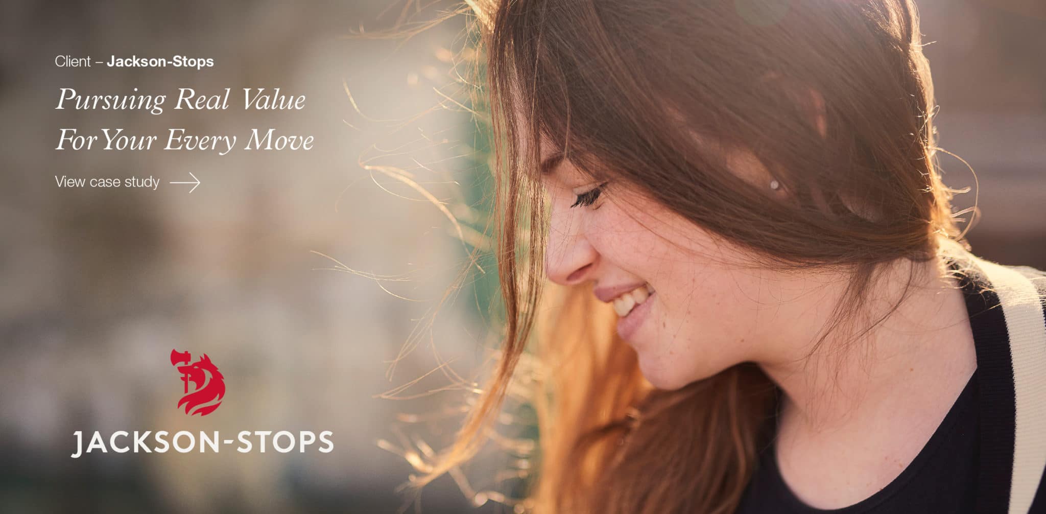
Category: OurWorkSliderTags: Brand Analysis, Brand Communication, Brand Design, Brand Digital Design, Brand Environment, Brand Implementation, Brand Journey, Brand refresh, Brand Strategy, Brand Verbal Identity, London | Comments Off on Aeron 2017 Slider CS2 – Jackson-Stops
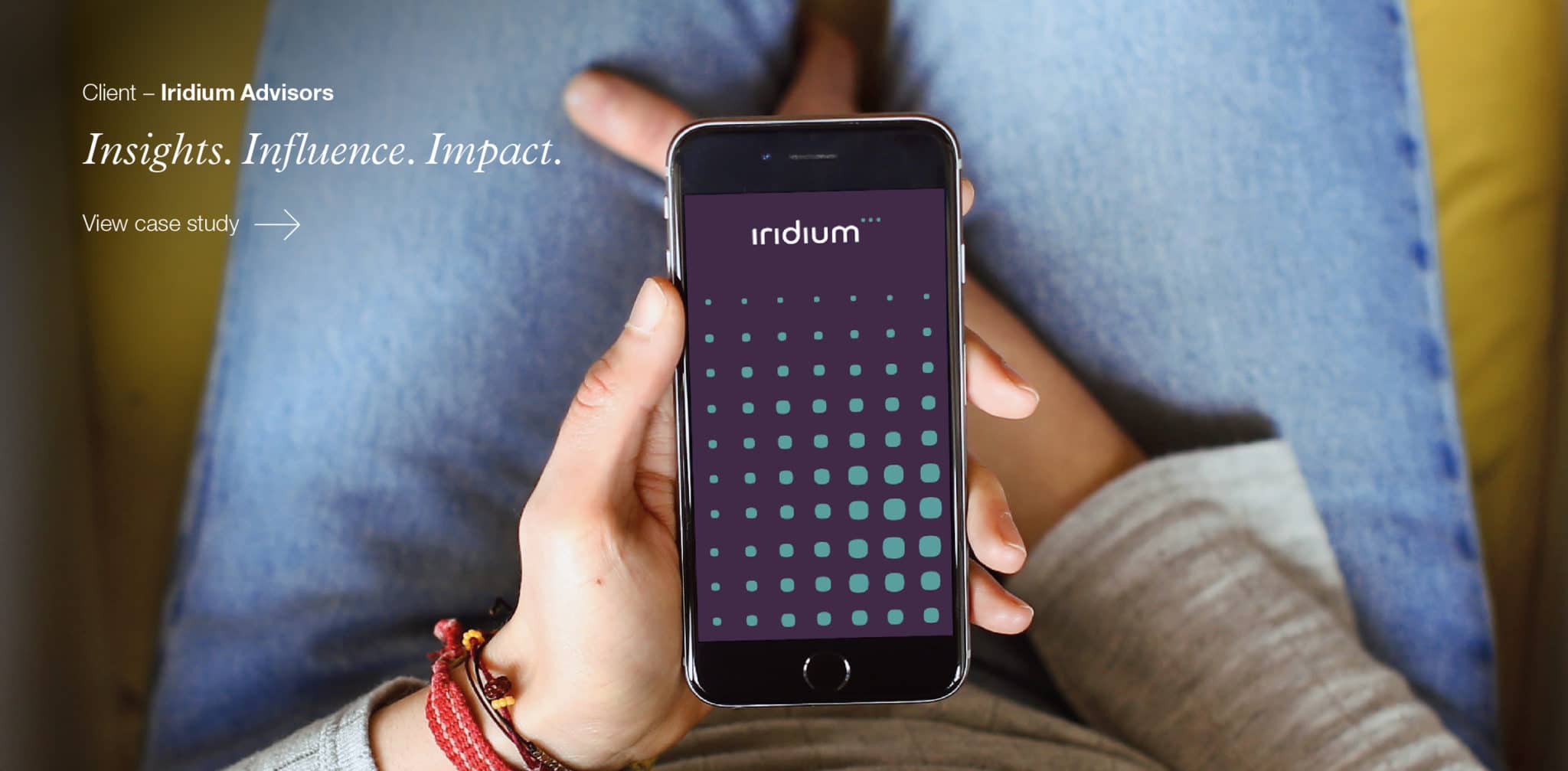
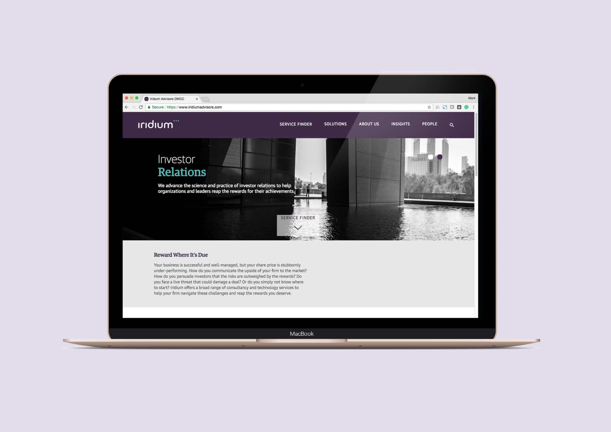
Category: OurWorkSliderTags: Brand Communication, Brand Design, Brand Digital Design, brand environments, Brand refresh, Iridium Advisors, London | Comments Off on Aeron 2017 Slider CS4 – Iridium
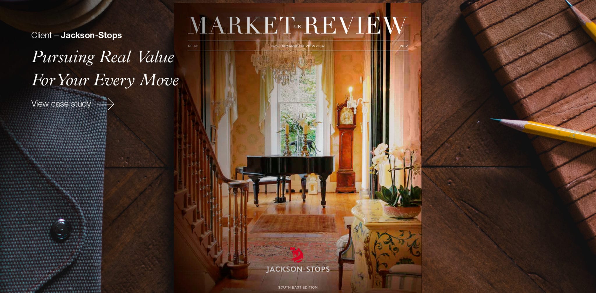
Category: HomePageSlidesTags: Brand Communication, Brand Design, Brand Digital Design, Brand Environment, Brand Implementation, Brand Journey, Brand refresh, Brand Strategy, Brand Verbal Identity, London | Comments Off on Aeron 2017 Slider CS3 – Jackson-Stops
BEN ROBINSON
The latest inspirational advert from the challengers to Nike and Adidas’s sporting crowns has left the starting blocks with a splash.
A new 60 second spot for Under Armour’s #WeWill campaign features Syrian Olympic swimmer Yusra Mardini and a powerful tale of overcoming the most extreme challenges. Yusra competed as part of the Refugee Olympic Team at the 2016 Rio Olympics, having left her family and home in war-torn Syria just a year prior.
The Under Armour ad picks up the inspirational story as part of a wider campaign that also supported the relief efforts of first responders after the devastating Hurricane Harvey. The underlying message is that “sports can inspire, unite, and even change the world.”
https://www.youtube.com/watch?v=1RWVgnrQtZM
An ambitious message, perhaps, but time and again sport proves to be a fantastic way to promote international unity and tell stories of challenging lives overcoming adversity. Events such as the Olympic Games and the FIFA Wold Cup truly do bring billions of people together and allow for inspiring tales to be told.
This year, we are also hearing some tales that until recently were less commonly told in the sporting arena. Finally it seems, there is a genuine shift in focus to bring women in to the picture. Sport England’s This Girl Can campaign has been hugely successful in getting more women more active in the UK since it’s launch in 2015.
However, the most emphatic new voices are coming from the Middle East. Yusra’s story follows on from Nike’s move to launch an athletic hijab after seeing Sarah Attar sprinting for Saudi Arabia at the London 2010 Olympics. Due for release in Spring 2018, the hijab line was announced with an epic ad showing Middle Eastern women playing their sport and looking seriously cool doing it. Finally, sport is no longer just for men.
With changing attitudes in the Middle East, as well as an acknowledged need to get everyone – but especially women – more active in the region, these are timely and well-produced campaigns. Working to encourage activity, they may also work to encourage unity, as more campaigns launch in the build up to the Qatar 2022 World Cup will finally give the Middle East some international sporting credentials to get behind and help open up a region that is alien and misunderstood by many – athletically or otherwise.
It seems that maybe sport does have the power to change the world. No longer just for men. No longer just a game.
Category: LondonThinking, ThinkingTags: Adidas, clothing, FIFA World Cup, Middle East, Nike, Olympic Games, sports, sports apparel, Under Armour | Comments Off on Sport is no longer just a man’s game
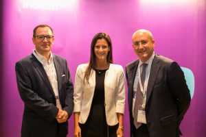
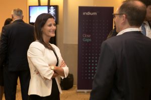
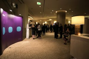
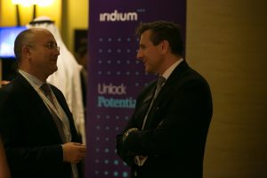
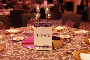
Congratulations to Iridium, on the launch of their new identity at the Middle East Investor Relations Association (MEIRA) Annual Conference 2017, at The Address Mall, Dubai.
As a primary sponsor, Iridium’s new identity took a prominent place at the conference, providing a distinctive backdrop for the important industry event. We were pleased to be able to support Iridium with the unveiling of the new identity, developed by Aeron, by providing designs for the nomadic stand, roll-up banners and additional materials.

Category: LondonThinking, ThinkingComments Off on Iridium Advisors Launch New Identity at MEIRA 2017
Context
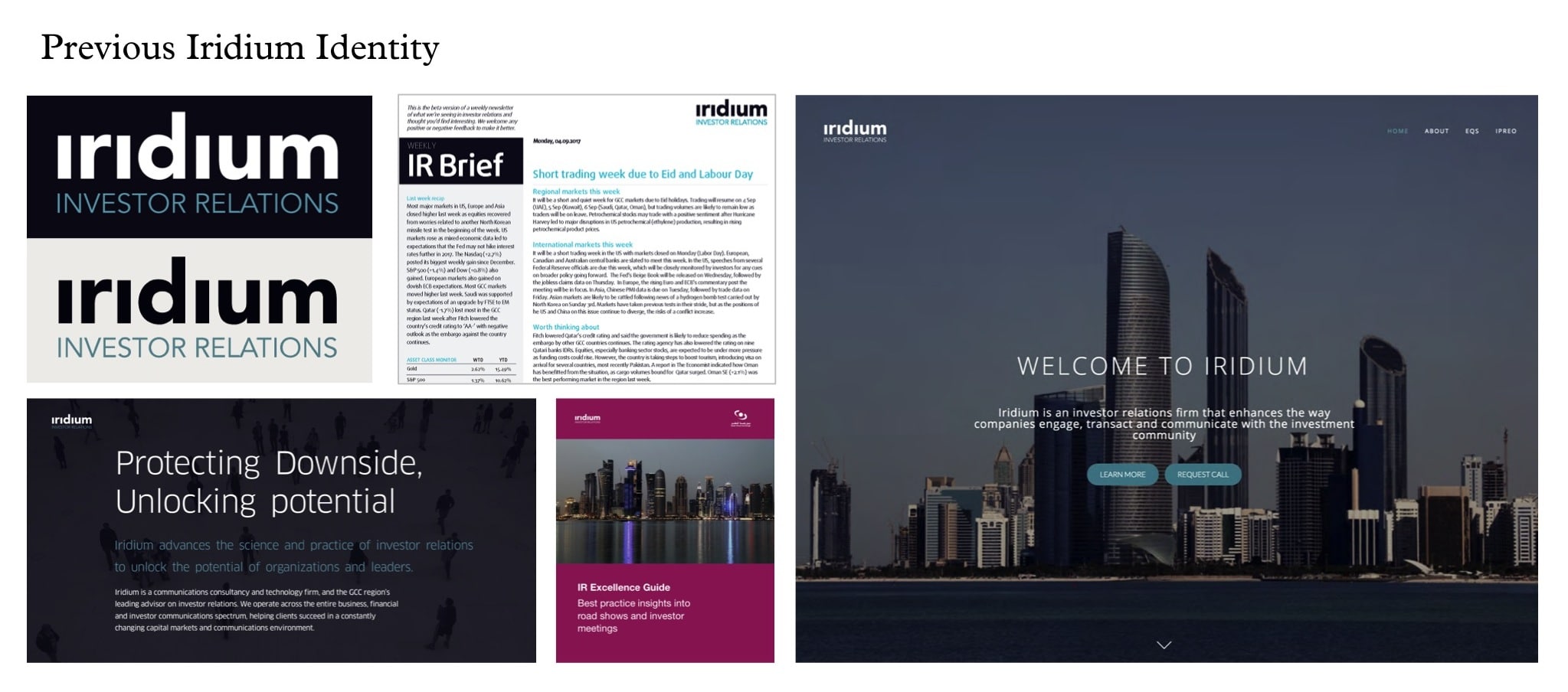
Iridium was founded in 2015 as the Middle East’s first pure investor relations consultancy and technology firm. In a short time, Iridium established itself as the region’s leading investor relations advisor.
Iridium’s business model is underpinned by the growing interest of international investors in MENA equities, greater regulation of investor relations by GCC governments and continuous advances in global best practices.
Ambition
Working across strategy, finance, investor relations and communications, Iridium brings rigour, coherence and consistency to the heart of senior management, and enables them to project confidence and clarity to the global investment community.
Our task was to create a compelling corporate visual identity system, which would encapsulate Iridium’s ambition, proposition and guiding principles.
Action
We worked closely with Iridium to get a thorough understanding of its position in the market, its appeal to clients and the key differentiators the brand should stand for.
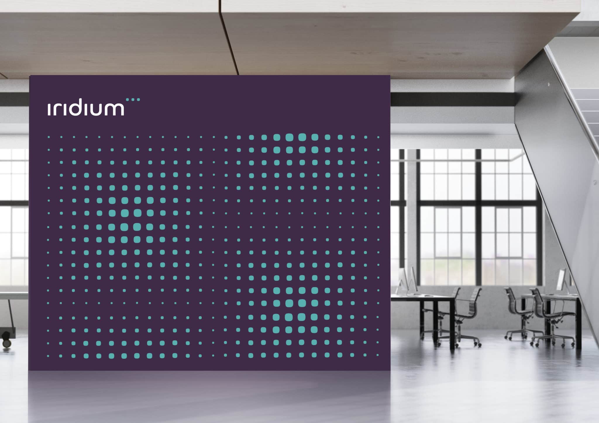
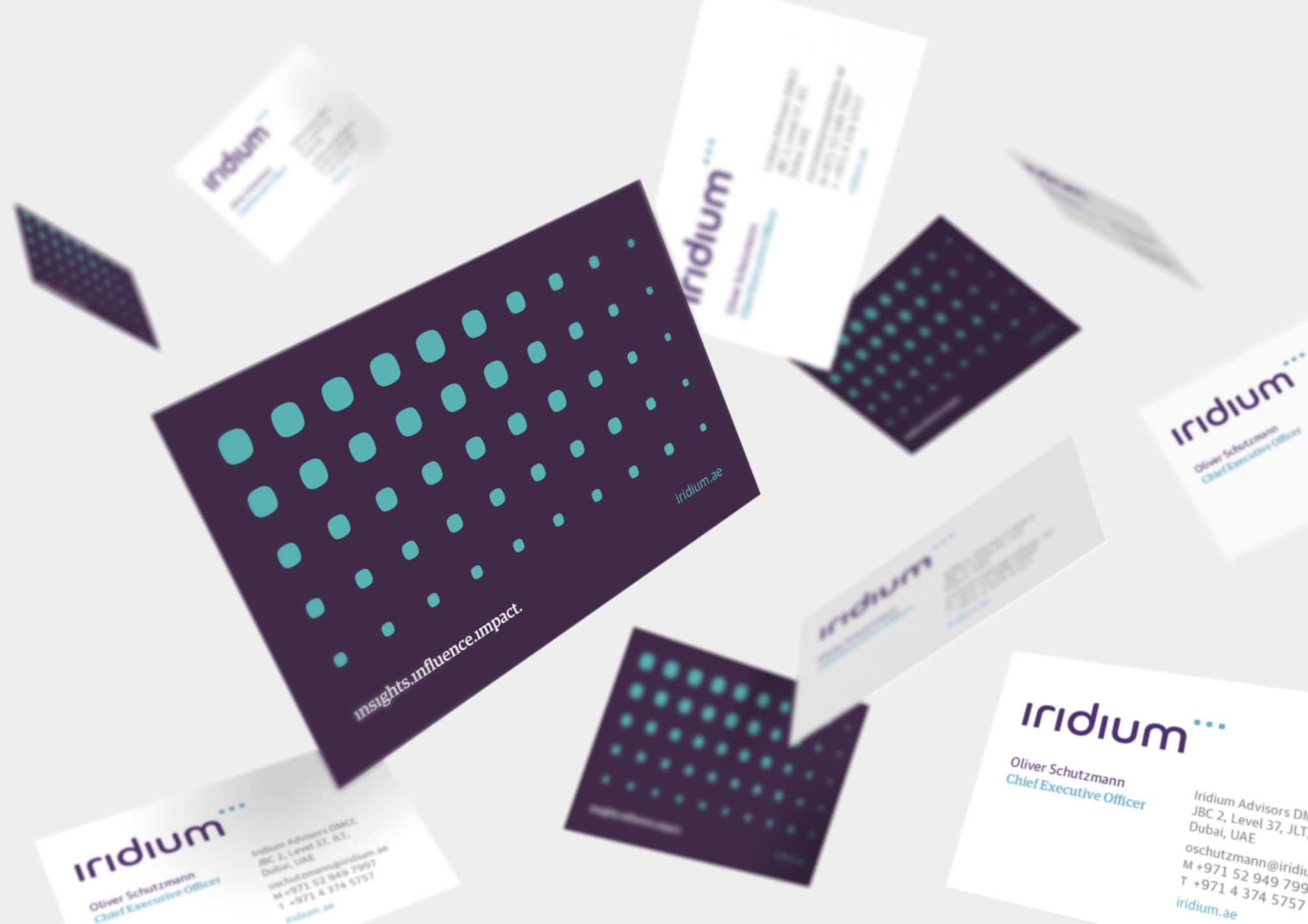
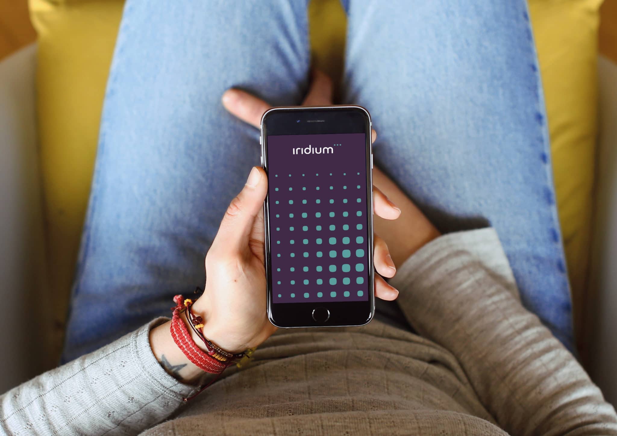
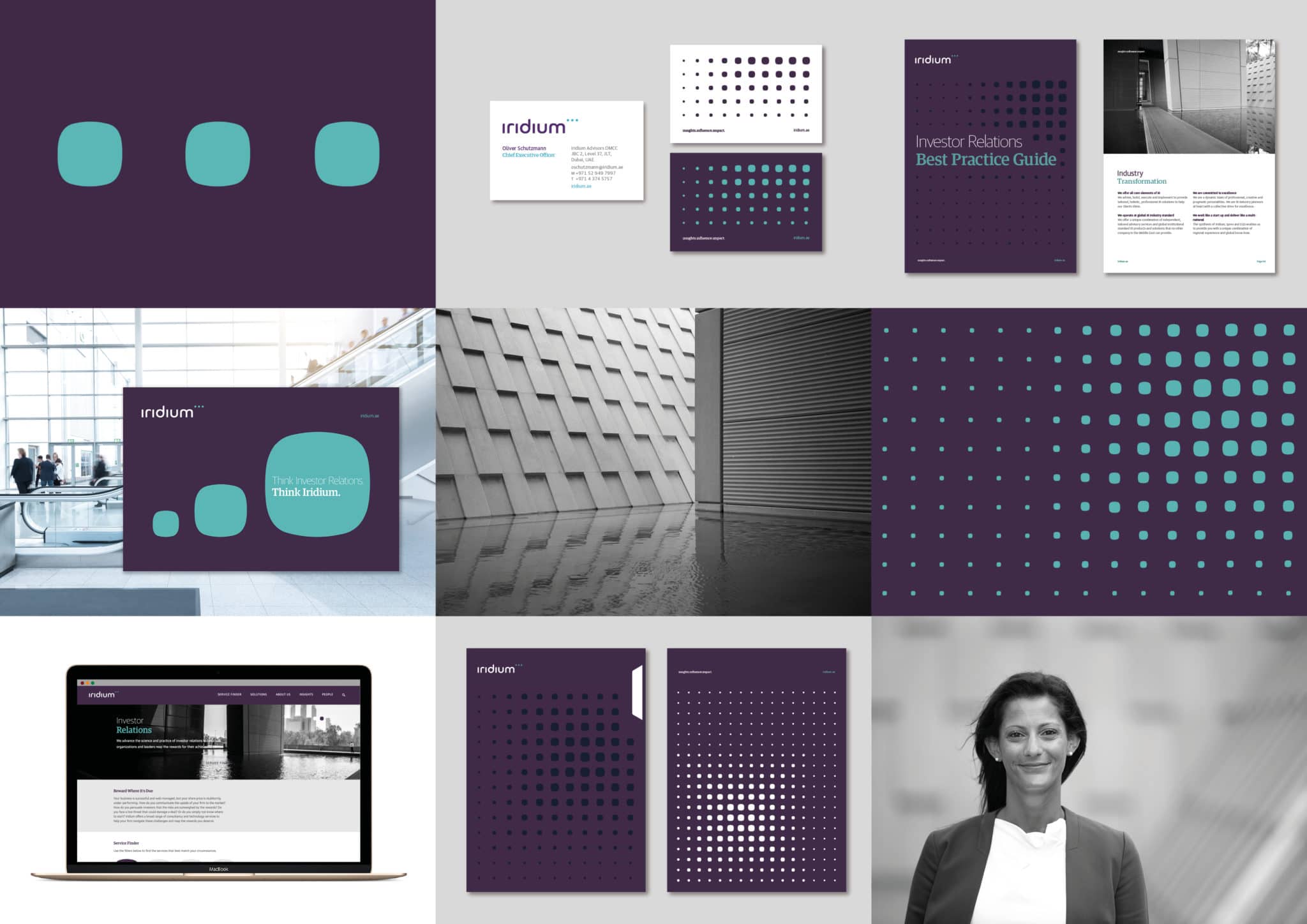
We created a distinctive wordmark and symbol for Iridium that reflects the belief that high quality investor relations are the hallmark of successful capital markets.
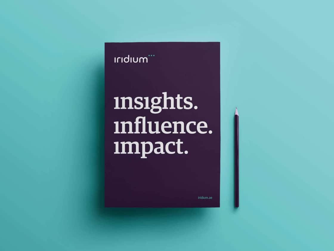
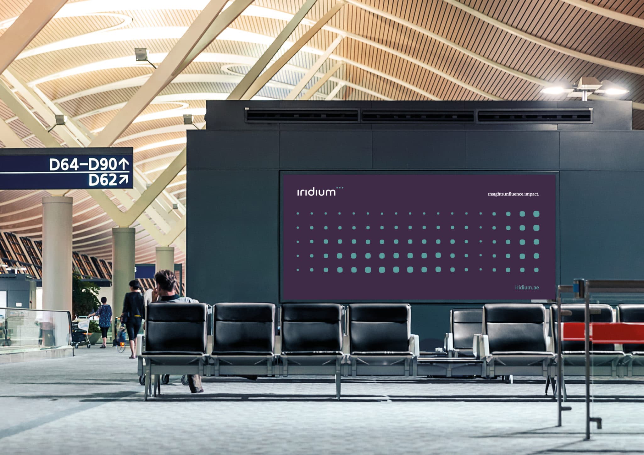
The wordmark and symbol are strongly interlinked, to represent the synergy Iridium builds with its clients, and are formed by the dots from each letter ‘i’ escaping the confines of the type to create an ellipsis symbol that hints at Iridium’s ability to identify and close gaps, and unlock new opportunities. The three dots also encapsulate Iridium’s three key principles: insights.influence.impact.
The symbol then opened up a comprehensive visual identity system that enabled distinctive and dynamic brand communication. This system was rooted in a grid matrix, built from the dots of the ellipsis, and highlighting the attention to detail and fine technical analysis that Iridium prides itself on.
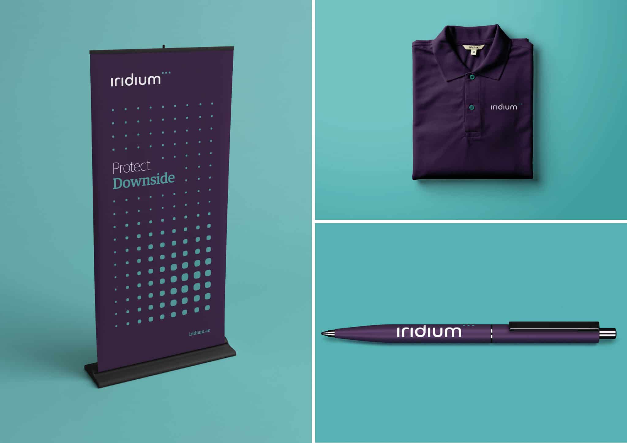
Overall, the visual identity system includes a broad range of brand assets from new typography, a full logo suite, corporate stationery, infographics, icons and photography to marketing communications – including investment reports and digital newsletters. In addition we provided design direction for digital applications such as a new website, presentations and signage, wayfinding and brand environments.
Response
The new identity was unveiled to the capital markets investment community on Tuesday September 19, 2017 in Dubai at the Middle East Investor Relations Association (MEIRA) annual conference. Iridium’s bold new identity took a prominent position at the conference, thanks to Iridium’s sponsorship of the event.
We have continued to support Iridium in the development of the identity since the initial launch, exploring additional elements and refining the design system to ensure its flexible use across different applications.
More information about Iridium is available from their website: iridium.ae
About Aeron
We are Aeron, a London brand design consultancy that specialises in business transformation, brand strategy and design. Our purpose is set on helping ambitious businesses thrive in today’s market place.
Based on fundamental insights, our London brand design consultancy is expert in helping organisations define their brand purpose; a clear, relevant, ownable and defendable territory – which delivers genuine value to customers.
With a reputation for linking brand strategy and innovative design with clear financial outcomes, our London branding agency combines intelligent data, imaginative insight with inspiring creativity and transformative digital technology to deliver enduring growth.
Category: CaseStudy, CaseStudyLondonTags: Brand Corporate Design, Brand Digital Design, brand environments, brand guidelines, Brand Identity, Brand Portfolio Management, Brand Positioning, Brand refresh | Comments Off on Insights Influence Impact
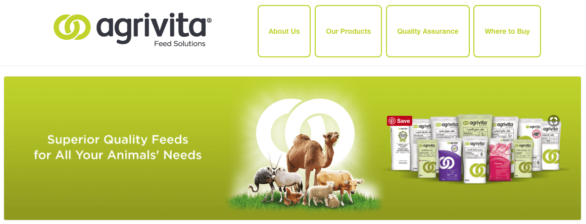
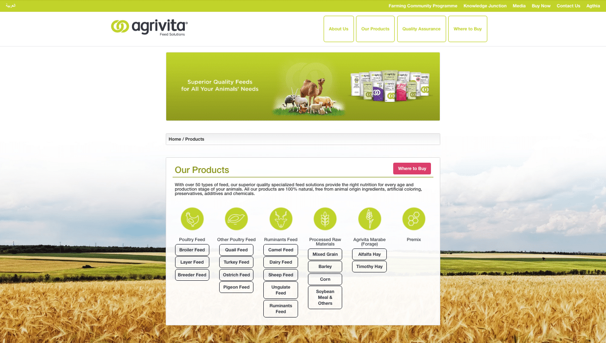
Agrivita, the UAE’s market-leading feed brand, has launched a new website, agrivitafeeds.com, featuring the identity, icons and packaging designed by the team at Aeron.
The Agrivita brand was launched in 2014 after parent company Grand Mills separated it’s consumer and business flour operations from its business animal feed services. Our team created the new brand in close partnership with Grand Mills and Agthia, developing a bold new name and identity for the brand.
Since then Agrivita has been a prominent brand in the UAE, sponsoring the Nahab camel race in Al Wathba in July 2017, which is one of the toughest competitions for Arabian camels.
According to Agthia, the new website, launched in August 2017, aims to “provide a one stop reference guide for Animal Nutrition & Farming generic to anywhere in the world and specific to the Gulf; farming under the extreme climate.”
You can read more about our work with Agrivita, and view some of our designs, on our case study page below:
Category: ThinkingComments Off on New website for Agrivita