IRIDIUM ADVISORS
Investor Relations, Strategic Communications
Brand Refresh, Brand Guidelines, Brand Corporate Design, Brand Digital Design, Brand Environments, Brand Portfolio Management, Brand Positioning
IRIDIUM ADVISORS
Context
Iridium was founded in 2015 as the Middle East’s first pure investor relations consultancy and technology firm. In a short time, Iridium established itself as the region’s leading investor relations advisor.
Iridium’s business model is underpinned by the growing interest of international investors in MENA equities, greater regulation of investor relations by GCC governments and continuous advances in global best practices.
Ambition
Working across strategy, finance, investor relations and communications, Iridium brings rigour, coherence and consistency to the heart of senior management, and enables them to project confidence and clarity to the global investment community.
Our task was to create a compelling corporate visual identity system, which would encapsulate Iridium’s ambition, proposition and guiding principles.
Action
We worked closely with Iridium to get a thorough understanding of its position in the market, its appeal to clients and the key differentiators the brand should stand for.
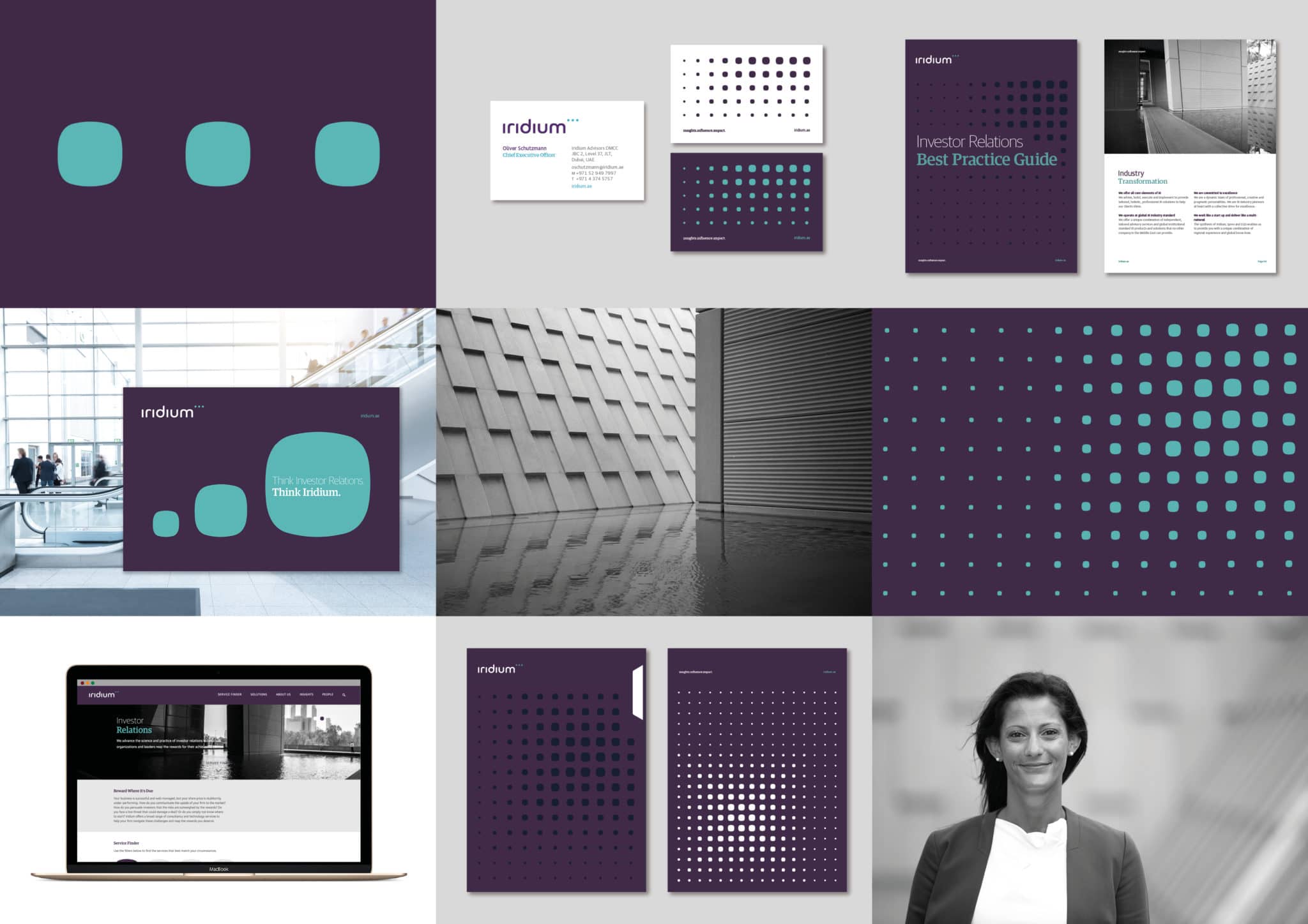
We created a distinctive wordmark and symbol for Iridium that reflects the belief that high quality investor relations are the hallmark of successful capital markets.
The wordmark and symbol are strongly interlinked, to represent the synergy Iridium builds with its clients, and are formed by the dots from each letter ‘i’ escaping the confines of the type to create an ellipsis symbol that hints at Iridium’s ability to identify and close gaps, and unlock new opportunities. The three dots also encapsulate Iridium’s three key principles: insights.influence.impact.
The symbol then opened up a comprehensive visual identity system that enabled distinctive and dynamic brand communication. This system was rooted in a grid matrix, built from the dots of the ellipsis, and highlighting the attention to detail and fine technical analysis that Iridium prides itself on.
Overall, the visual identity system includes a broad range of brand assets from new typography, a full logo suite, corporate stationery, infographics, icons and photography to marketing communications – including investment reports and digital newsletters. In addition we provided design direction for digital applications such as a new website, presentations and signage, wayfinding and brand environments.

Response
The new identity was unveiled to the capital markets investment community on Tuesday September 19, 2017 in Dubai at the Middle East Investor Relations Association (MEIRA) annual conference. Iridium’s bold new identity took a prominent position at the conference, thanks to Iridium’s sponsorship of the event.
We have continued to support Iridium in the development of the identity since the initial launch, exploring additional elements and refining the design system to ensure its flexible use across different applications.
More information about Iridium is available from their website: iridium.ae
About Aeron
We are Aeron, a London brand design consultancy that specialises in business transformation, brand strategy and design. Our purpose is set on helping ambitious businesses thrive in today’s market place.
Based on fundamental insights, our London brand design consultancy is expert in helping organisations define their brand purpose; a clear, relevant, ownable and defendable territory – which delivers genuine value to customers.
With a reputation for linking brand strategy and innovative design with clear financial outcomes, our London branding agency combines intelligent data, imaginative insight with inspiring creativity and transformative digital technology to deliver enduring growth.