1. Pursuing Real Value For Your Every Move

    April 10, 2018 by Samuel Panda

    Context

    A leading national firm of estate agents with 46 offices across the UK, Jackson-Stops has been growing its reach, advising and supporting on property trading since 1910.

    Ambition

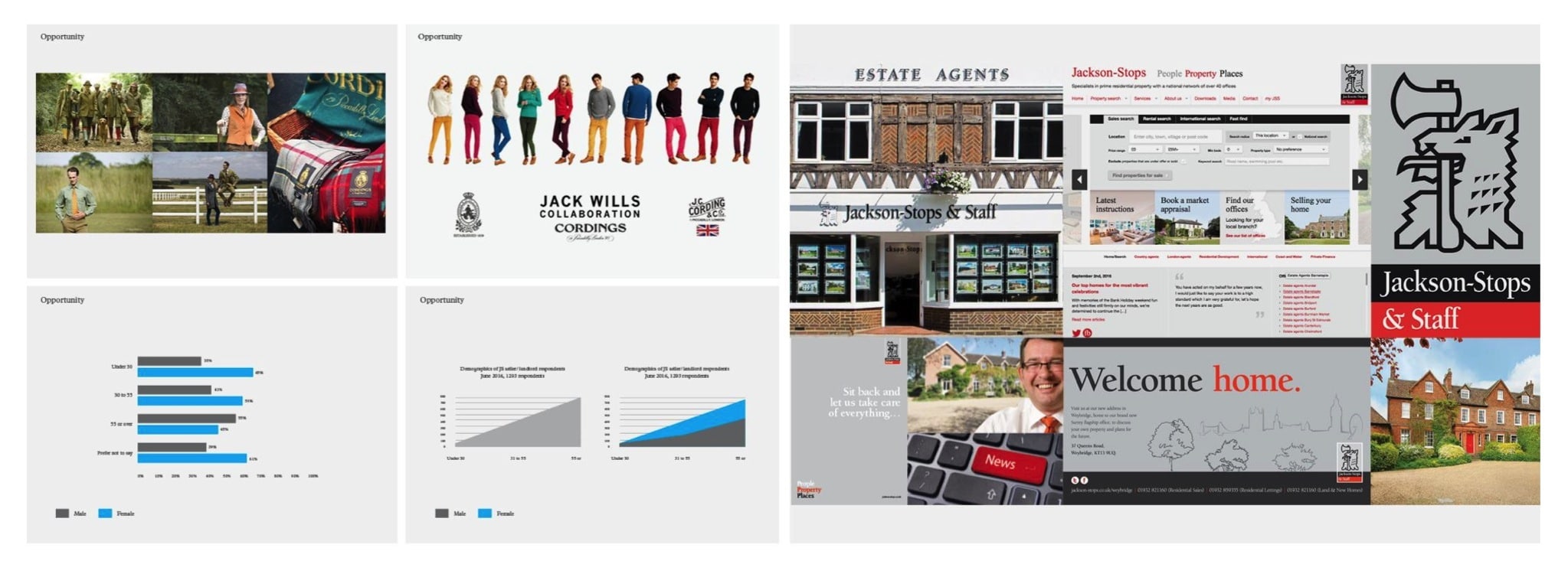
    Originally added alongside the founder’s name to build a family spirit within the company, it had become clear that the “& Staff” was not being understood by customers. Customer survey feedback showed that many clients were already just using ‘Jackson-Stops’ and it was time to make the change formally.

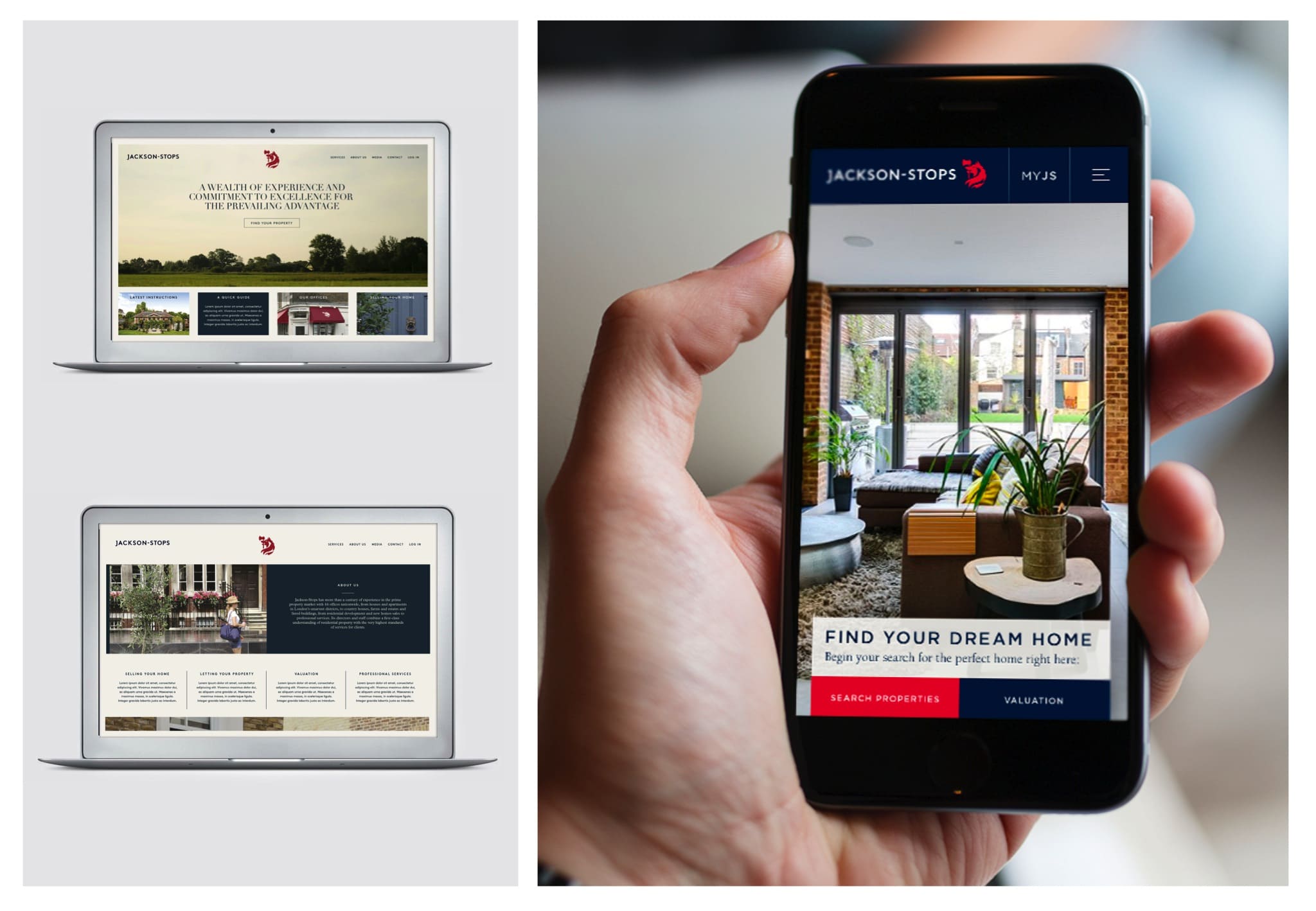
    With this came the potential to refresh the brand as a whole and faced with a rapidly growing digital real estate market and the fresh challenges that brings it was important to have a clean, contemporary brand that could stand out in the digital market place, as well as on the high street.

    Action

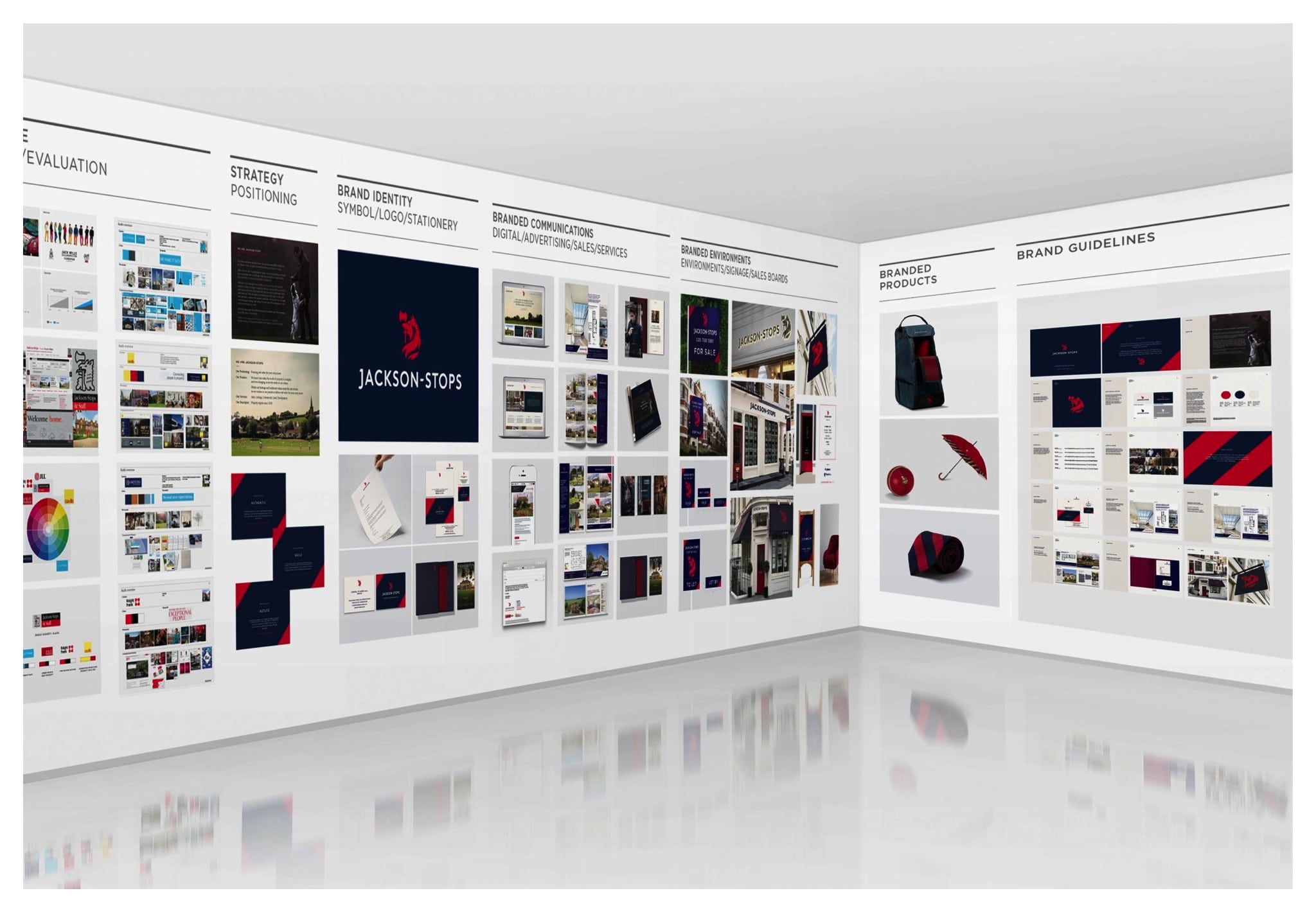
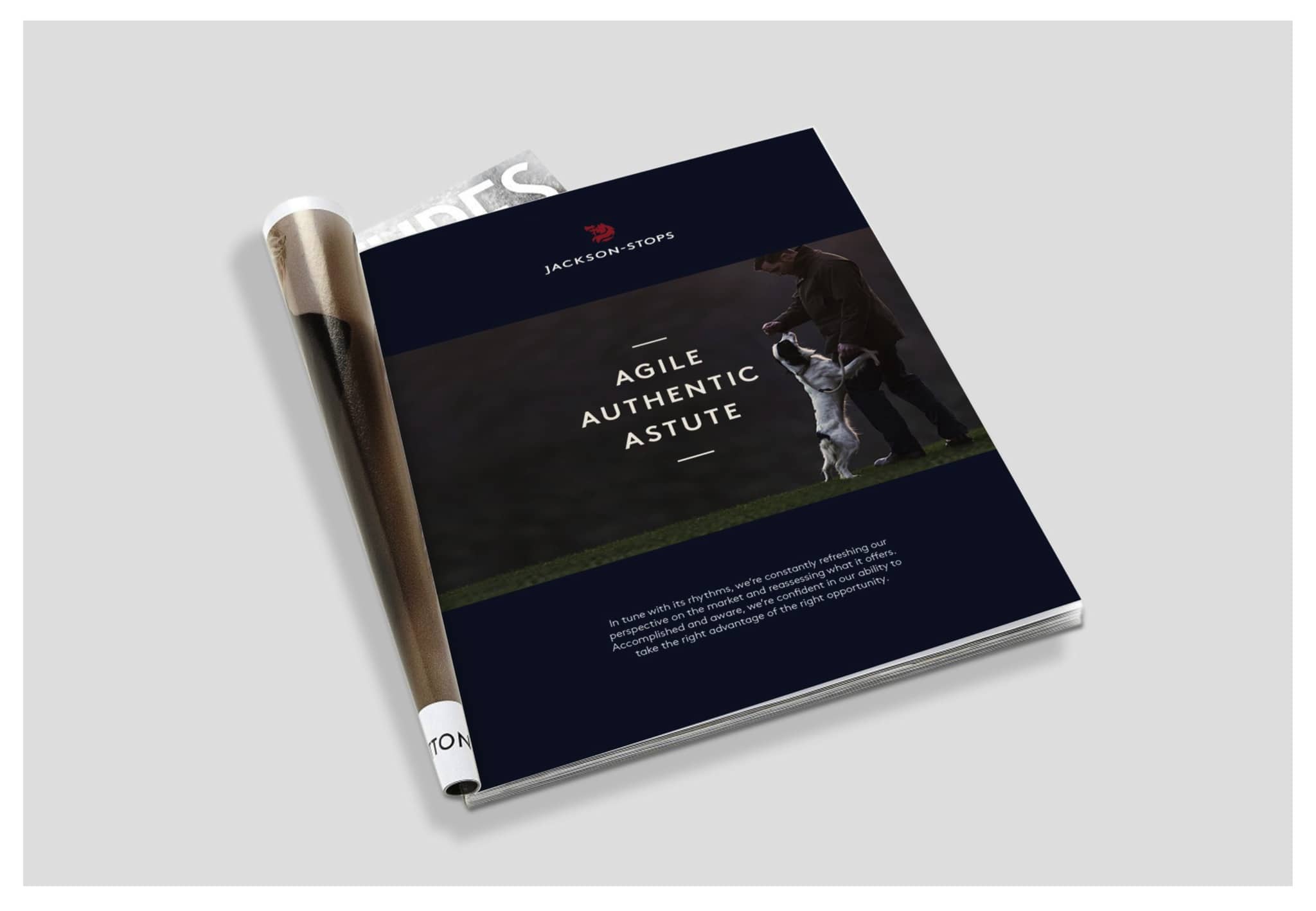
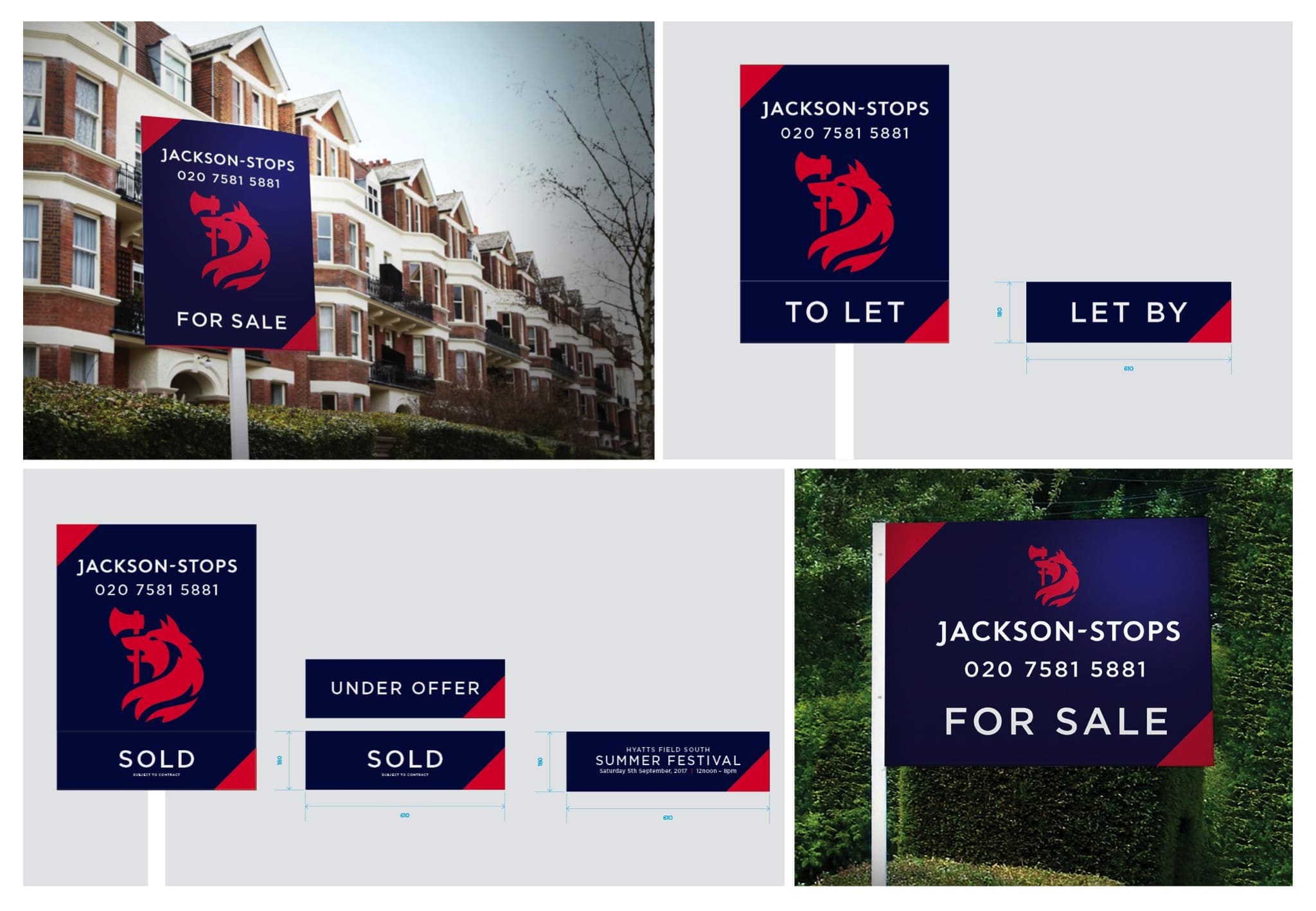
    We conducted a thorough audit of digital and brick-and-mortar estate agents, analysing the market and design trends of competing agencies. This let us understand how online trends and property portals are affecting the traditional agency model. We analysed the brand across hundreds of customer touchpoints – from sales boards and stationery to office fronts and advertising.

    Result

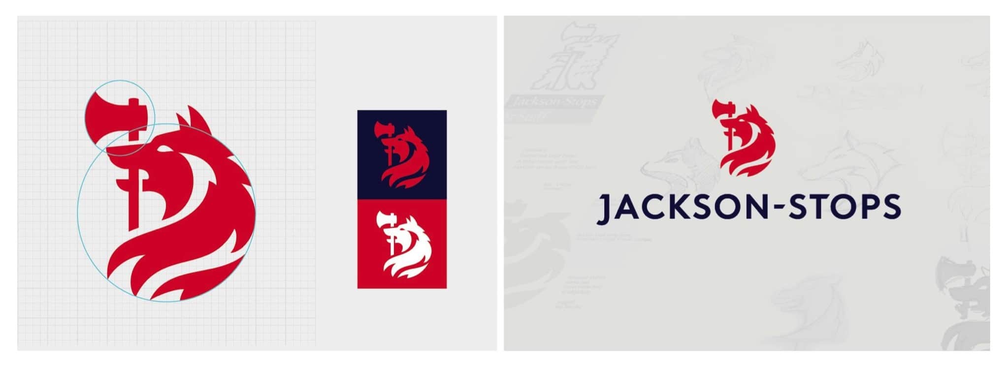
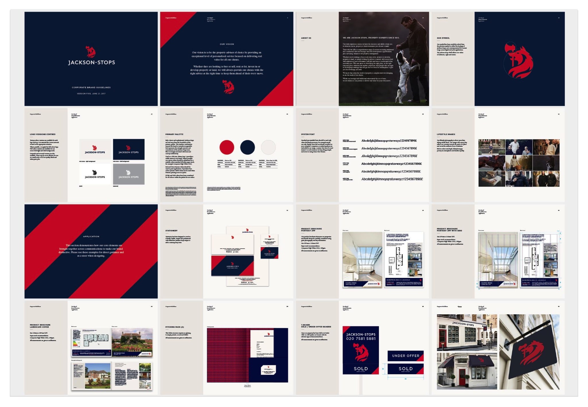
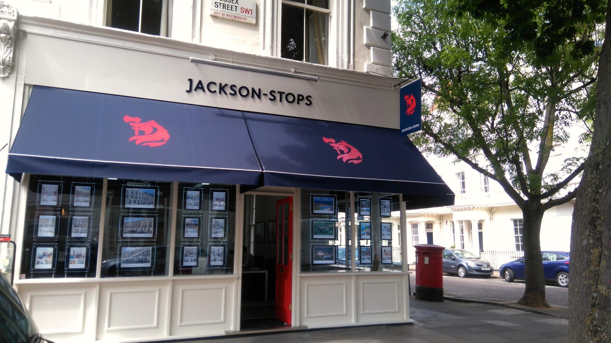
    The iconic Jackson-Stops symbol of a wolf holding an axe in his mouth is not just tied to a company, but originates from the Jackson-Stops family crest. Therefore, it was imperative to treat the mark with utmost respect and care. We carefully crated a mark that not only retains but celebrates this heritage, shaping a new symbol that is as comfortable on a family seal as it is as a digital icon.

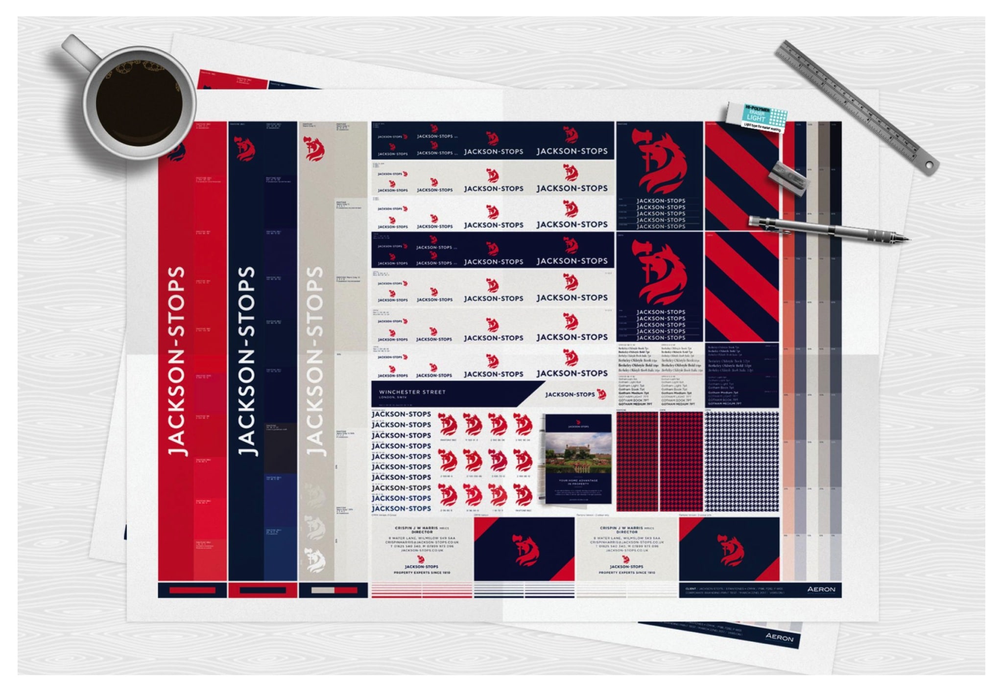
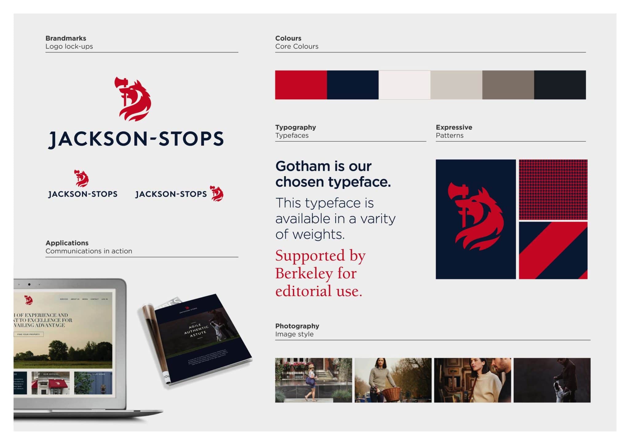
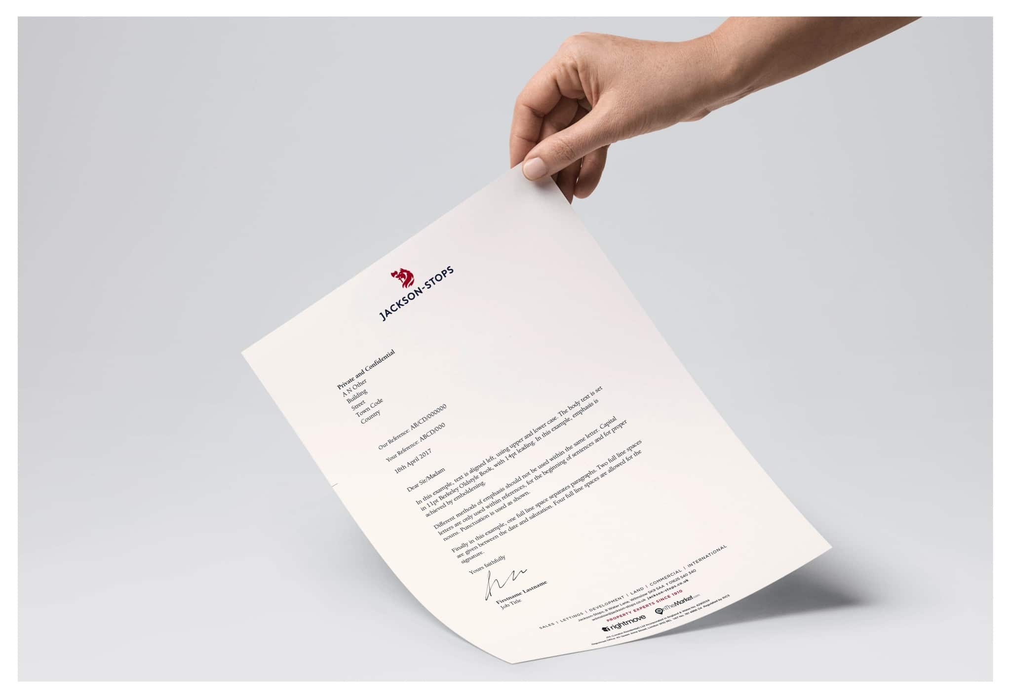
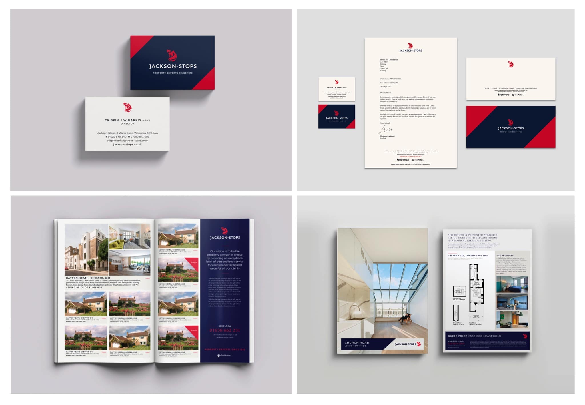
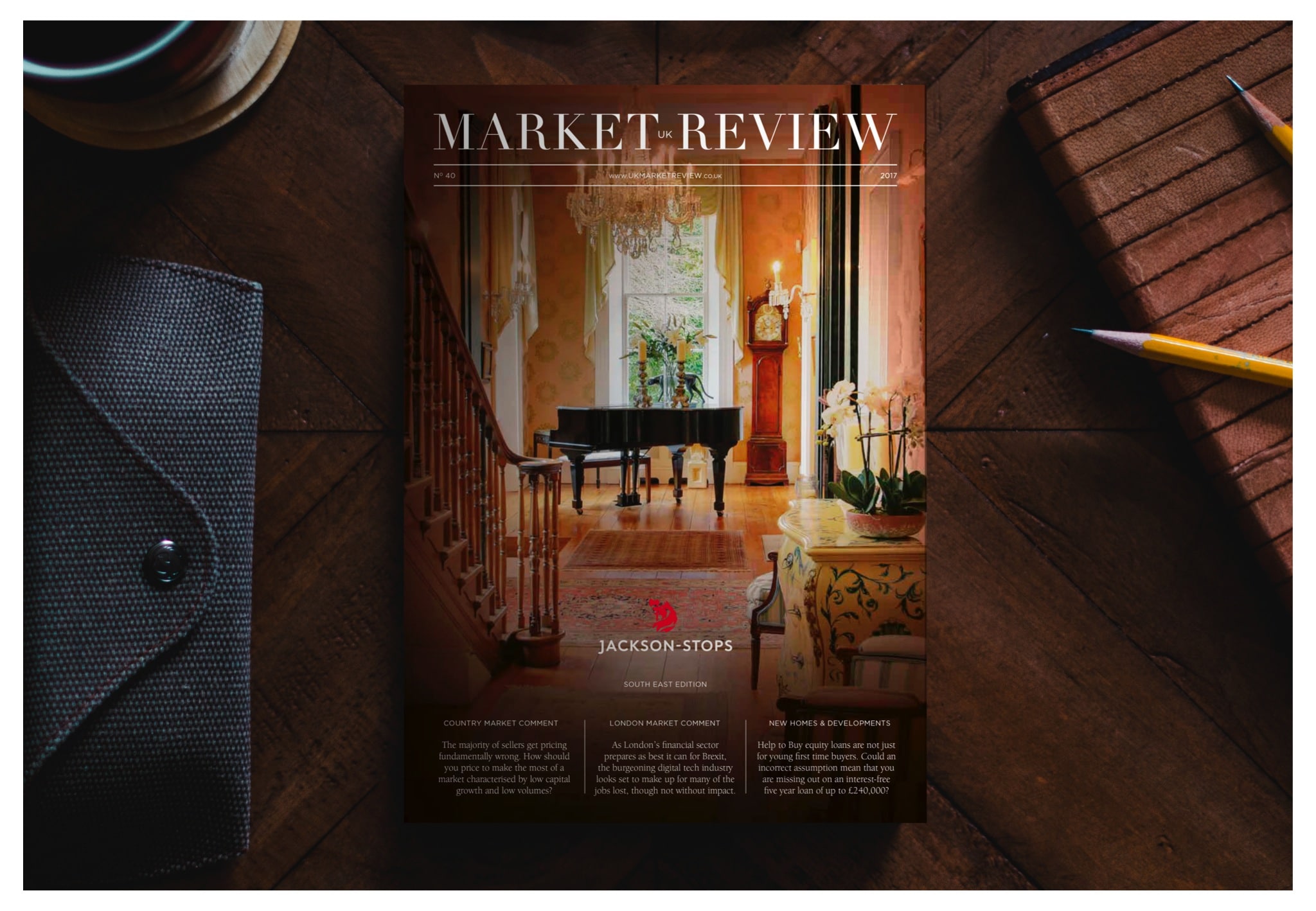
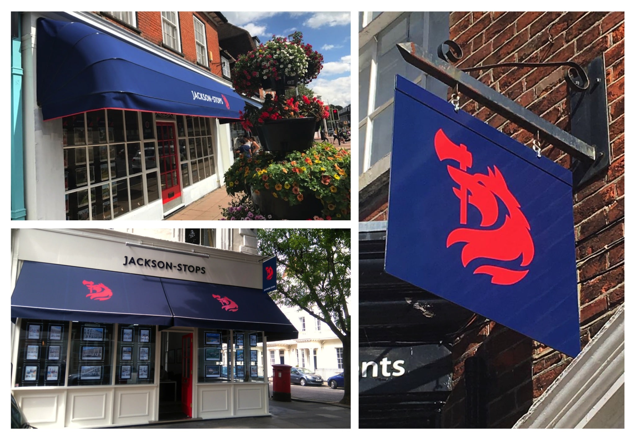
    Alongside a sophisticated colour palette, softening the previous identity’s black to a rich navy blue, we worked closely with Jackson-Stops to develop the identity across the wide range of applications across the customer journey. After conducting detailed print and paint colour testing, we developed a thorough set of corporate and implementation guidelines across stationery, advertising and environments.

    The new identity was launched in September 2017 and we continue to support and advise Jackson-Stops, including in the development of a bold new website.

    The news from straight from the Wolf’s mouth

    About Aeron

    We are Aeron, a London brand design consultancy that specialises in business transformation, brand strategy and design. Our purpose is set on helping ambitious businesses thrive in today’s market place.

    Based on fundamental insights, our London brand design consultancy is expert in helping organisations define their brand purpose; a clear, relevant, ownable and defendable territory – which delivers genuine value to customers.

    With a reputation for linking brand strategy and innovative design with clear financial outcomes, our London branding agency combines intelligent data, imaginative insight with inspiring creativity and transformative digital technology to deliver enduring growth.

  2. Branding for the fans

    February 20, 2018 by Samuel Panda

    BEN ROBINSON

    The launch of any new brand identity always carries a mixture of excitement and trepidation for both those announcing it, and those who will use and wear it day-to-day – in some cases literally.

    Reinvigorating established brands will always be met with resistance. New identities for AirBnB and DropBox were both met with criticism, which is always heard louder than praise on the internet. Launch hiccups were handled well, stakeholders brought on board and the designs are now firmly established.

    However, football clubs are brands of a different ilk. They engender fierce loyalty, and fans almost always prefer to look backwards than forwards when it comes to asserting their identity.

    Branding football clubs, therefore, is a task increasingly fraught with danger – especially in the age of social media. Pre-internet grumbles from the terraces might have made it as far as a fanzine but otherwise fans just had to take what they were given when their treasured team unleashed a fashionable – if rarely stylish – new badge on the latest match-shirt.

    Now, every slightest tweak is subject to the mightiest scrutiny. Arsenal’s 2002 simplified crest looked neat, but switched the direction the Gooners gun was pointing – sacrilege! In 2014 Hull dropped the name of the club from their badge to fan’s ire. Two years later, Aston Villa “spent £80,000 to remove the word ‘prepared’ from their crest” – ‘that could have been a new player!’. They should have asked the fans first. The fans care most about the club. The fans know best.

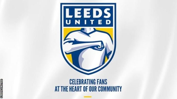
    Which brings us to Leeds United. Keen to avoid such pitfalls, the new design to celebrate the club’s centenary was launched after six months of research and consultation with 10,000 stakeholders. Great fanfare and excitement was met with immediate and apparently universal distain from social media – especially the fans.

    For brands with such powerful stakeholder groups, the ability to meet everyone’s needs is like disentangling a Gordian knot. Careful engagement is crucial and goes beyond market research and consultation. It requires careful management after the launch as well.

    However, sometimes it is necessary to show leadership and just cut the chord so you can move on. Juventus, took a radical approach to rebrand. Their success on and off the pitch meant they could reveal a far more revolutionary symbol as demonstration for their intention to build a brand – and legacy – that is more than just selling a few extra scarves and shirts. The new design therefore, although challenged by fans, seems to be living up to its iconic ambitions.

    Now it seems Hull City have learned from their mistakes and our keeping the fanbase in the loop on the new design.

    Leeds are stuck in the bind though. After all, if you are designing a logo for the fans, by the fans – you better make sure the fans actually like it!


  3. Changing faces of Marketing

    November 1, 2017 by Matthew Millard-Beer

    MATTHEW MILLARD-BEER

    Leading national estate agent, Jackson-Stops, have been making good progress rolling out the new identity designed by Aeron and launched officially last month.

    As well as refreshing the previous identity, the rebrand process also appears to have unveiled even older brand identities, such as this example from the Jackson-Stops Hale office, featuring an advert from 1961.

    The whole style and layout of the poster makes for a wonderful period piece, and is a far cry from the glossy image-led posters, or even interactive digital banners we are more familiar with today.

    The old Jackson-Stops family crest is just visible at the top of the poster, and survived barely touched throughout the next 56 years. Now though, with the ‘& Staff’ being retired from the name, the iconic ‘dog and chopper’ symbol has been brought up to date in a style that nods to the brand’s heritage but with a bold, contemporary execution.

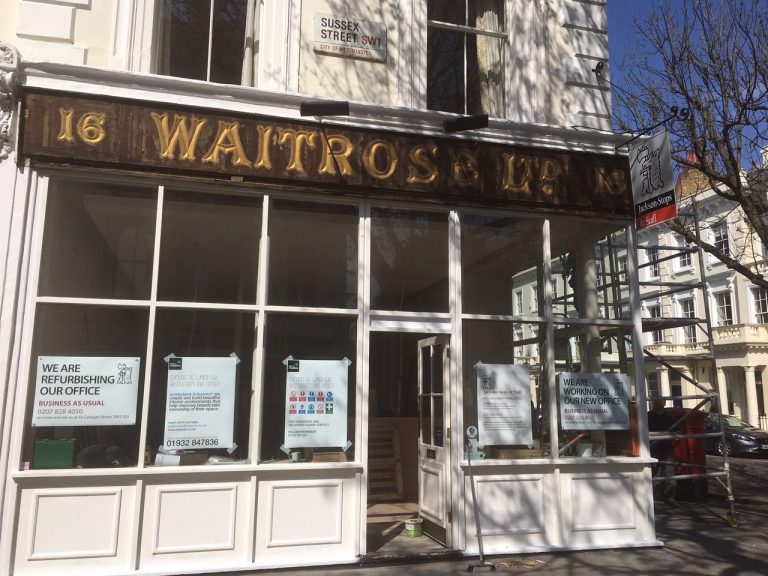
    Earlier in the project, we saw a similar example of a historical evolution from a different brand – when one of the original Waitrose signs was uncovered at Jackson-Stops Pimlico. A stunning example of early 20th Century sign-writing and a far cry from the simple, clean lines of the brand’s current sans serif identity. JS Pimlico is now proudly sporting its new, Aeron-designed livery – while the Waitrose sign has since been acquired by the John Lewis Heritage Centre.

    With over 100 years of property expertise, it’s fascinating to see 100 years of marketing changes as well.


  4. An Eye for Branding

    February 15, 2017 by Samuel Panda


    Context

    Nifor are a strategic international marketing consultancy focused on helping ambitious companies realise their growth objectives in Europe and the Middle East.

    Ambition

    Established at the end of 2016, Nifor needed a strong brand identity to support their launch as a consulting partner that bridges high-level marketing services with regional insight to connect investment with commercially rewarding opportunities.

    Action

    Working closely with the Nifor team, we ran a competitive audit to establish their intended positioning in the market. Having assessed the strategic positioning opportunities, we made sure Nifor had a clear offer and proposition, so that we could develop a compelling visual and verbal identity.

    Response

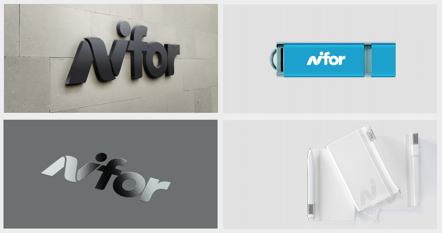
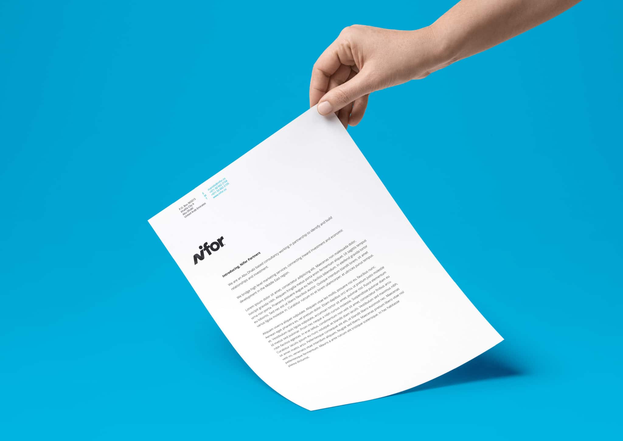
    We developed a striking brand identity, to reinforce Nifor’s eye for marketing detail and providing them with an iconic device and communications system that can be applied across marketing communications and brand assets.


  5. The Future is Retro

    October 27, 2016 by Samuel Panda

    Sometimes backwards is the way forwards.

    When times get hard, there is often comfort to be found looking back to former glories. Certainly that seems to be story behind three of this year’s big rebrands.

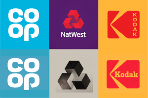
    The Co-opNatwest and Kodak have launched refreshed identities that look to consolidate past heavyweight status after recent challenging periods that were in danger of turning them into deadweights.

    Top Row: 2016 Bottom Row: 1968, 1968, 1971

    Top Row: 2016
    Bottom Row: 1968, 1968, 1971

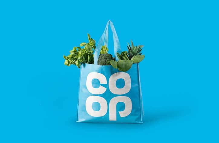
    Co-op in particular are deliberately attempting to “evoke[s] nostalgic memories of local shops and dividend stamps”. Harking back to simpler times, they are asking you to forget recent banking scandals that have tarnished the forgettable mixed-weight, navy blue marque and remember the glory days of the high street – when Co-op and it’s icy-clue clover dominated and it was Brentry, not Brexit, that was looming.

    AERON_Retro_Case_Study_Co-Op bag

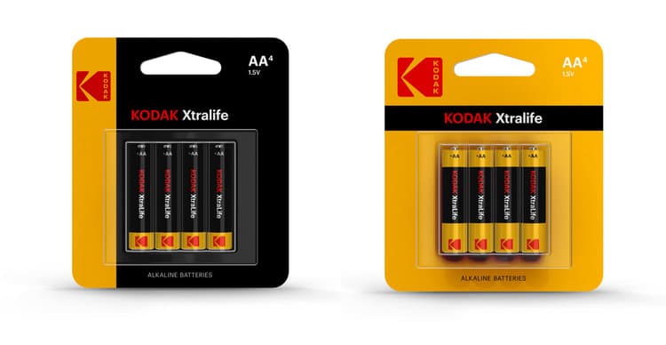
    Likewise Kodak’s golden years, when it dominated the camera market, seem like ancient history. Having been all but forgotten in the era of smart phones and Instagram, reclaiming 1971’s red and yellow K looks like a smart way of reasserting a strong heritage – especially when tied with a launch of retro-inspired products that straddle the digital/analogue line.

    AERON_Retro_Case_Study_Kodak_Batteries

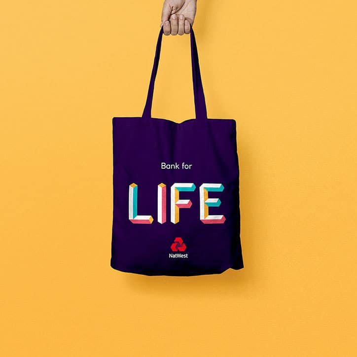
    Natwest’s call-back to 1968 is subtler in some respects – the Natwest logo has never been far removed from its original conception of three interlinking blocks representing three merging banks. An odd move, perhaps, as the three separate banks is no longer particularly relevant to its current story. Nevertheless, it does enable a far more interesting development in its broader storytelling and brand language with colourful, playful blocky illustrations trying to break the mould of the more staid traditional banking imagery.

    AERON_Retro_Case_Study_Natwest_Illustrations

    This does, of course, rely on people having positive memories and associations with the time and its identity. And while there have been dissenting voices, it seems to be doing some good for Co-op. Earlier this week, they were rewarded for Outstanding Achievement at the Retailer Industry Awards, after a major shakeup crowned by rising sales and the successful relaunch.

    Further more, simple, flat logos like Co-op’s and Kodak’s work well in the digital age, the limitations of print in the sixties and seventies giving way to the need for scalable, vector-based artwork that can sit comfortable across digital and physical platforms.

    This could suggest, therefore, that nostalgia is trending once more – not that it ever really goes away.

    Then again, judging from these examples it might just be more cases of “when things get hard, just stop, reset and relaunch from the last ‘save point’.”

    AERON_Retro_Case_Study_Natwest_Illustrations-Personal-Bank-For-Life


© Aeron Branding, 2024. All rights reserved.