MATTHEW MILLARD-BEER
Leading national estate agent, Jackson-Stops, have been making good progress rolling out the new identity designed by Aeron and launched officially last month.
As well as refreshing the previous identity, the rebrand process also appears to have unveiled even older brand identities, such as this example from the Jackson-Stops Hale office, featuring an advert from 1961.
How our marketing has changed! Read about a rare #estaeagent find in a #Hale #Cheshire #property #JacksonStops https://t.co/cN9dYQC71g pic.twitter.com/ayNG9fBEHc
— JS Hale (@JS_Haleoffice) October 31, 2017
The whole style and layout of the poster makes for a wonderful period piece, and is a far cry from the glossy image-led posters, or even interactive digital banners we are more familiar with today.
The old Jackson-Stops family crest is just visible at the top of the poster, and survived barely touched throughout the next 56 years. Now though, with the ‘& Staff’ being retired from the name, the iconic ‘dog and chopper’ symbol has been brought up to date in a style that nods to the brand’s heritage but with a bold, contemporary execution.

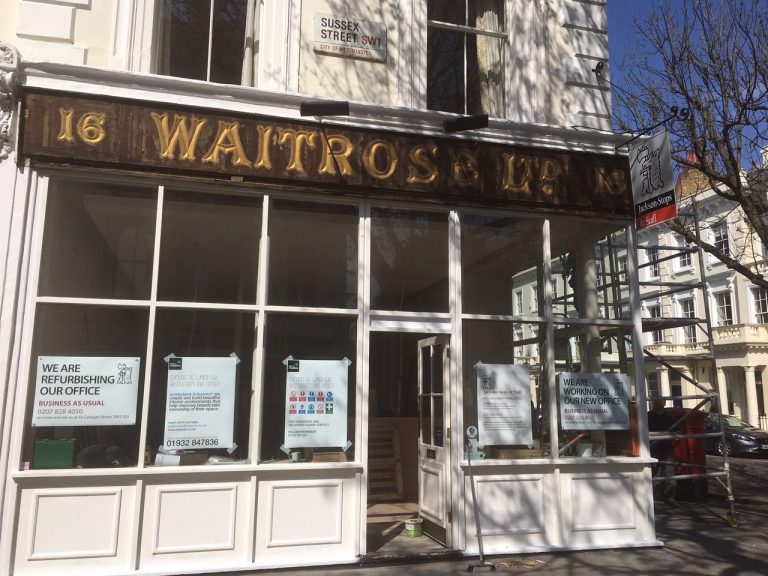
Earlier in the project, we saw a similar example of a historical evolution from a different brand – when one of the original Waitrose signs was uncovered at Jackson-Stops Pimlico. A stunning example of early 20th Century sign-writing and a far cry from the simple, clean lines of the brand’s current sans serif identity. JS Pimlico is now proudly sporting its new, Aeron-designed livery – while the Waitrose sign has since been acquired by the John Lewis Heritage Centre.
With over 100 years of property expertise, it’s fascinating to see 100 years of marketing changes as well.
September 23, 2025
January 28, 2025
December 9, 2024
September 29, 2024
August 9, 2024
July 22, 2024
May 10, 2024
April 27, 2024
November 20, 2023
October 20, 2023
