JACKSON-STOPS
Real Estate, Property
Brand refresh, Brand Guidelines, Brand Corporate Design, Brand Digital Design, Brand Environments, Brand Portfolio Management, Brand Positioning
![]()
JACKSON-STOPS
Context
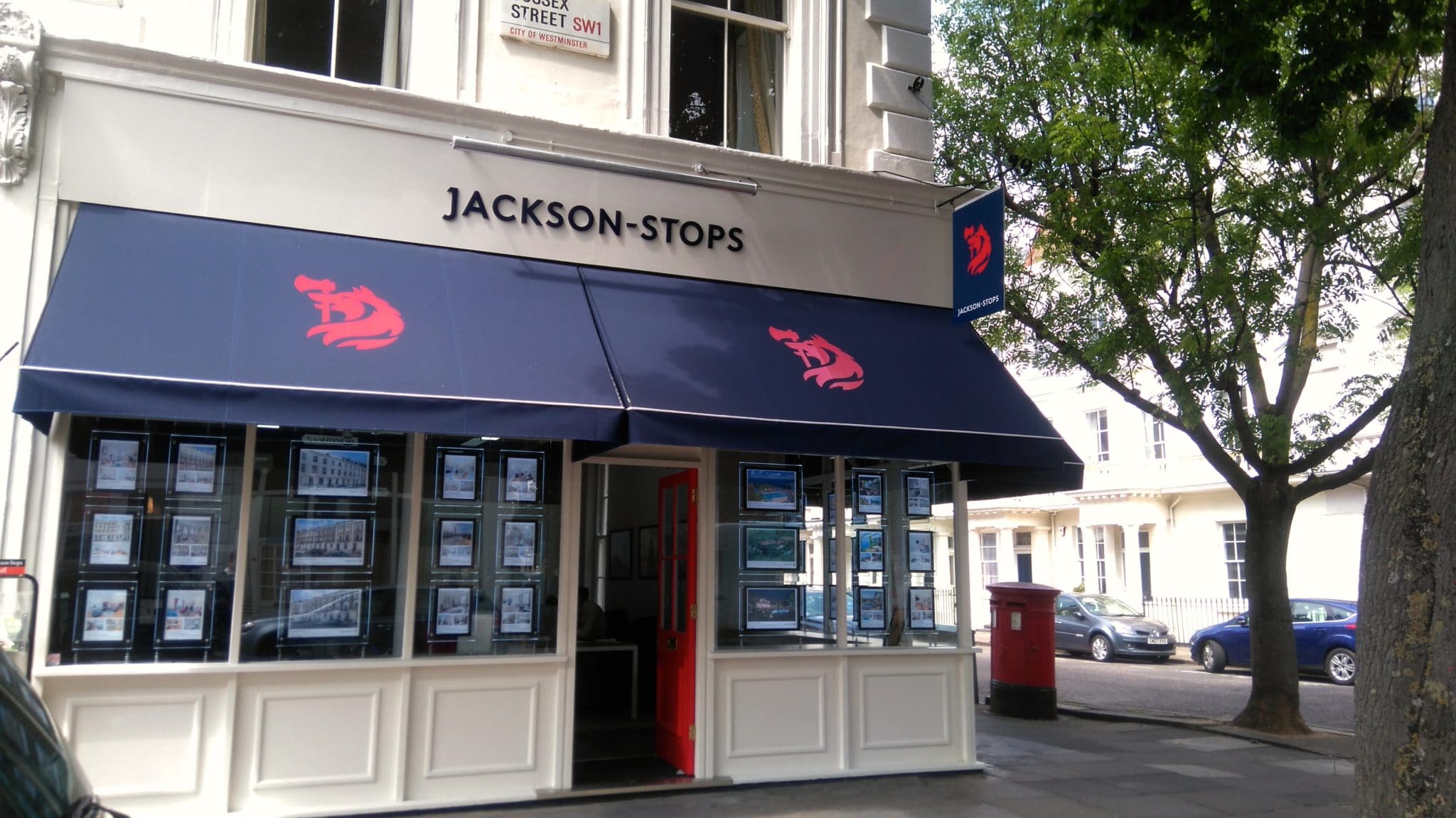
A leading national firm of estate agents with 46 offices across the UK, Jackson-Stops has been growing its reach, advising and supporting on property trading since 1910.
Ambition
Originally added alongside the founder’s name to build a family spirit within the company, it had become clear that the “& Staff” was not being understood by customers. Customer survey feedback showed that many clients were already just using ‘Jackson-Stops’ and it was time to make the change formally.
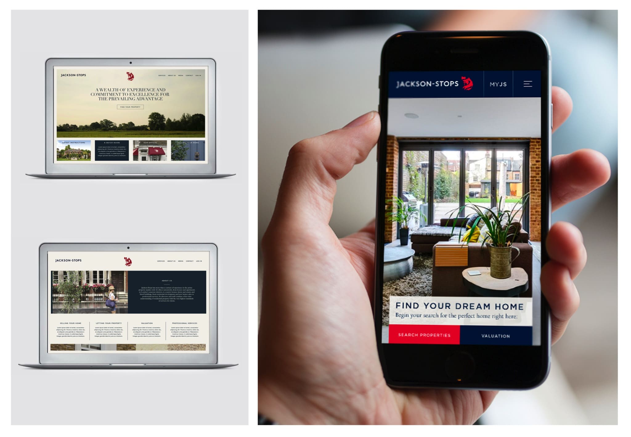
With this came the potential to refresh the brand as a whole and faced with a rapidly growing digital real estate market and the fresh challenges that brings it was important to have a clean, contemporary brand that could stand out in the digital market place, as well as on the high street.
Action
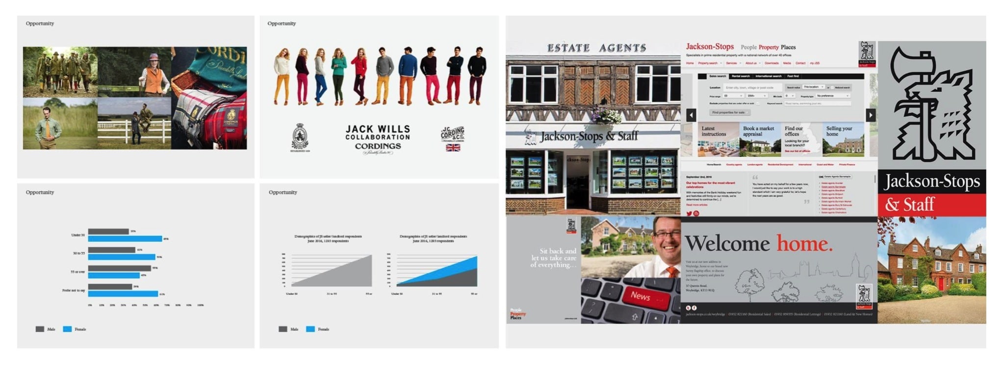
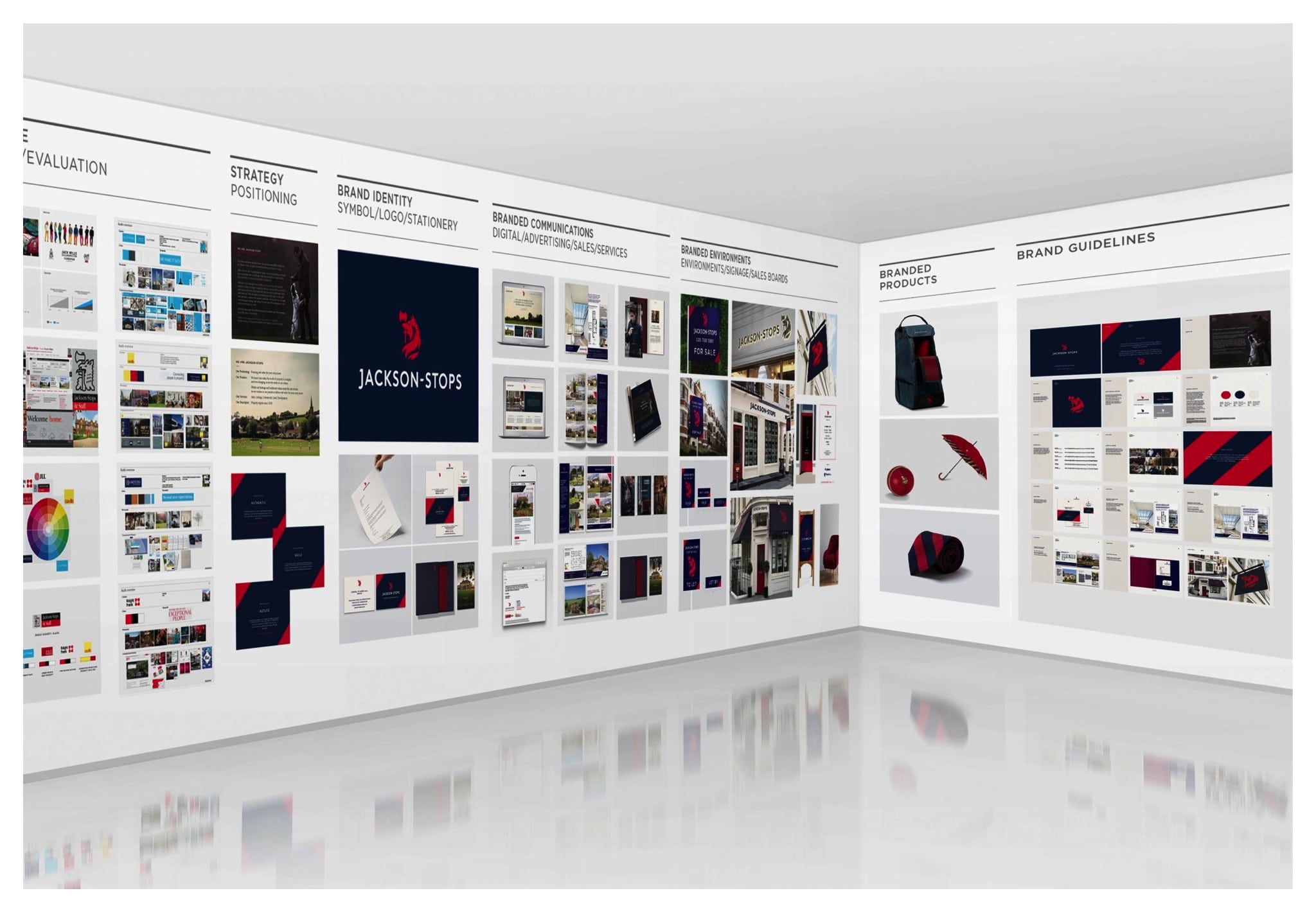
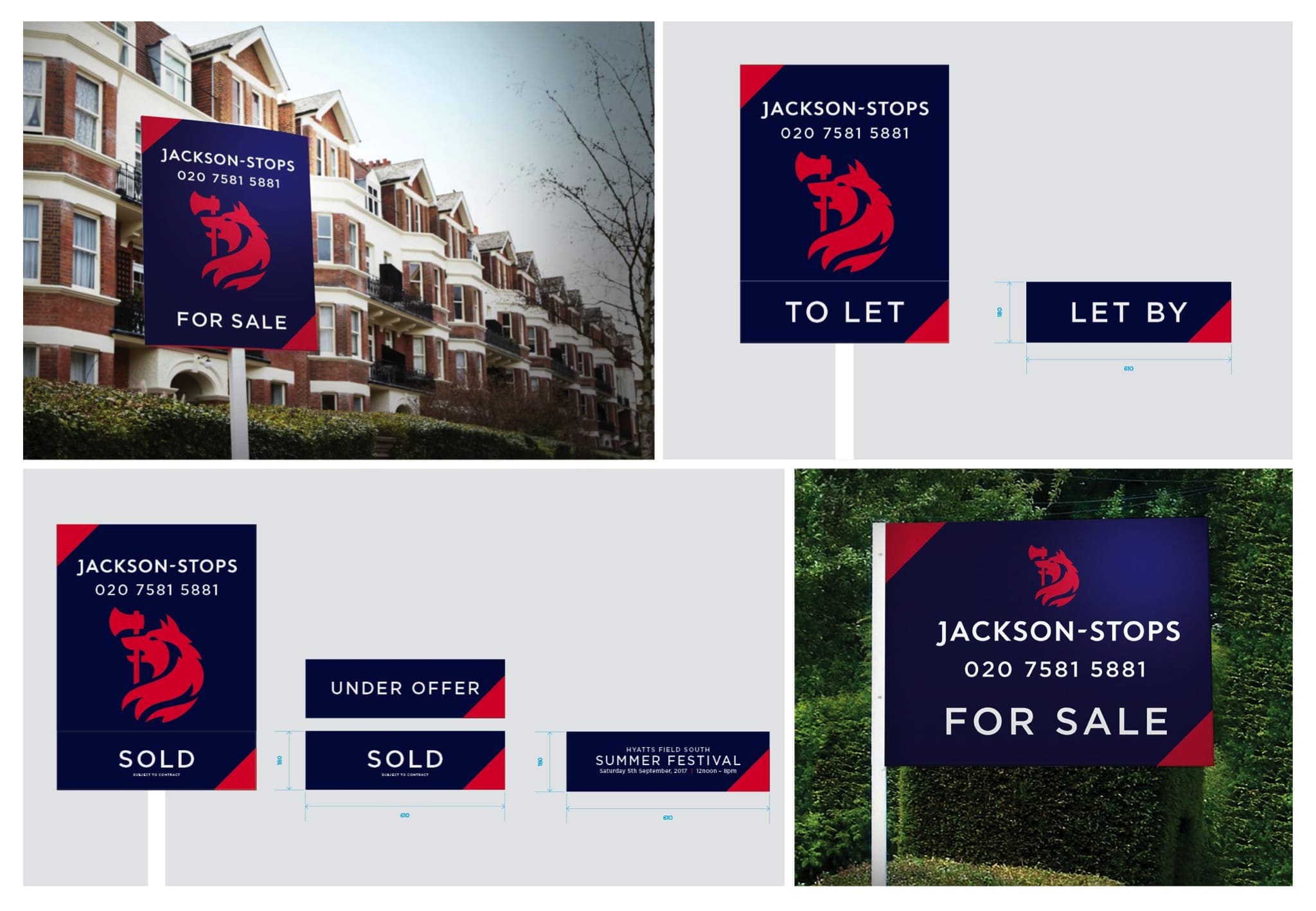
We conducted a thorough audit of digital and brick-and-mortar estate agents, analysing the market and design trends of competing agencies. This let us understand how online trends and property portals are affecting the traditional agency model. We analysed the brand across hundreds of customer touchpoints – from sales boards and stationery to office fronts and advertising.
Result
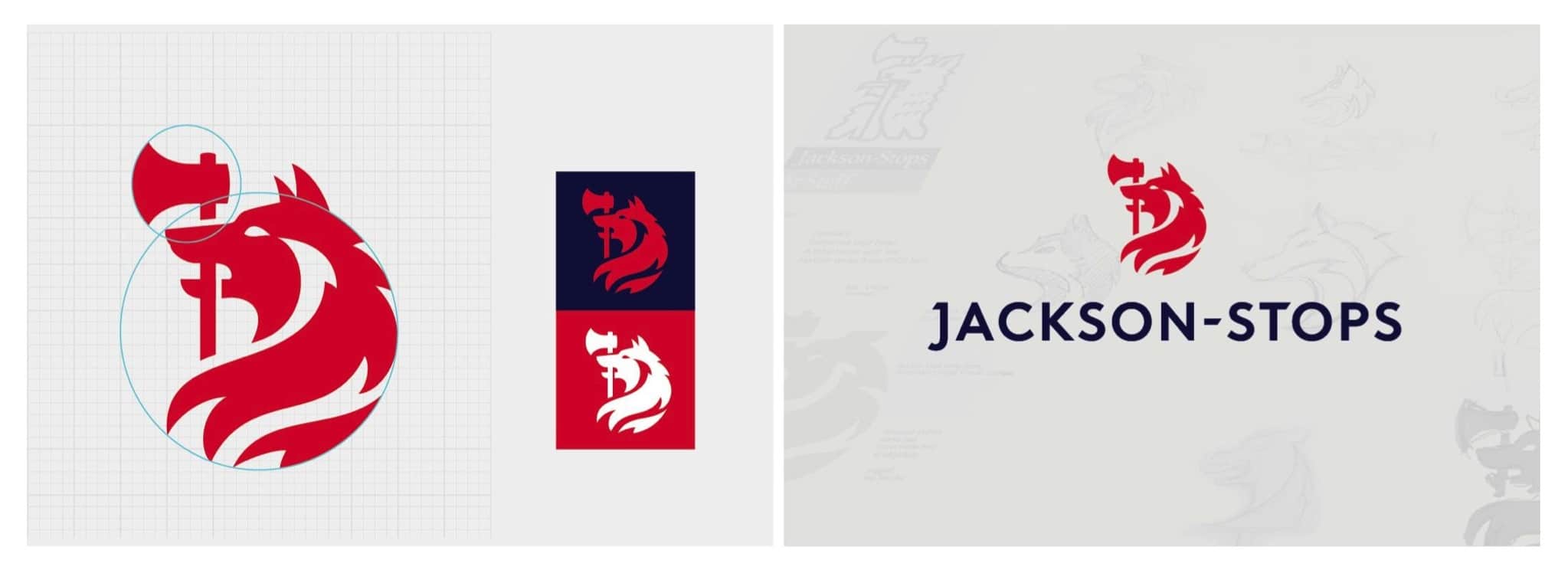
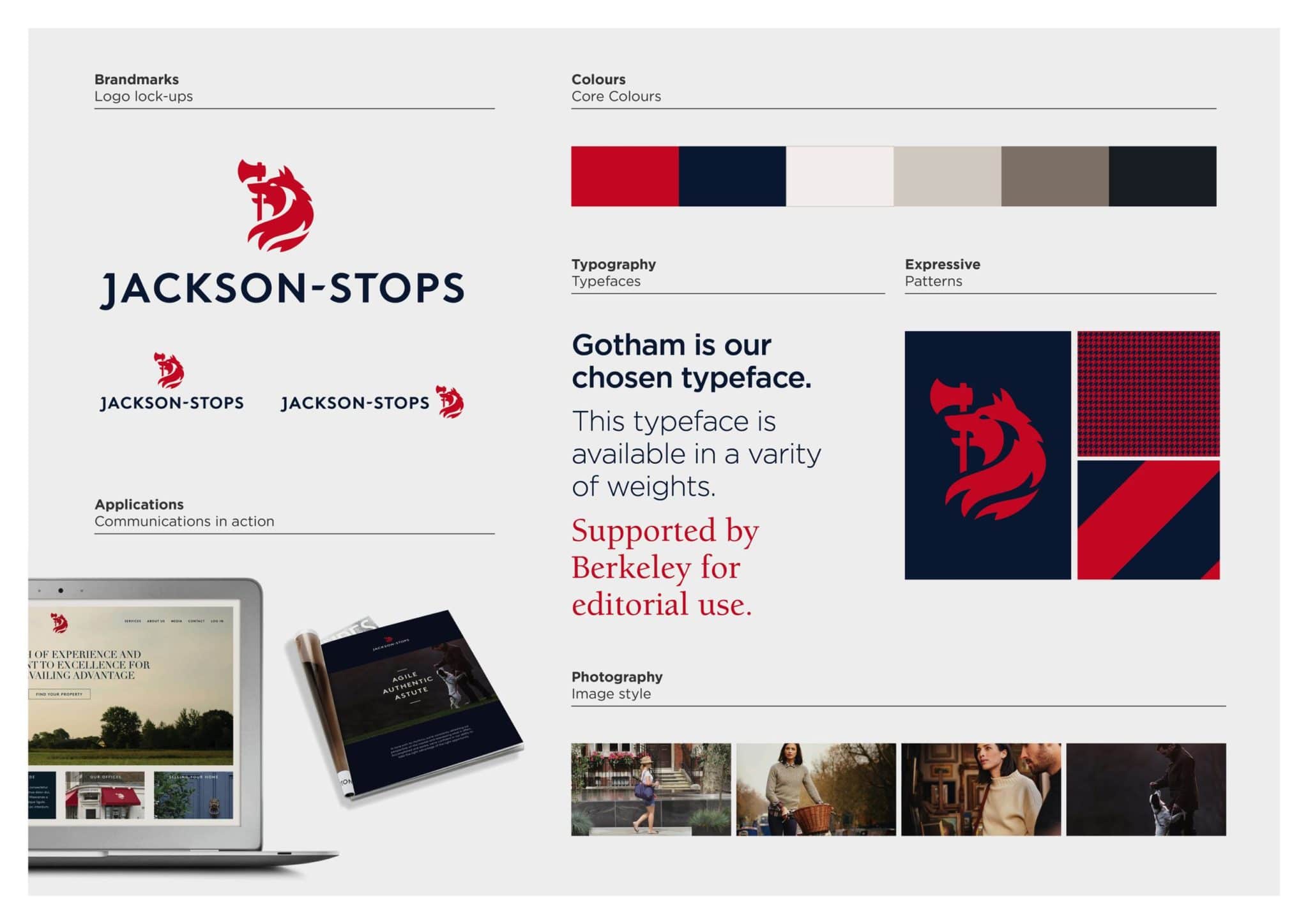
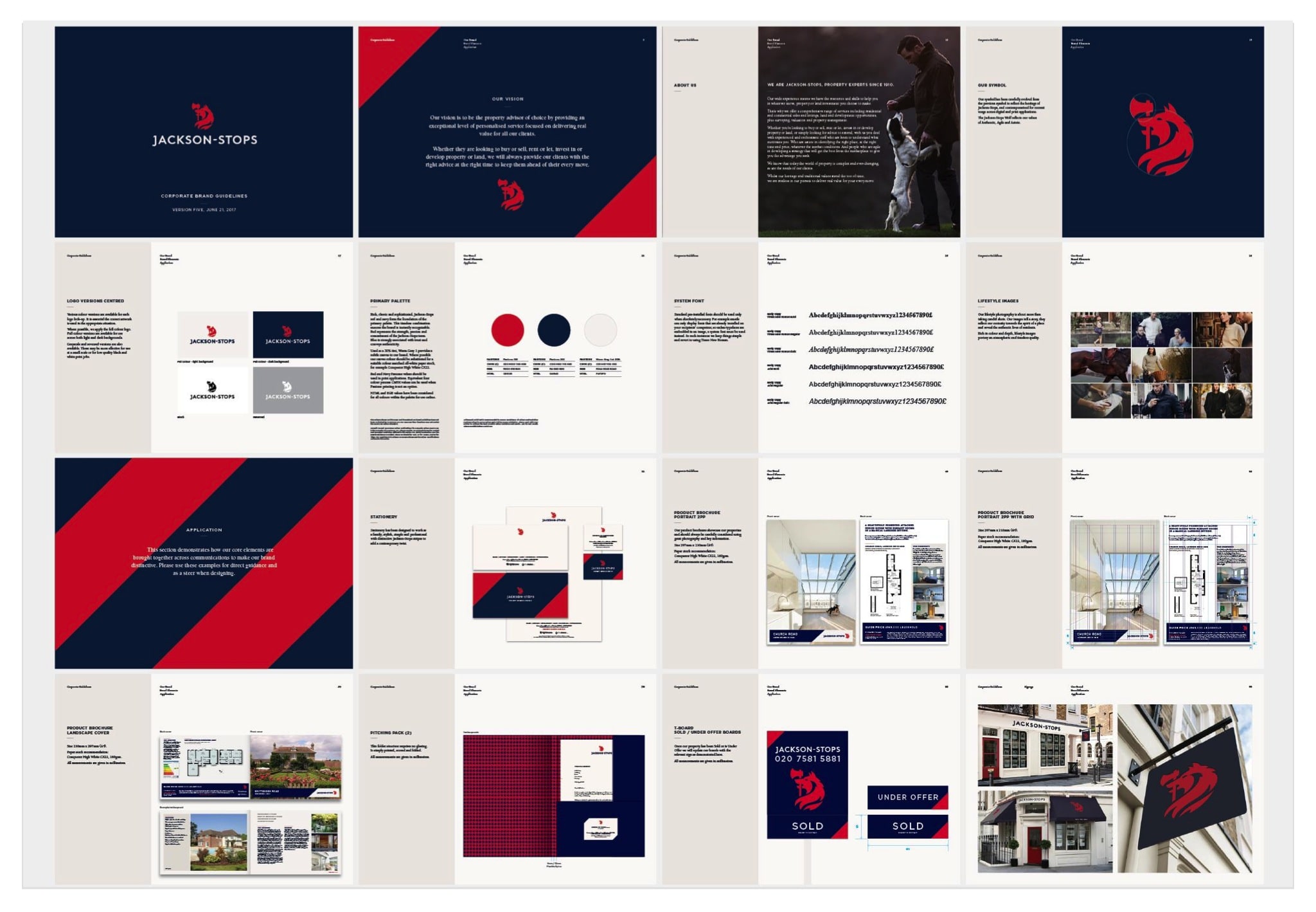
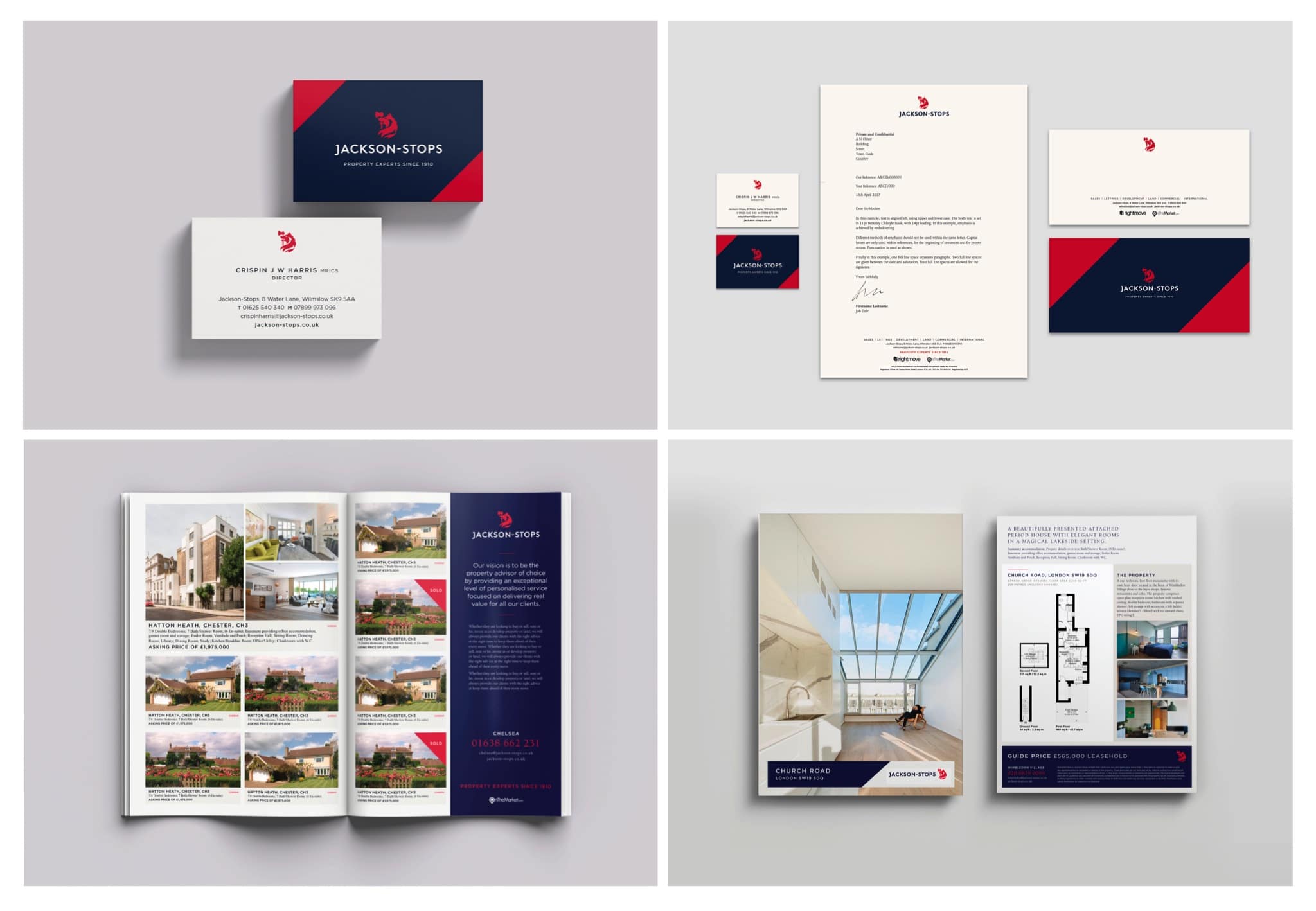
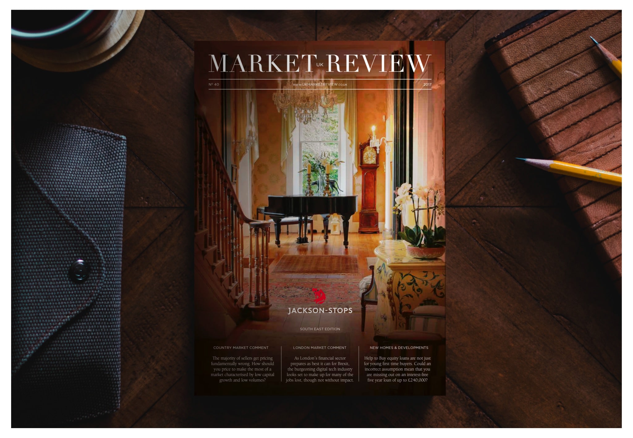
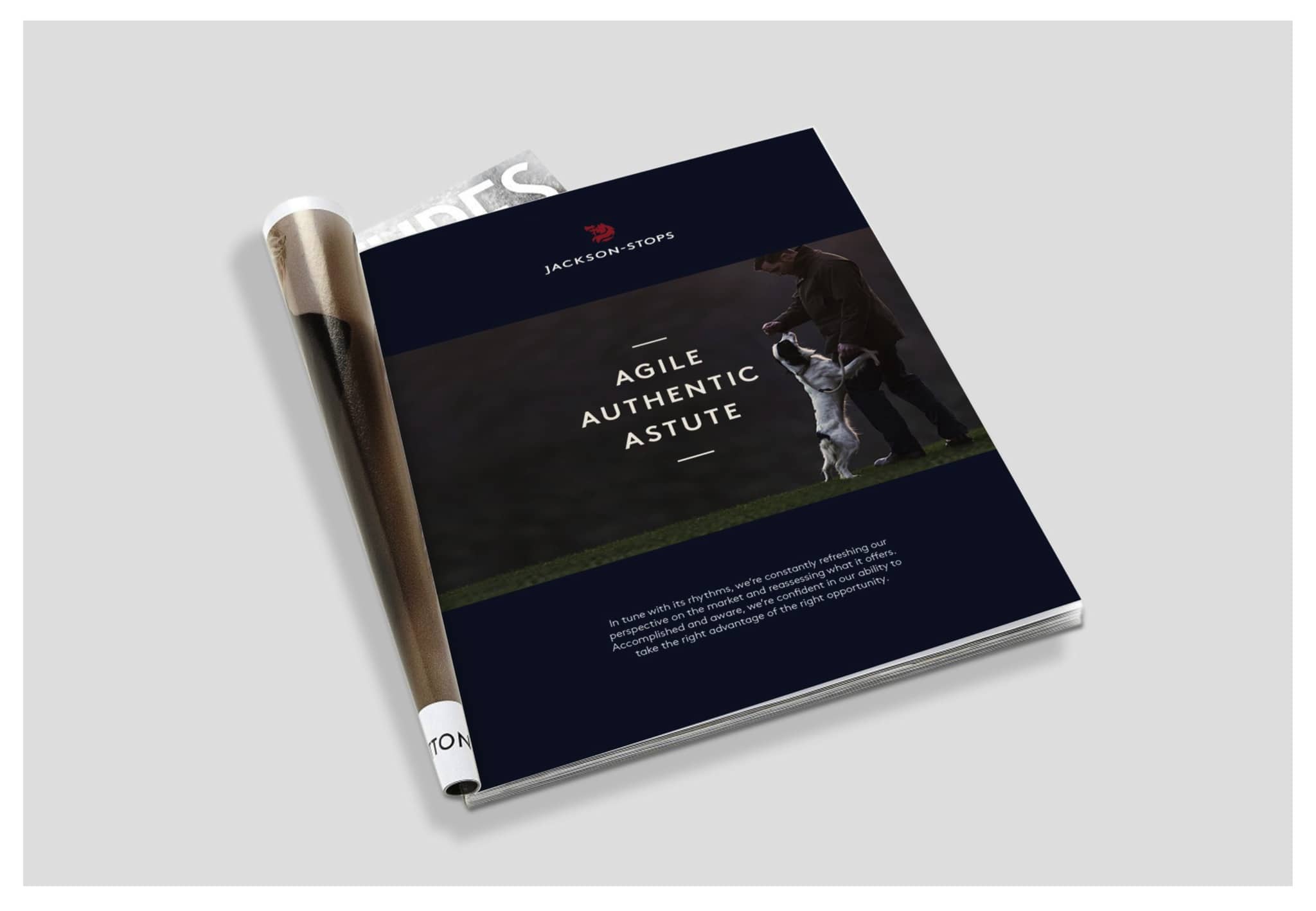
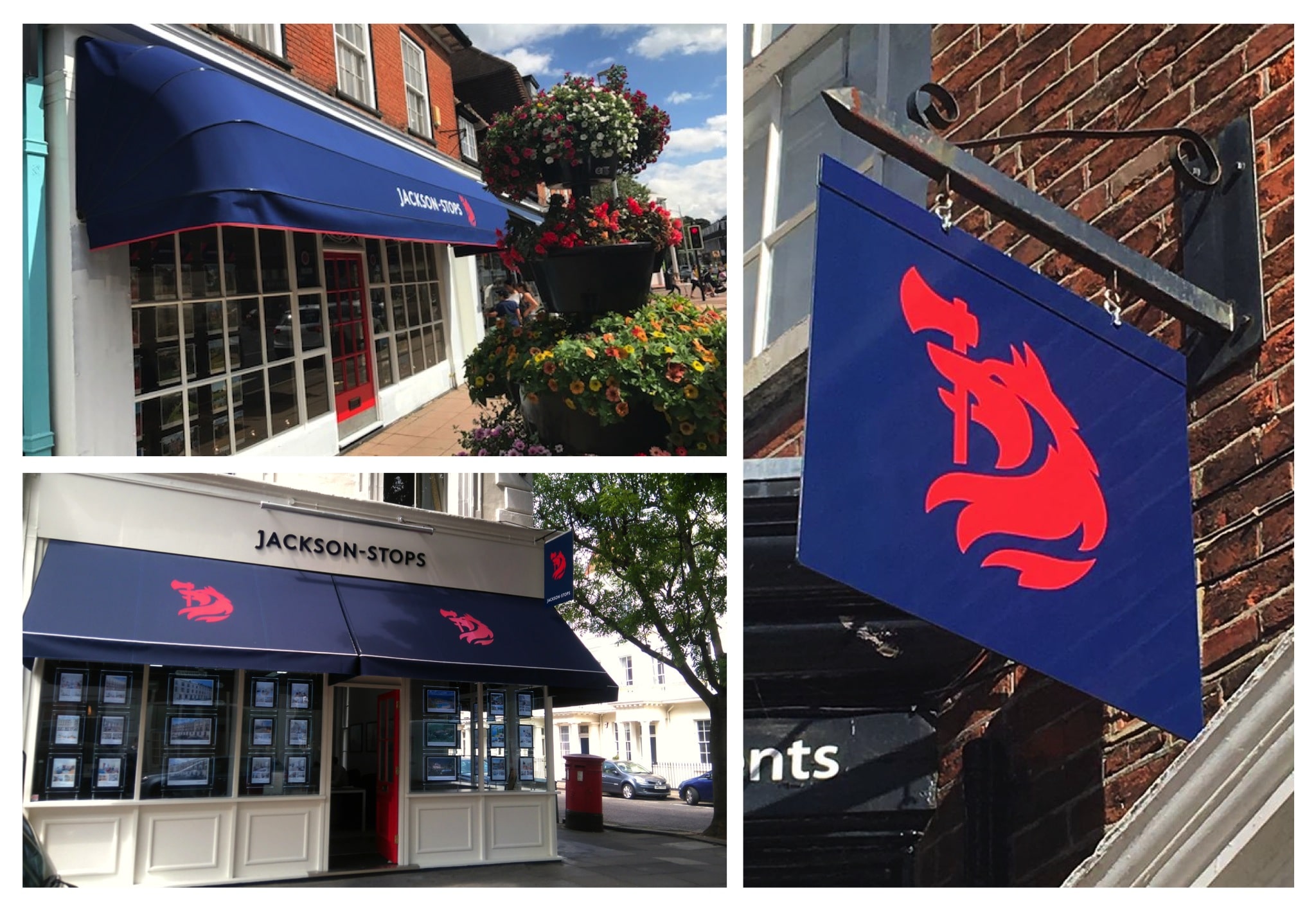
The iconic Jackson-Stops symbol of a wolf holding an axe in his mouth is not just tied to a company, but originates from the Jackson-Stops family crest. Therefore, it was imperative to treat the mark with utmost respect and care. We carefully crated a mark that not only retains but celebrates this heritage, shaping a new symbol that is as comfortable on a family seal as it is as a digital icon.
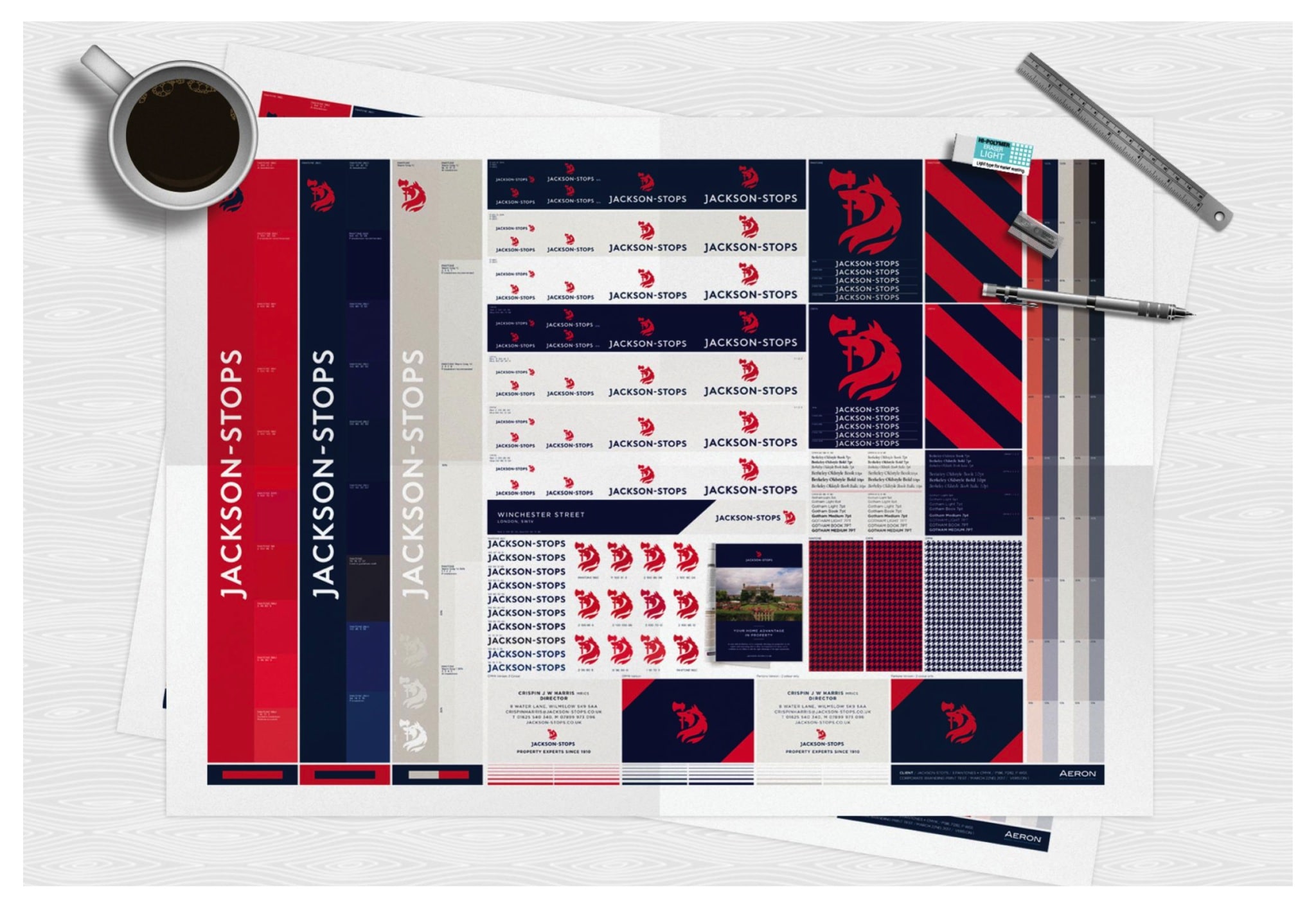
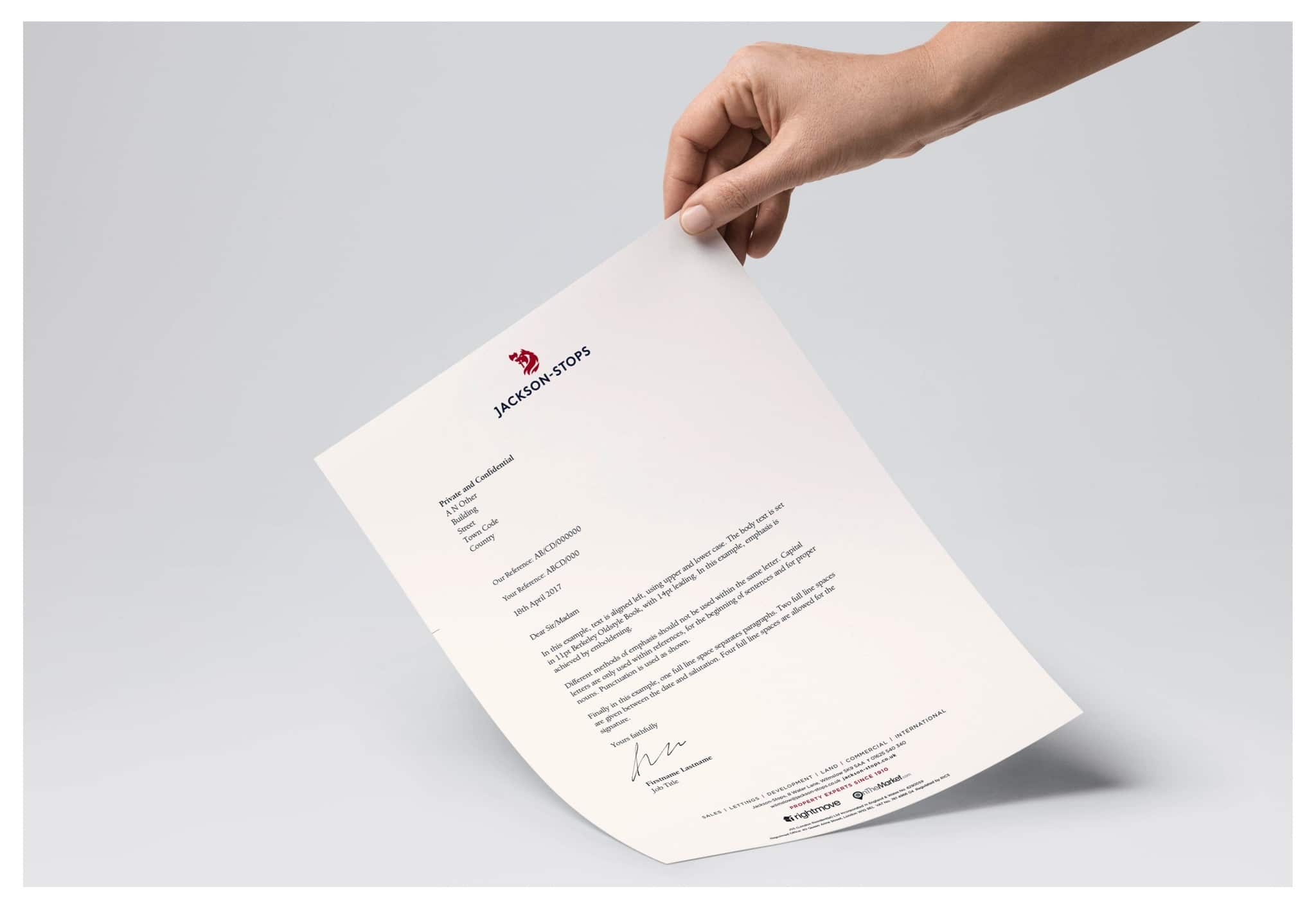
Alongside a sophisticated colour palette, softening the previous identity’s black to a rich navy blue, we worked closely with Jackson-Stops to develop the identity across the wide range of applications across the customer journey. After conducting detailed print and paint colour testing, we developed a thorough set of corporate and implementation guidelines across stationery, advertising and environments.
The new identity was launched in September 2017 and we continue to support and advise Jackson-Stops, including in the development of a bold new website.
The news from straight from the Wolf’s mouth
About Aeron
We are Aeron, a London brand design consultancy that specialises in business transformation, brand strategy and design. Our purpose is set on helping ambitious businesses thrive in today’s market place.
Based on fundamental insights, our London brand design consultancy is expert in helping organisations define their brand purpose; a clear, relevant, ownable and defendable territory – which delivers genuine value to customers.
With a reputation for linking brand strategy and innovative design with clear financial outcomes, our London branding agency combines intelligent data, imaginative insight with inspiring creativity and transformative digital technology to deliver enduring growth.
