September 24, 2023 by admin
With two decades of dedicated craftsmanship in the realm of creative branding, Chris Walmsley stands as a seasoned Creative Director. His specialism is in conceiving, nurturing, and executing comprehensive brand programs that transcend geographical boundaries for Aeron’s global clientele.
Chris excels in bridging the gap between brand and user, Chris crafts with unwavering clarity and purpose, employing strategic insight to bolster business objectives.
Chris’s portfolio spans the spectrum, encompassing iconic brands from multinational juggernauts to nimble, dynamic start-ups. He excels in Aviation Branding, Retail and Premium Banking, driving Product Innovation, curating seamless Digital Customer Experiences, shaping FMCG Product Branding and Design, and orchestrating unforgettable Customer Live Experiences and Events.
Awards
World Travel Awards, Asia Golden Awards – Brand
Revitalization, Marketing Communication and Campaign of the Year — Flynas
Golden Award for Excellence — ABN AMRO rebrand to RBS Bank
Category: peopleTags: Agthia and Shell., Akbank, Bacardi, Bacardi, Corus, ING, Barclaycard, Merrill Lynch, Rio Tinto, Hilton, Akbank, Vodafone, SEB, Ladbrokes, John Lewis, RBS, GREY GOOSE, Saudi Arabian Railways, Agthia and Shell., Barclaycard, Corus, GREY GOOSE, Hilton, ING, John Lewis, Ladbrokes, Merrill Lynch, RBS, Rio Tinto, Saudi Arabian Railways, SEB, Vodafone | Comments Off on Chris Walmsley
November 1, 2017 by Matthew Millard-Beer
MATTHEW MILLARD-BEER
Leading national estate agent, Jackson-Stops, have been making good progress rolling out the new identity designed by Aeron and launched officially last month.
As well as refreshing the previous identity, the rebrand process also appears to have unveiled even older brand identities, such as this example from the Jackson-Stops Hale office, featuring an advert from 1961.
The whole style and layout of the poster makes for a wonderful period piece, and is a far cry from the glossy image-led posters, or even interactive digital banners we are more familiar with today.
The old Jackson-Stops family crest is just visible at the top of the poster, and survived barely touched throughout the next 56 years. Now though, with the ‘& Staff’ being retired from the name, the iconic ‘dog and chopper’ symbol has been brought up to date in a style that nods to the brand’s heritage but with a bold, contemporary execution.

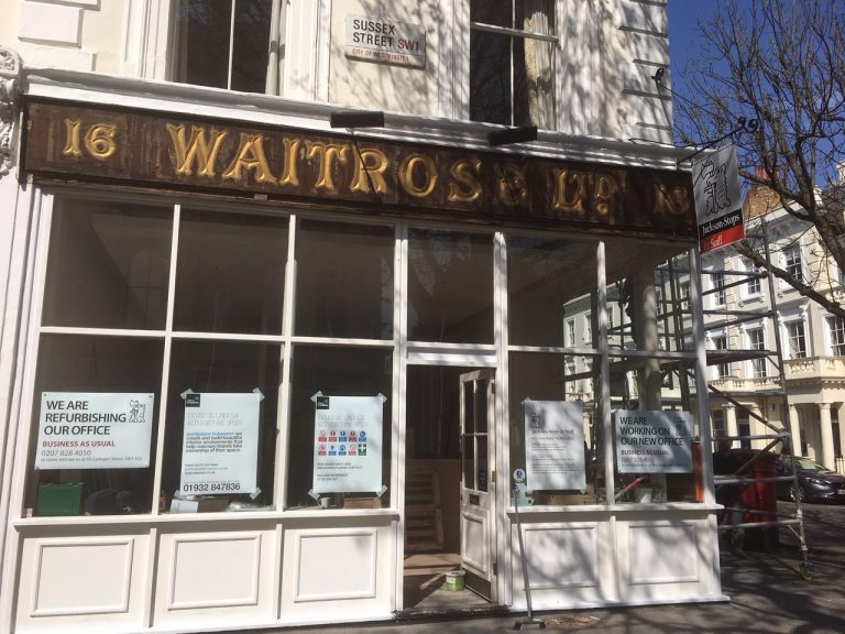
Earlier in the project, we saw a similar example of a historical evolution from a different brand – when one of the original Waitrose signs was uncovered at Jackson-Stops Pimlico. A stunning example of early 20th Century sign-writing and a far cry from the simple, clean lines of the brand’s current sans serif identity. JS Pimlico is now proudly sporting its new, Aeron-designed livery – while the Waitrose sign has since been acquired by the John Lewis Heritage Centre.
With over 100 years of property expertise, it’s fascinating to see 100 years of marketing changes as well.
Category: LondonThinking, ThinkingTags: brand environments, Brand Identity, Brand refresh, Heritage, history, Jackson-Stops, John Lewis, Logos, Waitrose | Comments Off on Changing faces of Marketing
