1. Change that Counts

    March 26, 2021 by Samuel Panda

    Context

    Gate One is a specialist management consultancy, solely focused on the acceleration of successful digital and business change through smart, well-defined and executed portfolio, programme and project delivery.

    Ambition

    Gate One provide small, highly experienced and innovative teams embedded seamlessly alongside their clients’ teams, who get to the crux of problems quickly, shaping intelligent solutions and delivering lasting transformation results which can be felt across the organisation.

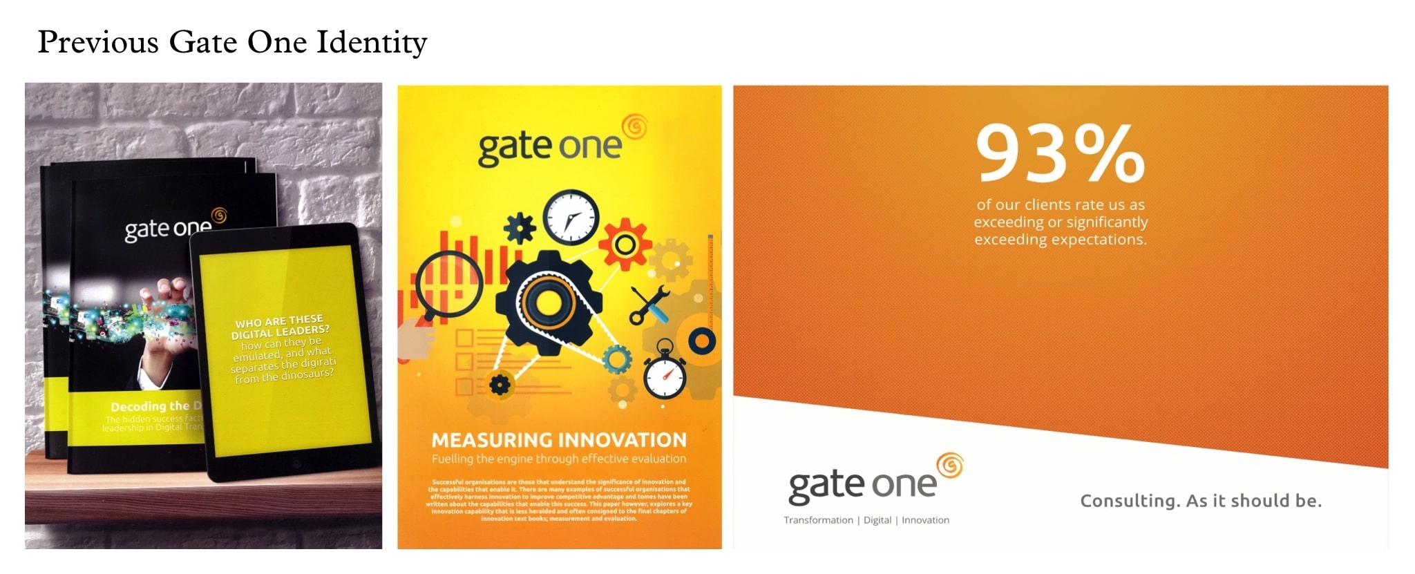
    Aeron were tasked with supporting Gate One with their next chapter of their growth with the development of a clear brand positioning, a defendable proposition and a refreshed compelling verbal and visual identity system.

    Action

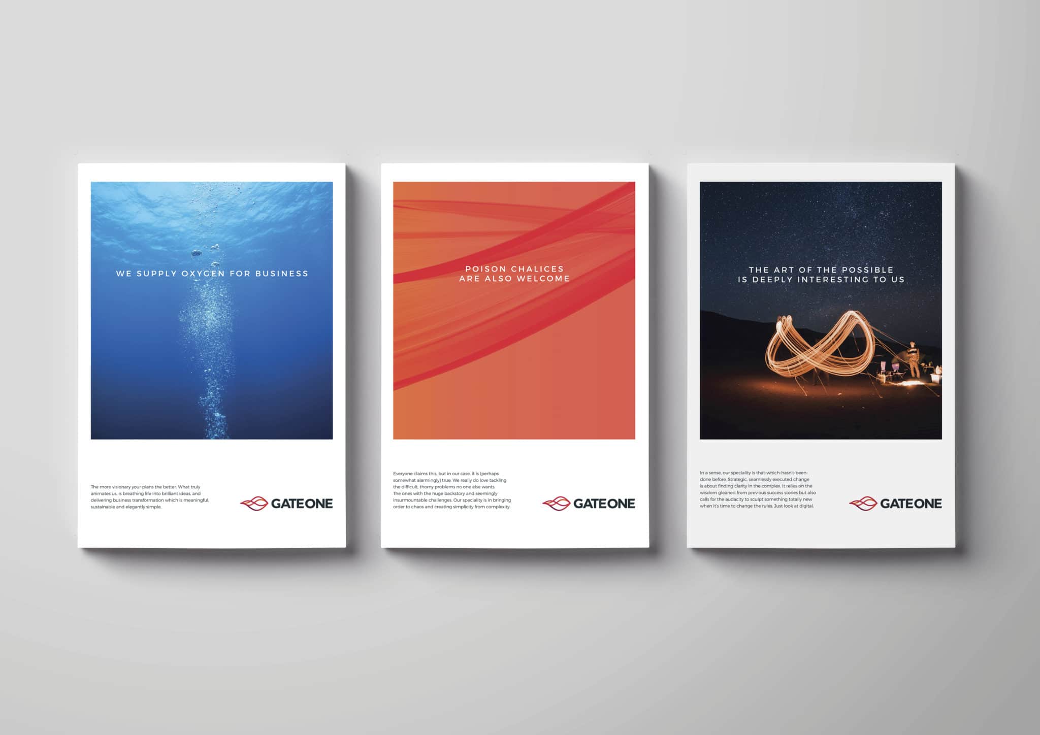
    We helped define Gates One’s purpose as co-piloting the reinvention of some of the world’s most interesting and influential organisations: whilst positioning the business as a collective of ex-big firm consultants, unified by a simple ideal – more meaningful business transformation, delivered as consulting should be.

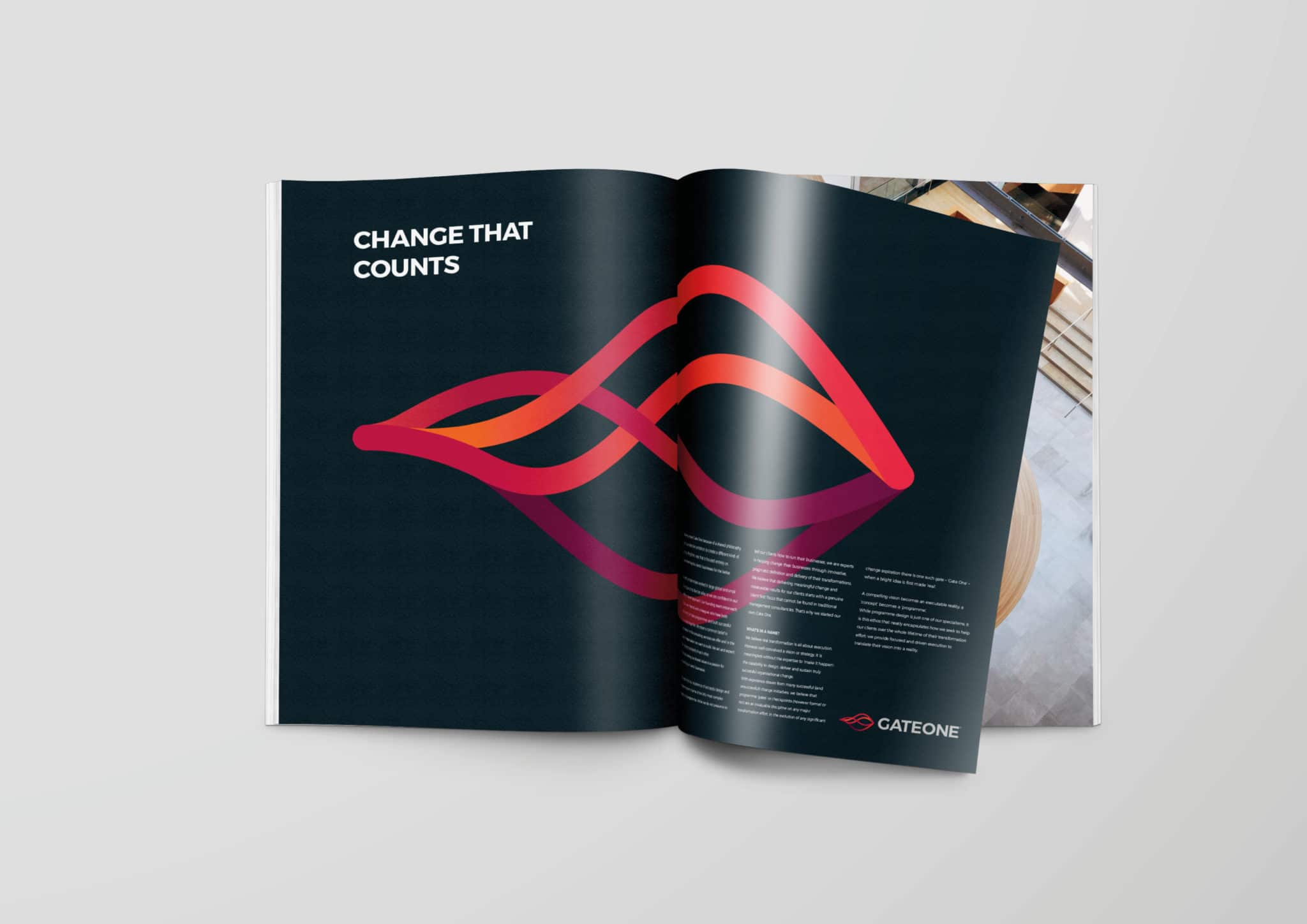
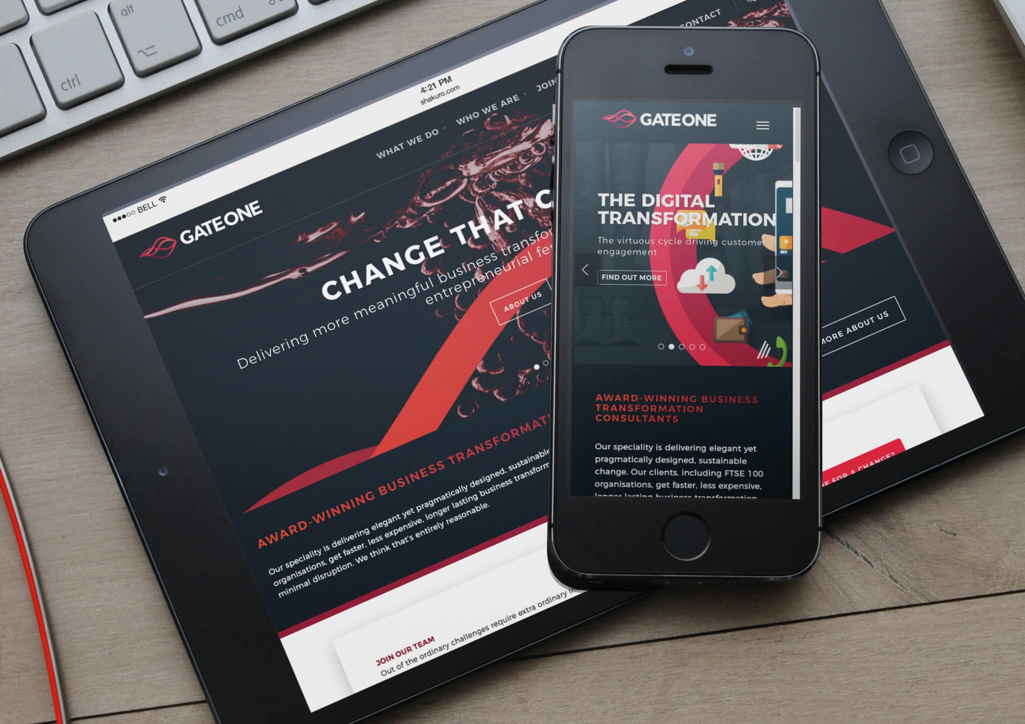
    The ‘Ripple’ icon graphically brings to life the force multiplying ripple effect which Gate One believe is at the heart of every successful business transformation. It speaks to the journey, in partnership with Gate One’s clients, to deliver change that counts. It encapsulates Gate One’s DNA, which is a blend; a combination of founders’ mentality, tempered with humility and a brilliant team spirit – which means Gate One genuinely relish taking complex situations apart, and designing something better. The colours reflect the care, passion, loyalty, humanity, empathy, warmth, approachability and dynamism Gate One hold true to their core.

    Result

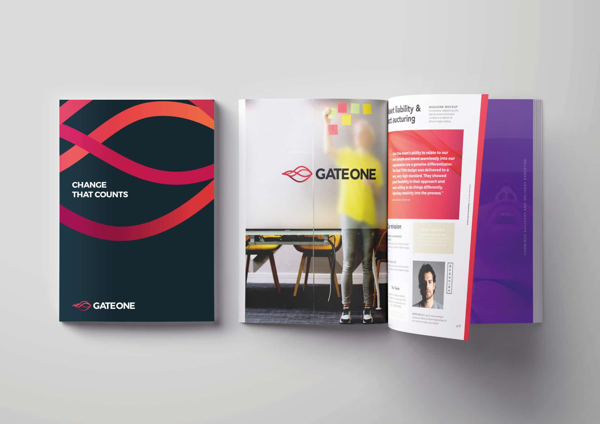
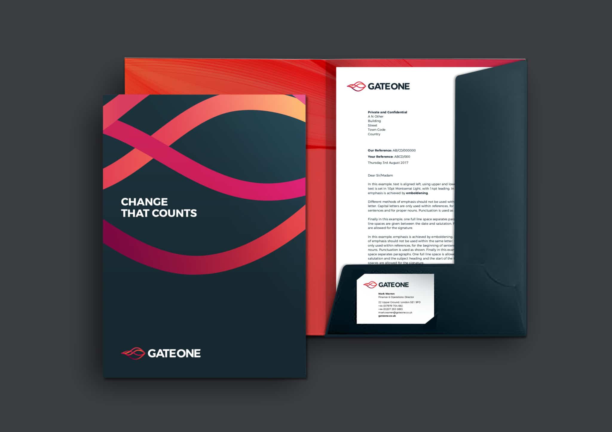
    The new brand was launched in October 2017, commencing with an internal engagement programme supported by the provision of assets and tools to effect a seamless transition to the new brand from templates, brochures, stationery and digital asset design direction. The brand has now been implemented with an integrated external communications and marketing programme in conjunction with a next generation mobile and desktop website and digital assets.


    About Aeron

    We are Aeron, a London brand packaging design agency that specialises in business transformation, brand strategy and design. Our purpose is set on helping ambitious businesses thrive in today’s market place.

    Based on fundamental insights, our London brand design consultancy is expert in helping organisations define their brand purpose; a clear, relevant, ownable and defendable territory – which delivers genuine value to customers.

    With a reputation for linking brand strategy and innovative design with clear financial outcomes, our London branding agency combines intelligent data, imaginative insight with inspiring creativity and transformative digital technology to deliver enduring growth.

  2. Pursuing Real Value For Your Every Move

    April 10, 2018 by Samuel Panda

    Context

    A leading national firm of estate agents with 46 offices across the UK, Jackson-Stops has been growing its reach, advising and supporting on property trading since 1910.

    Ambition

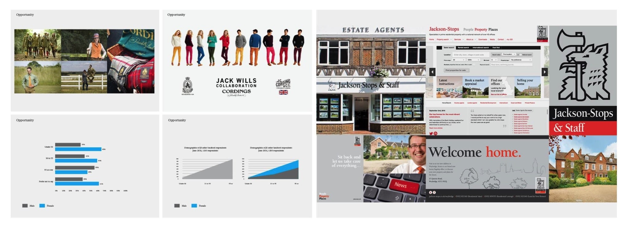
    Originally added alongside the founder’s name to build a family spirit within the company, it had become clear that the “& Staff” was not being understood by customers. Customer survey feedback showed that many clients were already just using ‘Jackson-Stops’ and it was time to make the change formally.

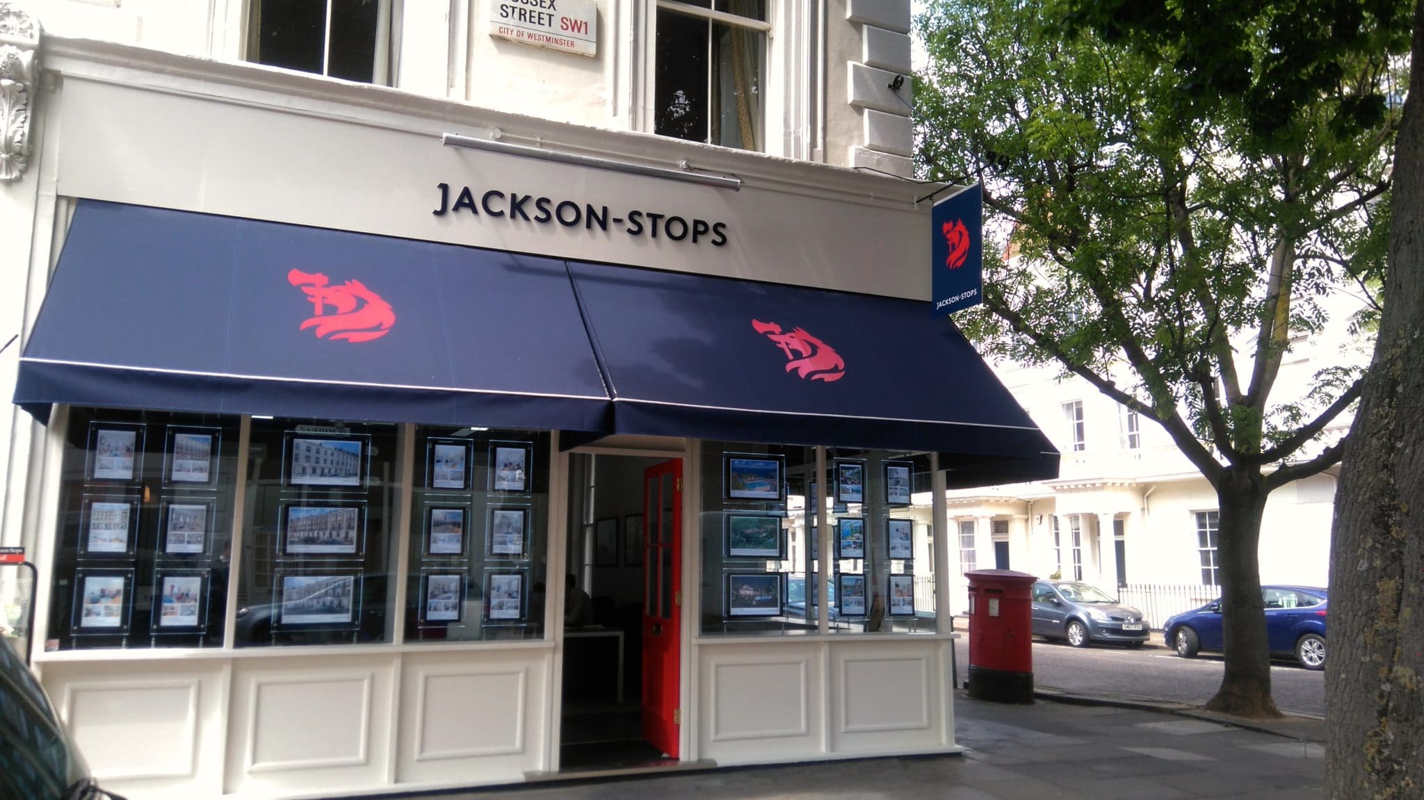
    With this came the potential to refresh the brand as a whole and faced with a rapidly growing digital real estate market and the fresh challenges that brings it was important to have a clean, contemporary brand that could stand out in the digital market place, as well as on the high street.

    Action

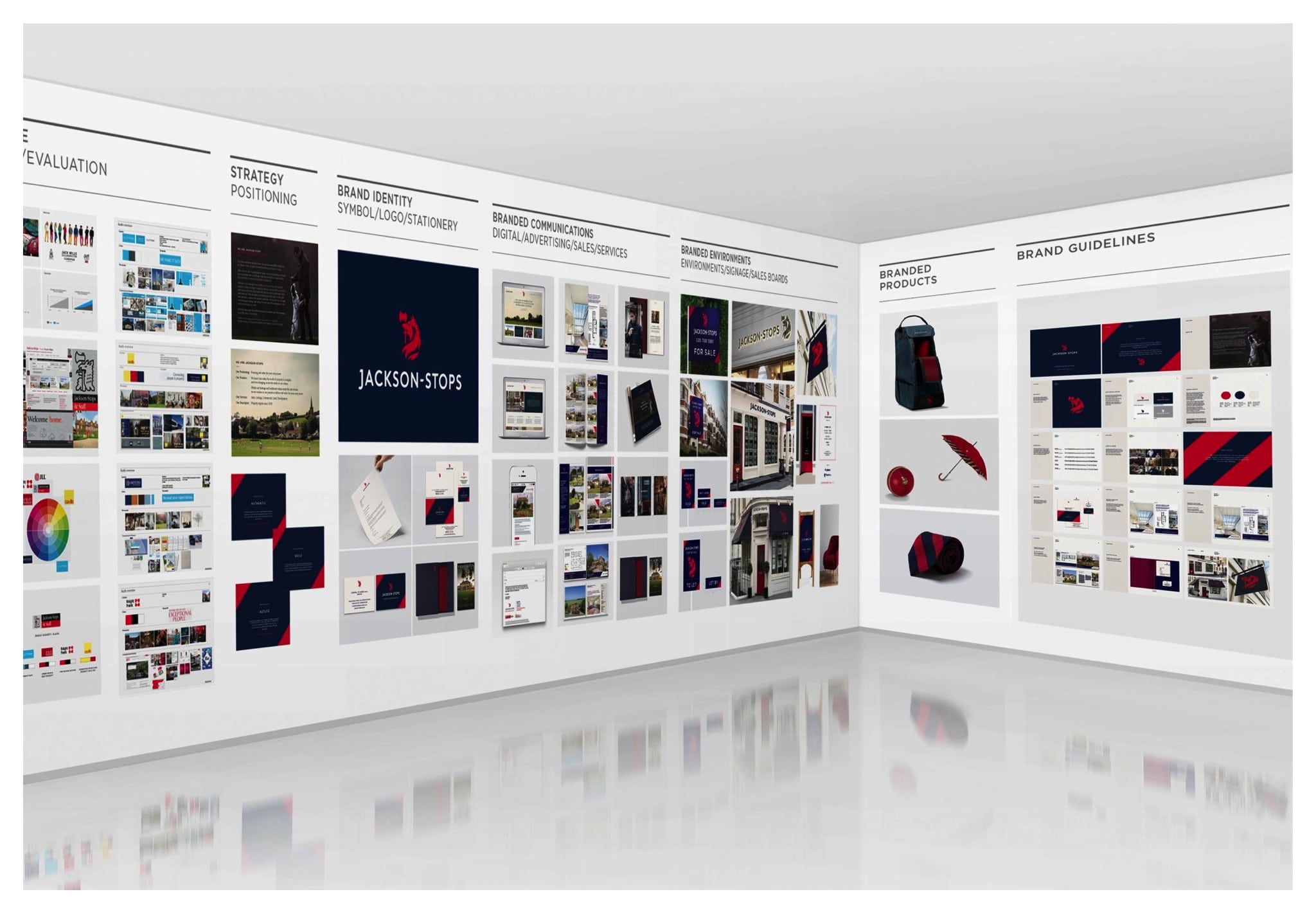
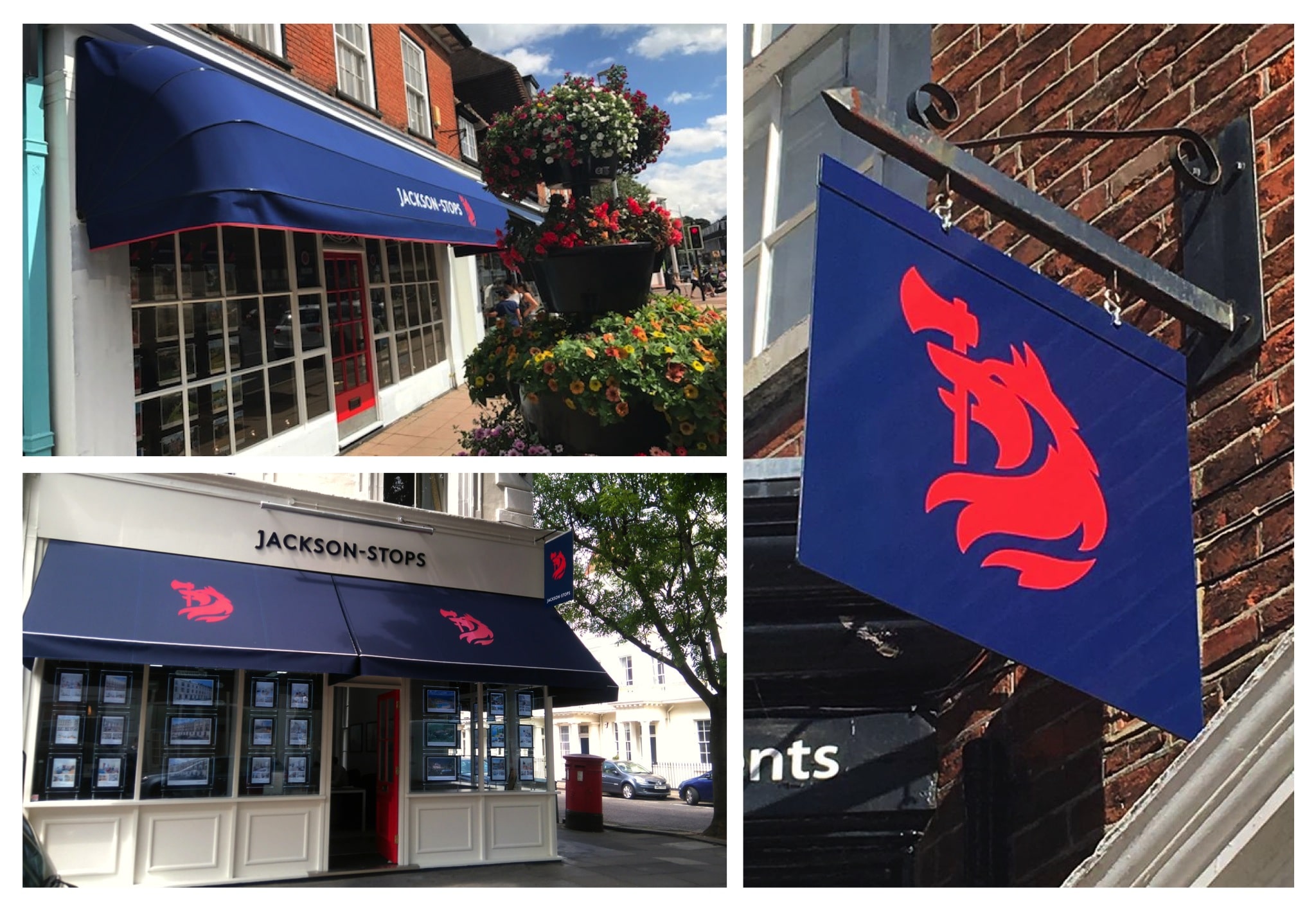
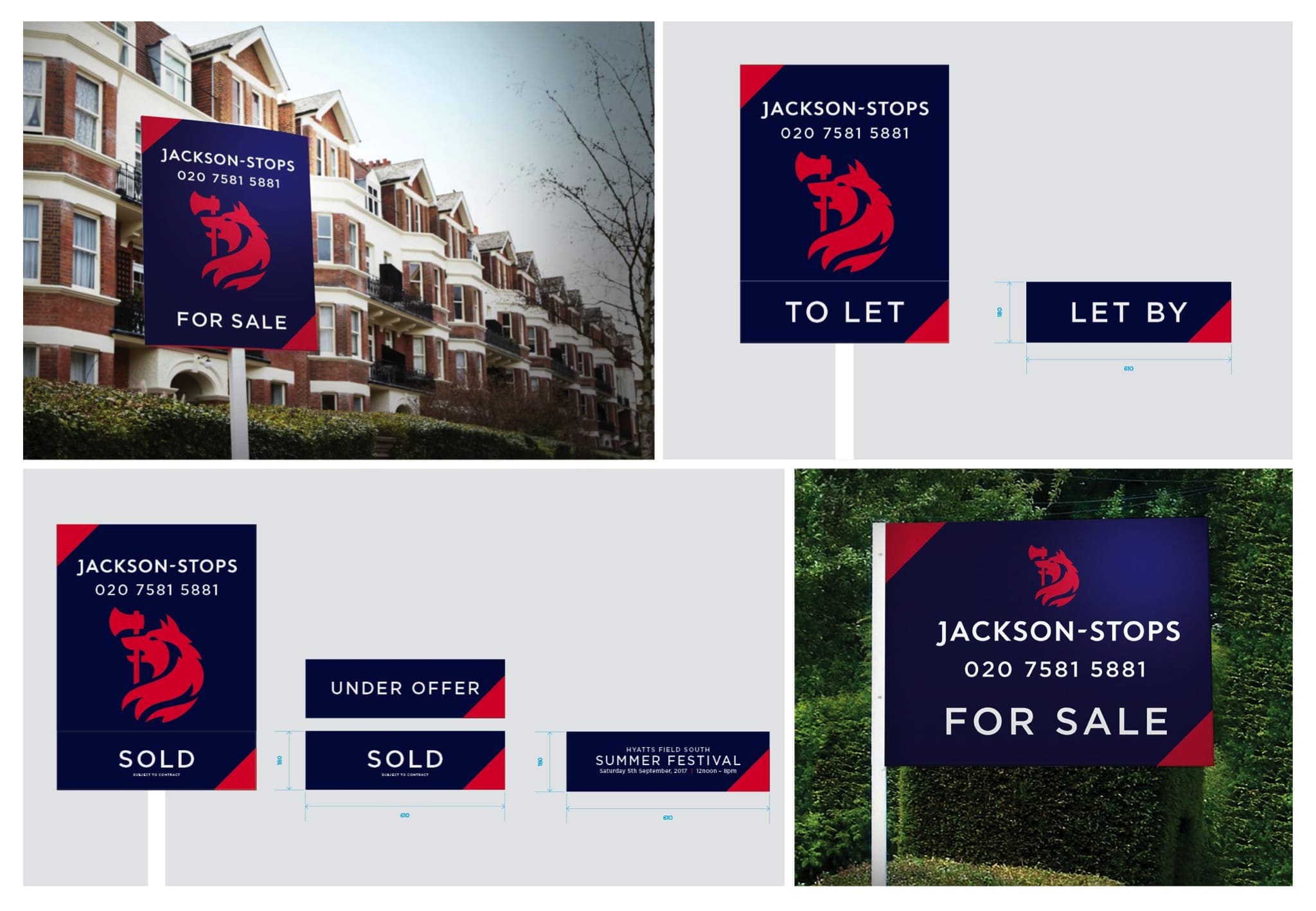
    We conducted a thorough audit of digital and brick-and-mortar estate agents, analysing the market and design trends of competing agencies. This let us understand how online trends and property portals are affecting the traditional agency model. We analysed the brand across hundreds of customer touchpoints – from sales boards and stationery to office fronts and advertising.

    Result

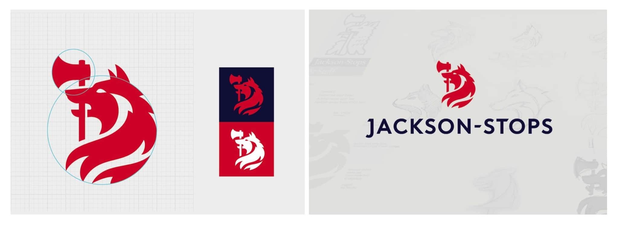
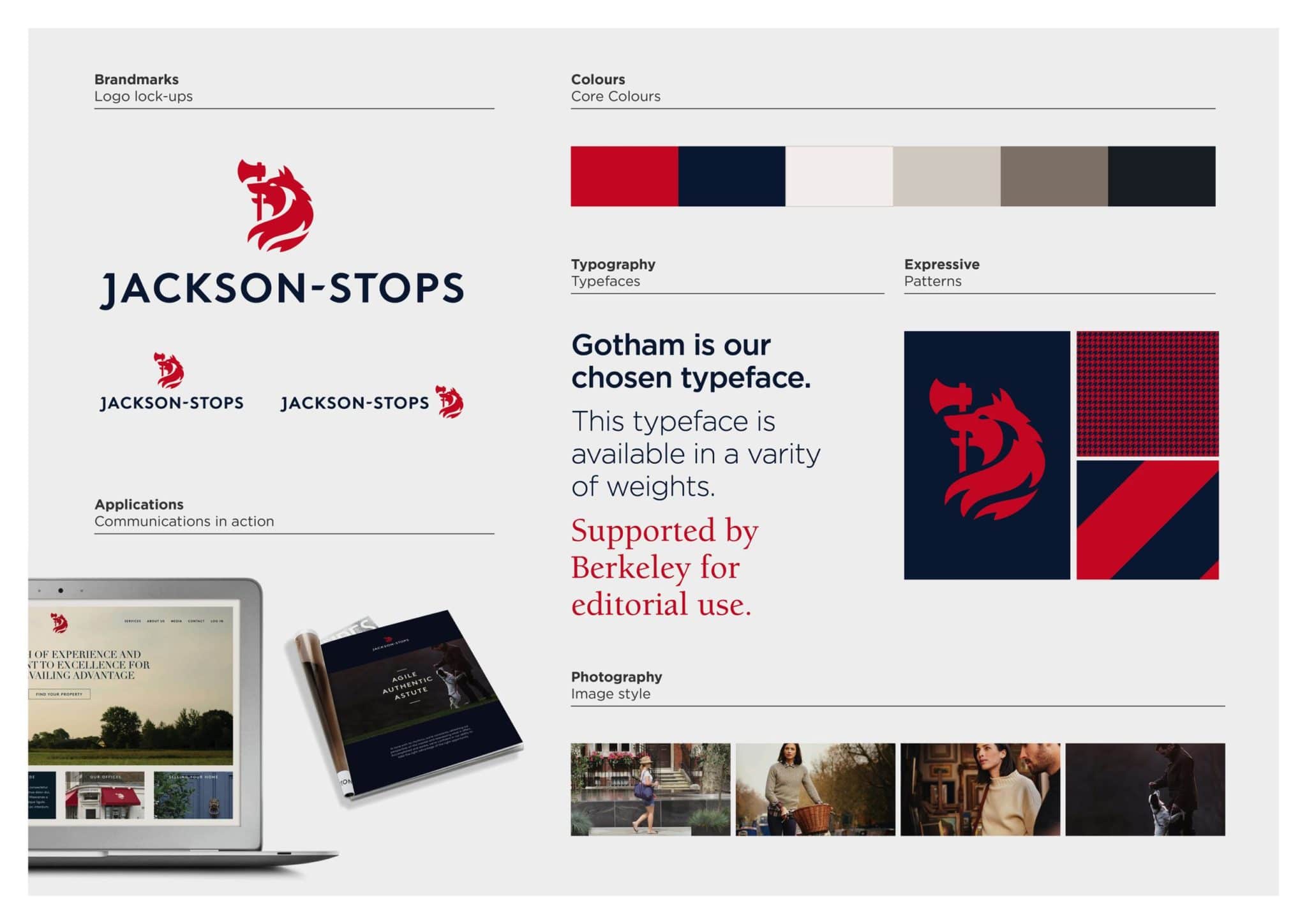
    The iconic Jackson-Stops symbol of a wolf holding an axe in his mouth is not just tied to a company, but originates from the Jackson-Stops family crest. Therefore, it was imperative to treat the mark with utmost respect and care. We carefully crated a mark that not only retains but celebrates this heritage, shaping a new symbol that is as comfortable on a family seal as it is as a digital icon.

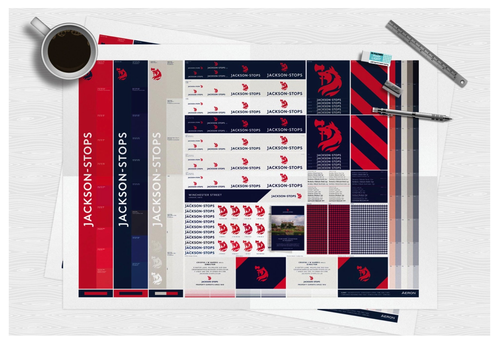
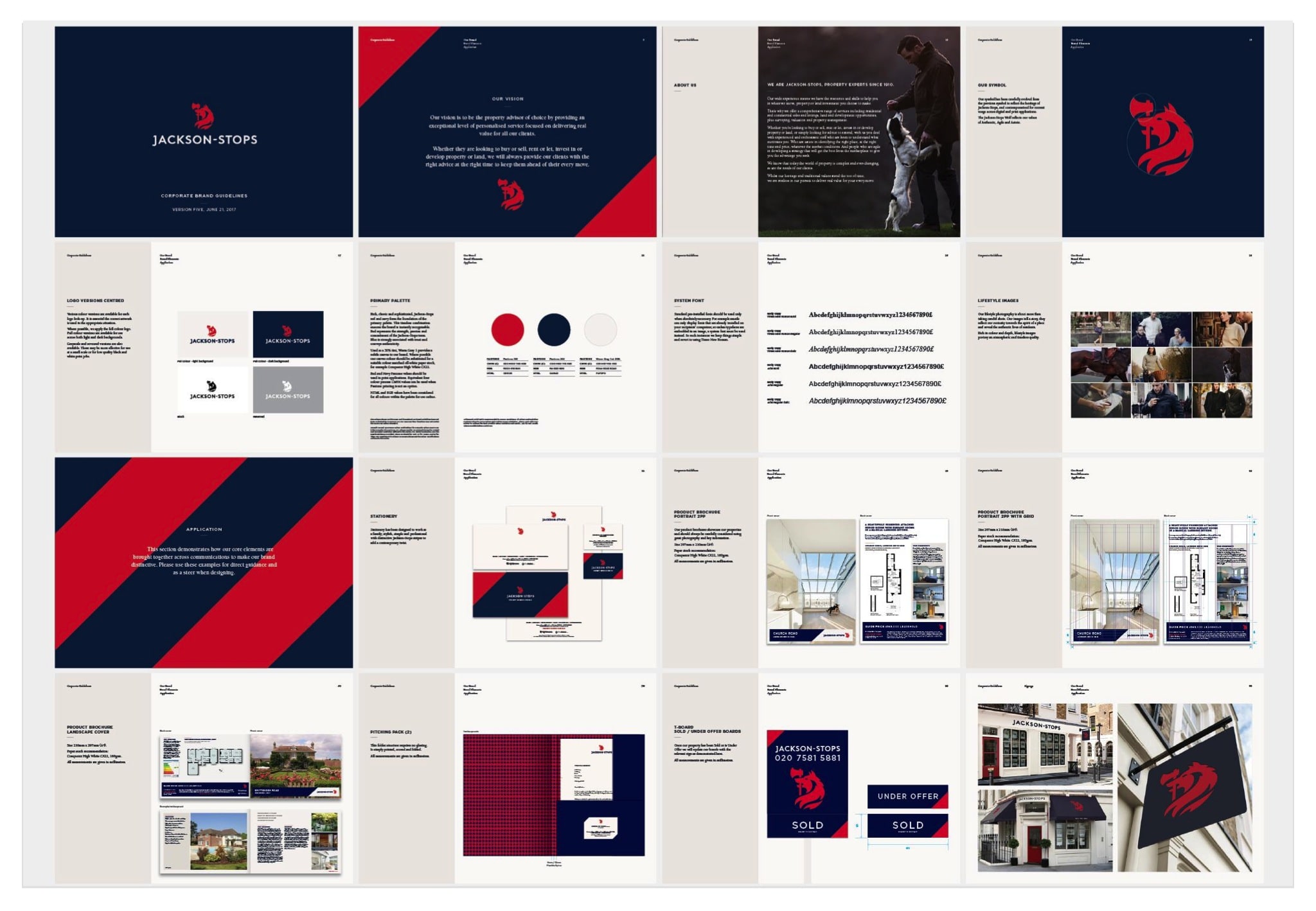
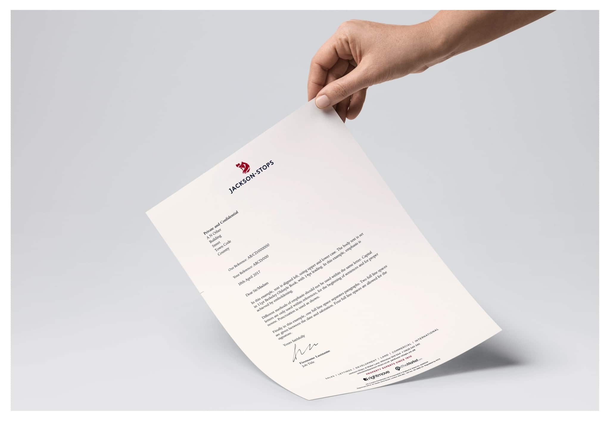
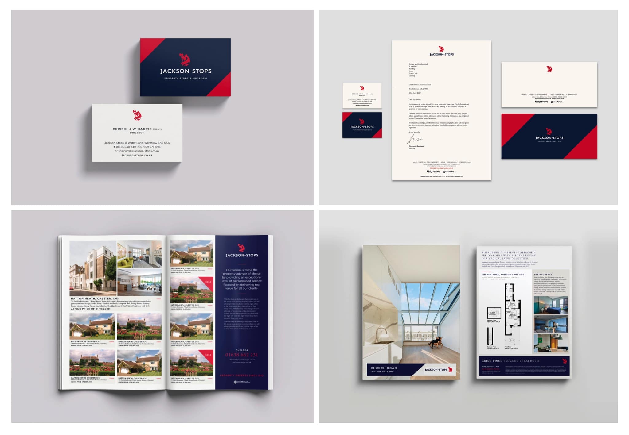
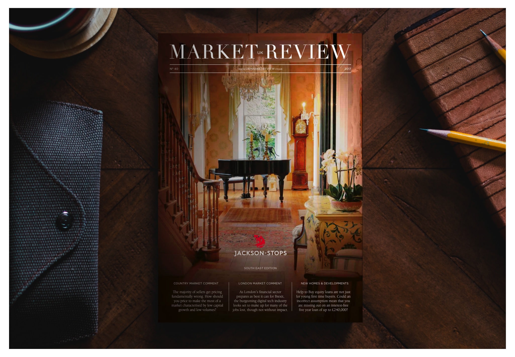
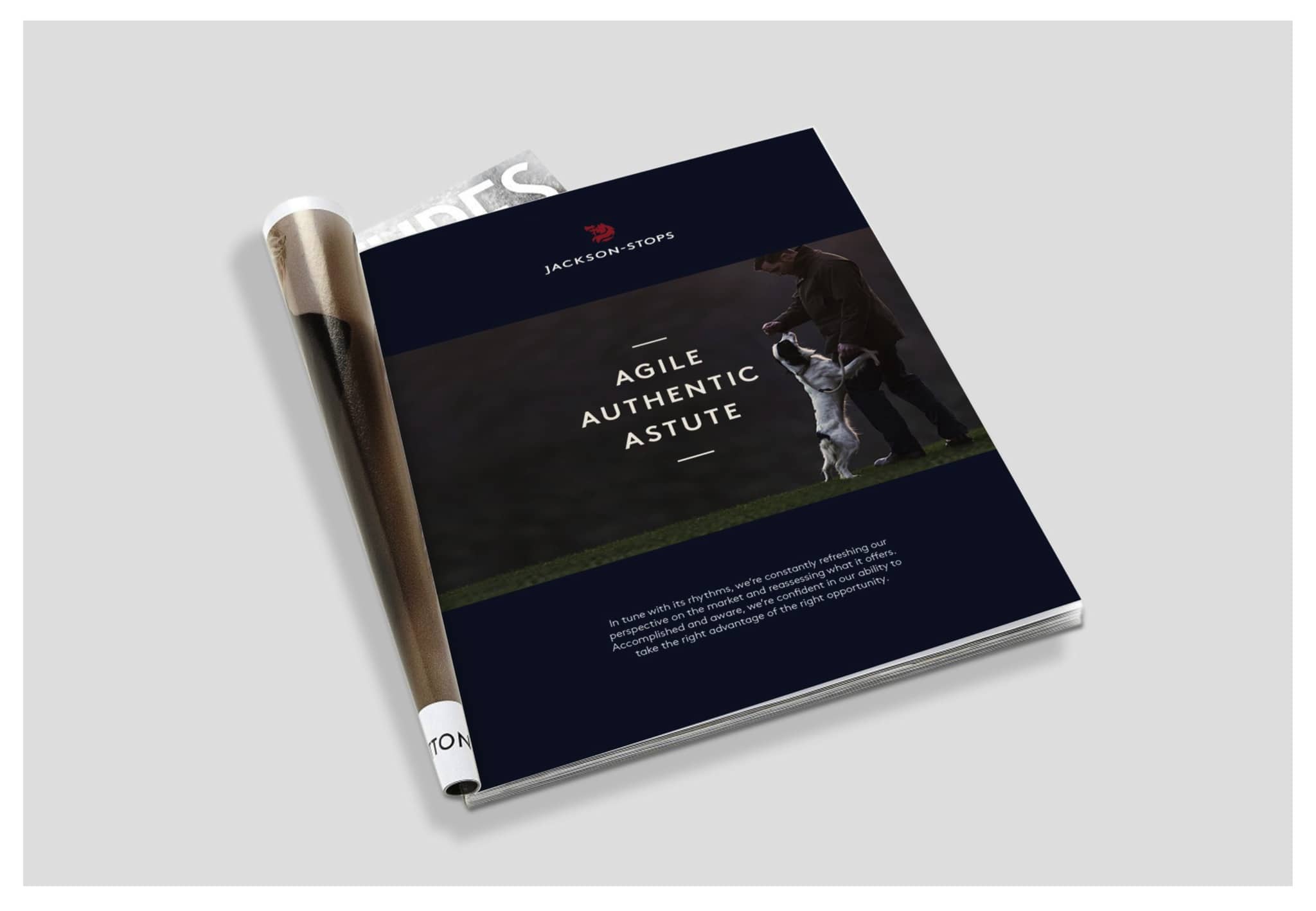
    Alongside a sophisticated colour palette, softening the previous identity’s black to a rich navy blue, we worked closely with Jackson-Stops to develop the identity across the wide range of applications across the customer journey. After conducting detailed print and paint colour testing, we developed a thorough set of corporate and implementation guidelines across stationery, advertising and environments.

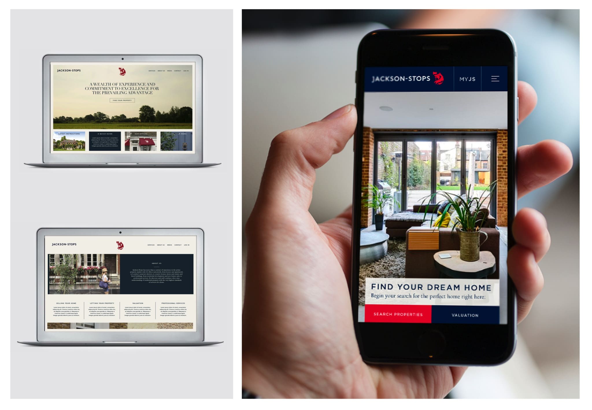
    The new identity was launched in September 2017 and we continue to support and advise Jackson-Stops, including in the development of a bold new website.

    The news from straight from the Wolf’s mouth

    About Aeron

    We are Aeron, a London brand design consultancy that specialises in business transformation, brand strategy and design. Our purpose is set on helping ambitious businesses thrive in today’s market place.

    Based on fundamental insights, our London brand design consultancy is expert in helping organisations define their brand purpose; a clear, relevant, ownable and defendable territory – which delivers genuine value to customers.

    With a reputation for linking brand strategy and innovative design with clear financial outcomes, our London branding agency combines intelligent data, imaginative insight with inspiring creativity and transformative digital technology to deliver enduring growth.


© Aeron Branding, 2024. All rights reserved.